Executive Summary
In recent years, the evolution in digital marketing for financial advisors has transformed advisor websites from a static, online version of the advisor's sales brochure into a crucial part of the marketing funnel and a place where many visitors actually decide whether or not to become clients (or at least to contact the advisor about talking further). But as the role of advisor websites in the marketing process has increased, so too have the standards for website design – since, in order to entice visitors to stay and (ideally!) engage with the advisor, the site needs to be a place where visitors actually want to stay to begin with. The ability to establish trust and credibility is one of the critical components of a website that creates a favorable impression for visitors – an impression that often extends to the advisor themselves.
In this guest post, Mikel Bruce, CEO of TinyFrog Technologies, explains why trust and credibility matter for financial advisor websites, what strategies can help with establishing trust and credibility, and how advisors can implement these strategies into their own sites.
First impressions tend to have a lasting impact on how a person views a business, so the earlier in the visitor's experience that the website can establish a baseline level of trust, the easier it is to build on that foundation until the visitor feels comfortable enough to take action. This is particularly important in the COVID era, where many potential clients rely solely on the internet for finding an advisor, because the advisor's website may be the only physical manifestation of the business for potential clients. And while it is difficult to objectively measure trust and credibility with website visitors, one way for advisors to know whether their site is effective at establishing trust and credibility is to track the site's conversion rates (e.g., the percentage of website visitors who submit a contact form), because website visitors who do "convert" are likely to be those who feel comfortable enough with their impression of the advisor to do so.
As humans, most of us rely heavily on our vision for sensory information; accordingly, one of the most immediate ways to establish a baseline level of trust in a website is to create 'visual trust' – which can be as simple as having a clean, modern-looking site, but can also involve creating a visual hierarchy that subtly emphasizes the most important information for the visitor to know. Another element, 'social trust', creates the reassuring impression to visitors that other people similar to them find the advisor trustworthy; this can be established by highlighting metrics about the advisor's existing clientele (such as the number of clients served or assets under management) as well as the advisor's prominence within the industry (for example, by showcasing the advisor's industry awards or media appearances). Finally, firms can seek to create 'longevity trust' by emphasizing the expertise and experience of the advisor (e.g., how long they have been in business or which industry credentials they hold) and reminding visitors of the advisor's stability, reliability, and professionalism.
Implementing a strategy to create trust and credibility begins with choosing which areas are the most relevant to the niche or target client that the advisor seeks to serve, which will then drive the decision of which elements to emphasize. For example, a "trust and credibility panel" located in a hard-to-miss place on the advisor's main landing page, with the information the advisor wants to highlight most (e.g., an "As Seen In…" section highlighting the advisor's media appearances), puts the most important information in the place where it is most likely to create a first impression. From there, advisors can build other credibility-generating elements into the site (such as a resource page or a case study), with the caveat that these sections will most likely build credibility only if they are well-organized and easy to navigate (and that cluttered, busy site can actually have the opposite effect of reducing trust!).
Ultimately, it's important to remember that building trust is a gradual process, and that a well-designed advisor website can establish a baseline foundation of trust with a positive first impression, gradually building layers of additional trust by incorporating other trust-building elements. And because trust and credibility are such crucial components of a website – since, after all, people naturally want to feel confident in the advisor to whom they entrust their finances – advisors who invest the resources to build those elements into their websites can boost engagement, bring in more prospects, and potentially grow their business!
Why Trust & Credibility Matter For Advisor Sites
A positive user experience is key in creating a website that brings in more leads and ultimately new clients, and the foundation for a good user experience is trust and credibility. A poor user experience marked by uncertainty and skepticism could reduce engagement with website visitors, and ultimately, it will work against building a good reputation with a firm's clientele.
Accordingly, establishing a baseline level of trust and connection is critical, especially as early on in the user's website visit as possible. An immediate sense of trust and safety can help to establish an emotional connection, which encourages a visitor to stay on the website and ultimately to take action.
In the financial industry, that emotional connection is especially crucial. Because if potential clients are going to invest their money – and potentially their life savings (trusting the advisor to help them in the process) – it's most definitely an emotional decision. The more trust the website can build, the more comfortable users will feel taking action on the site.
The Pyramid Of Trust
With any type of personal or professional relationship, establishing trust is a gradual process, and a higher level of commitment can occur once more basic needs are met.
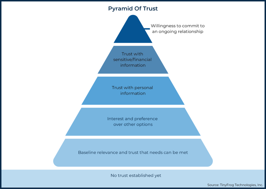
The Nielsen Norman Group (NNG) developed a pyramid of trust to visually represent how a website visitor progresses through these levels of commitment.
According to the pyramid of trust, new visitors to a site often start off with minimal trust in the site or the business. This initial phase, represented by the bottom of the pyramid, is where visitors are looking for relevancy. They're asking: "Am I in the right place?" and "Can they meet my needs?" At this phase, the quality of the design and the relevancy of the services or solutions will help build a baseline of trust.
In the next phase of the pyramid of trust, above the baseline phase, a visitor is asking: "Is this particular firm or advisor better than other options?" and "How does this solution or service compare to others?" Conveying the advisor's experience and clearly presenting all of the services on the site is critical in order to differentiate the site from competitors.
The next level of commitment is reflected in the third phase, when a visitor has enough trust in the firm to provide their personal information via the site or to the advisor directly. This could occur through an email newsletter sign-up form on the site or by contacting the advisor through a website form, email address, or phone call.
The last two phases of the pyramid of trust typically occur offline for a financial advisor where a potential client is now entrusting their financial information and committing to an ongoing relationship. In order to reach these final phases, though, trust needs to be built and not undermined in the previous phases.
So, by focusing on the user experience and building trust and credibility early on in the visitor's experience, advisors can ultimately help clients develop their own willingness to commit to an ongoing relationship with the firm. Which is supported by research showing that customers are willing to pay more and stay loyal to companies when they encounter a positive user experience!
Trust And Credibility = Good User Experience = Real-Life Payoff!
An Advisor's Website Is The Face Of Their Business
The digital world is obviously not new. However, we are in the midst of a digital transformation. Partially accelerated by the COVID-19 pandemic, consumers have quickly adapted to relying on the internet to a much greater extent. In many cases, web visitors perceive a website as the face of a business, and they tend to judge the business by the quality of the design and content of the site. That makes it important for any business owner to have a website that's a good reflection of their business.
When someone is referred to a business, they often go to the company's website before making direct contact. In recent research conducted by AdvisorEngine, 66% of prospects were found to start the search with an advisor by referral, but were receiving 2.6 referrals on average and then looking up each advisor online to select which one to contact.
Some prospects may rely solely on the internet for searching and finding a financial advisor. Google reported a 75% increase in mobile searches for the term "financial advisor" over the course of two years from 2015 to 2017. And not surprisingly, COVID-19 has given rise to more customer interactions that occur digitally for professional and financial services.
When customer interactions occur over video calls, it's not possible for an advisor to review printed marketing materials and brochures with their prospective clients in person. In these cases, the advisor's website serves as the main resource for a potential client to learn more about the team and the services during the sales process.
Since many people do, in fact, often judge a book by its cover, the business' cover (i.e., its website) needs to be reflective of the quality of the services and/or products offered. Through their business' website, advisors have a prime opportunity to educate their visitors or potential clients on the company's values, the benefits offered, and the advisor's expertise.
In order to capitalize on this opportunity, presenting what the business does in a clear, concise, and functional way can plant critical seeds of confidence. When represented by a quality website with an impactful user experience and educational content, advisors can start off on the right foot in building trust with visitors.
Establishing Trust With Visitors Will Impact Conversions
Establishing and maintaining trust with website visitors directly impacts conversion rates. What's considered a conversion? Any desired action that a user takes on a website. For example, when a user reads a blog post or signs up for a newsletter, those are considered positive conversions.
Nearly all websites have a variety of conversion objectives, but if a visitor doesn't feel safe and comfortable on the site, it will be unlikely that they will take the desired action. For a company with a website that doesn't foster trust in its visitors, this could result in the company missing out on an inquiry, an opt-in to sign up for a newsletter, engagement with live chat, or a call to the company directly.
Some common examples of conversion objectives for many financial advisor sites include:
- form submission;
- reading an educational blog post;
- setting an appointment through an online scheduling platform; and
- listening to or subscribing to a podcast.
Conversions can happen in a variety of ways, and when the ultimate objective involves establishing a relationship or making a sale, these conversions can serve to pull visitors further into the process. So, when we talk about trust leading to conversions, it ultimately means it can potentially lead to more clients and more sales!
While there's no easy way to directly track trust and credibility, there are tools that can help track conversions and engagements, which can provide insights into visitor behavior. Setting up Google Analytics can help gauge how comfortable visitors are with taking action on a site.
Trust & Credibility Strategies For An Advisor Site
Visual Trust
Considering a website's visual aesthetics and graphic design elements is a great place to start when assessing whether the site instills trust in its visitors. Visual trust is developed on a subconscious level and is based on what a visitor initially sees on a website. It often depends on the quality of the design and user interface of the site. Accordingly, it is important for websites to make a professional and modern impression of the firm and advisors they represent.
Keeping It Fresh
It's easy to tell when a site hasn't been updated in a while, and an outdated, unkempt look doesn't leave a good impression on potential clients. A site may be perceived as outdated if there are overwhelming navigation options with several web pages and drop-down menus, because modern websites tend to have much more intuitive navigation features with minimal drop-down menu options, if any at all. They're simple and straightforward.
Many years ago, visitors were limited to desktop devices (as there simply weren't options yet for mobile and tablets), and they didn't mind clicking through numerous pages to learn about a product or service. However, websites and visitor behaviors have changed drastically over the years. According to a recent study by digital consultancy firm Perficient, users now visit websites on mobile devices and tablets more than they do on desktops. Therefore, it makes sense to implement website designs that are mobile-friendly and that offer simplistic navigation options.
Website visitors tend to scroll and scan website pages instead of spending time reading through long, dense paragraphs. In fact, when many visitors encounter text-heavy content on a site, they tend to get discouraged and may even leave the site. Accordingly, easily digestible content offered in small segments can generally go much further these days than detailed, lengthy text. Of course, there are some exceptions to this rule. In some areas of a site, such as on a page of blog articles, it can be advantageous to include more text-based content to appeal to the search engines or to users who are interested in more in-depth information.
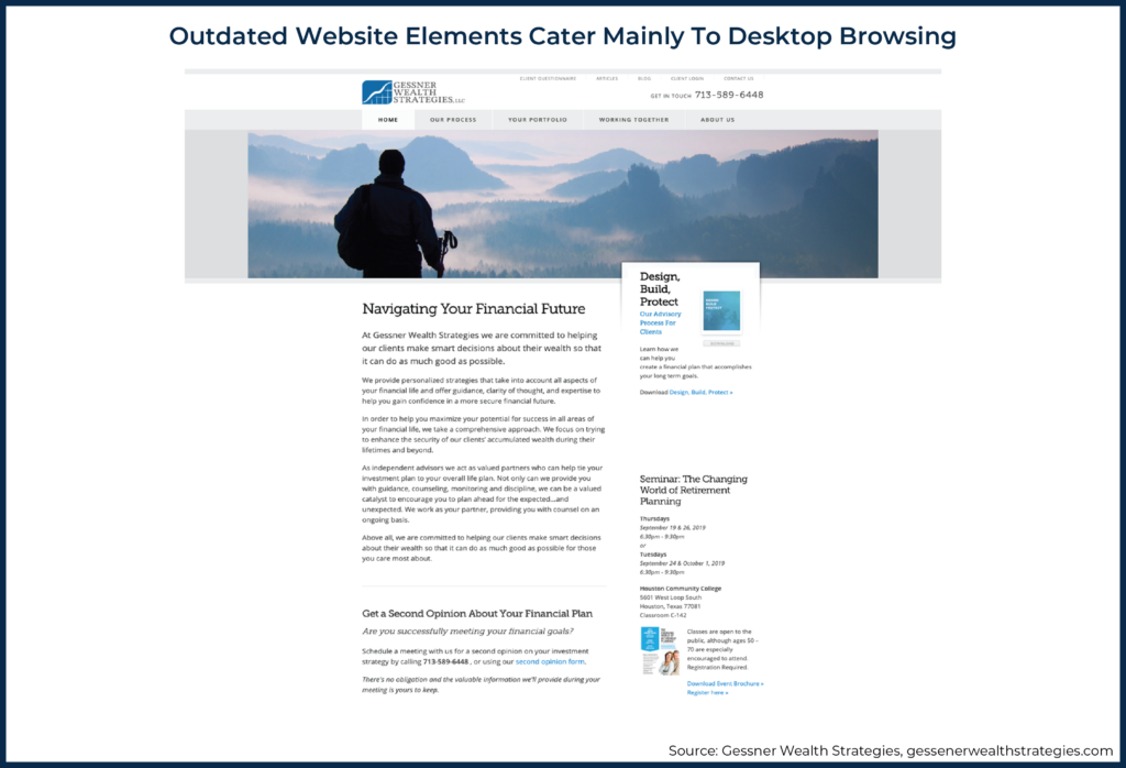
For example, consider how the 'before' image of the Gessner Wealth website home page (pictured below) may make it more challenging for a firm to build visual trust with visitors. The home page has fairly lengthy paragraphs with dense content and additional text in the right sidebar as well. While the website copy is well-written with important details about the team and services, it's difficult to quickly scan and comprehend.
The 'before' image of the Gessner Wealth website also has an older grid layout. Many years ago, websites were built utilizing a smaller grid where the content was placed in the center of the page with large margins on the right and left sides of the page. Sites were often designed this way when desktop devices were the only available devices for visitors.
However, current technology and the methods used to access websites make this older grid-style layout outdated. New, modern sites have an open layout where the images and text expand across the full width of the web page. Websites with the older grid layout are typically perceived as dated, and this in itself can hinder credibility.
The Gessner Wealth home page, pictured above, also has very few images, and the images in the sidebar and lower sections are small and difficult to see. The navigation menu has multiple levels with some page links at the very top of the page, then the phone number on a second line, and then a third line of page options below the logo. This is another indication of an outdated design.
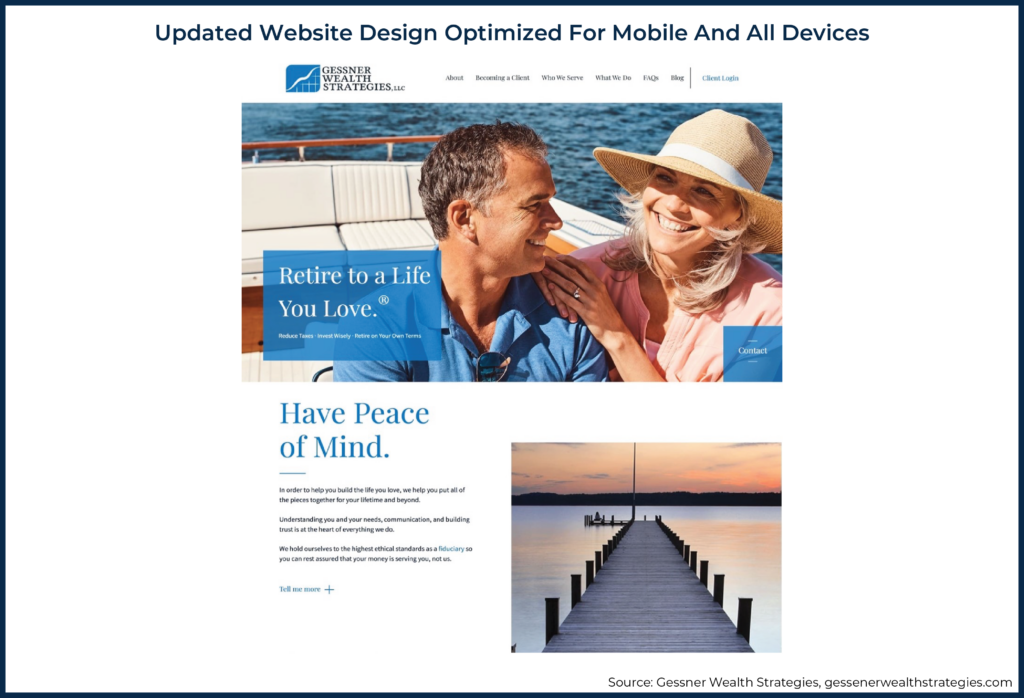
In comparison, the website redesign of Gessner Wealth has a modern layout with content organized into clear sections that are easy to comprehend and scan across a variety of platforms. Each section of the home page also has a high-quality image that supports the messaging in that panel.
With the rise of mobile devices and tablets, modern sites typically have clean, simple navigation menus, which are easier to use on smaller devices. On the new Gessner Wealth website, the navigation menu is simpler with key page options and a simple design, which allows a user to easily find and select key pages.
Understanding Visual Hierarchy
In order to make content easy to scan and comprehend quickly, modern website design uses visual hierarchy and high-level messaging consisting of larger text used to catch visitors' eyes when they view the web page (e.g., headlines, subheadings, calls to action, and bullet points).
Visual hierarchy uses font size, typeface, and other related visual web design elements to convey different levels of importance of site sections. For example, formatting text with headlines, sub-headlines, and paragraphs is one way to indicate the relative importance of different sections.
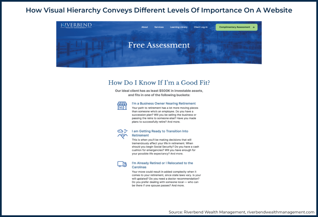
On the Riverbend Wealth Management site, a visual hierarchy is utilized throughout the design, but a good example is the section of the free assessment page, pictured above. The headline text, "How do I know if I'm a good fit?" uses a larger font size and type, and then the subheading is a little bit smaller in font size.
Below these items, the key points are all in a blue font color that distinguishes this content from the paragraph text below it. The style of the font and the use of font size from larger to smaller helps a visitor easily differentiate a headline from a sub-headline and other content.
Headline text typically refers to the largest font at the top of a section, with subheadings in slightly smaller fonts, helping a web visitor to process information quickly and identify key messages and points as they scan through the site. This is why the high-level messaging found in headlines, sub-headlines, and bullet points is so important. It's often the main information that visitors tend to read.

Nerd Note:
A web design mistake that detracts from creating visual trust with potential clients is using low-quality images on the site, such as blurry images or irrelevant stock photos. Most websites do utilize stock images, but it's important to be discerning when choosing the stock images used on the site. Some stock photo models have been over-used where numerous sites, even your competitors, may have the same face as the images on your site. One tip when searching on a stock photo site is to filter images by newest instead of most popular. If possible, a graphic designer can add a filter or overlay to an image to enhance it.
While a high-quality website will still probably utilize some stock imagery, those images should be carefully selected and built into the design in such a way as to enhance the look and feel of the site. It's also very important that the imagery used on the site is compelling and supports the high-level messaging. In other words, when an image is placed on a site, it should tie into and support the personality of the brand and the story that the website is telling about the business.
Social & Industry Trust
Social trust is another extremely important form of trust for web visitors. It is based on the integrity and reliability of a business and its services. One of the most common ways to build social trust is to demonstrate that other customers have utilized your services.
Since it can be a challenge for financial advisors to obtain third-party reviews about the firm's quality and services due to compliance guidelines, advisor sites can convey social trust in other ways.
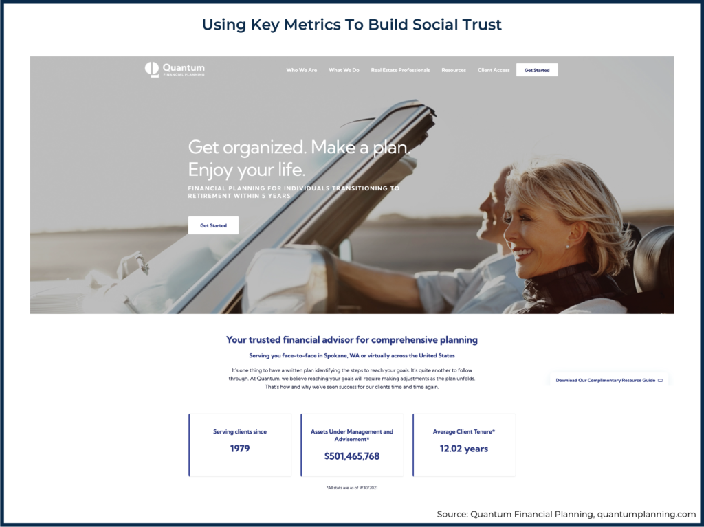
Key Metrics: Metrics are one way a firm can communicate that other clients are happy with their services and are successful when using them. Below are a few great metrics that can instill social trust by conveying the scope of clients with whom the firm works:
- Number of clients served
- Number of assets under management
- Average client tenure
The Quantum Financial Planning home page, below, is a great example of how to display key metrics that can build social trust. The section with three key data points on when the business was established, how many assets are under management, and the average client tenure demonstrates that many customers have relied on your services for many years.
Case Studies: Another strategy is to create in-depth case studies that represent the different clients served by the firm. Case studies can be effective tools to establish social trust, especially when potential clients are able to identify with and relate to a client scenario in the case studies.
There are a few options for how to present a case study. If you are listing a specific client by name and describing their scenario, it's always recommended to get the client's permission. Another option is to create hypothetical case studies where each case study describes a client scenario and is presented under a fictional client name.
Case studies may be considered testimonials for compliance purposes, and this can depend on whether the advisor is registered with the SEC or registered at the state level. Accordingly, it's best to review and get approval from a compliance officer or attorney for any case study content or testimonials prior to publishing the content on the site.
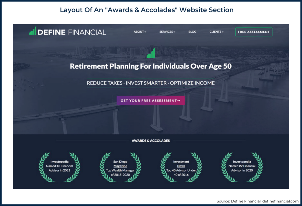
Awards: Industry credibility can also generate social trust and is formed based on a firm's noteworthy accomplishments, such as industry awards and affiliations. For an advisor site, one strategy to demonstrate credibility is to showcase awards with badges in a dedicated panel or section in a prominent area of the site. For example, Define Financial features an "Awards & Accolades" section on their website, as illustrated below.
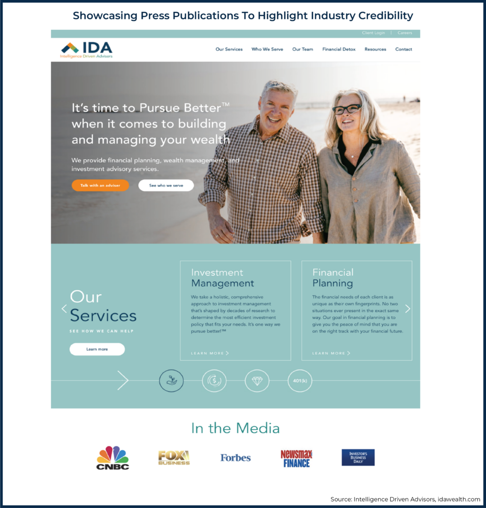
Press: Industry credibility can also be presented by highlighting press publications or mentions that the business has received. This is commonly done with an "As Featured In" or "In The Media" section, such as in the Press Section on IDA Wealth's website, below, that showcases logos from the press publications.
On the IDA Wealth site, this section is located further down the home page. Some sites will place this section as the third or fourth part of the home page above the fold, while other sites will push this section further down the home page and closer to a section about blog posts and resources.
It's worth noting that the article on the press website does not need to be written by your business. Firms can highlight publications where they have been featured or quoted to showcase their expertise in the industry.
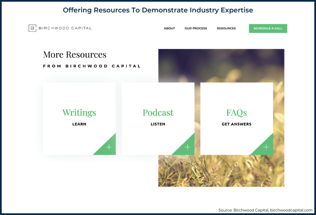
Resources: Lastly, industry expertise can also be demonstrated through resources like podcast episodes, article interviews, and speaking engagements. These elements can be displayed in a regularly updated "Resources" section of the website.
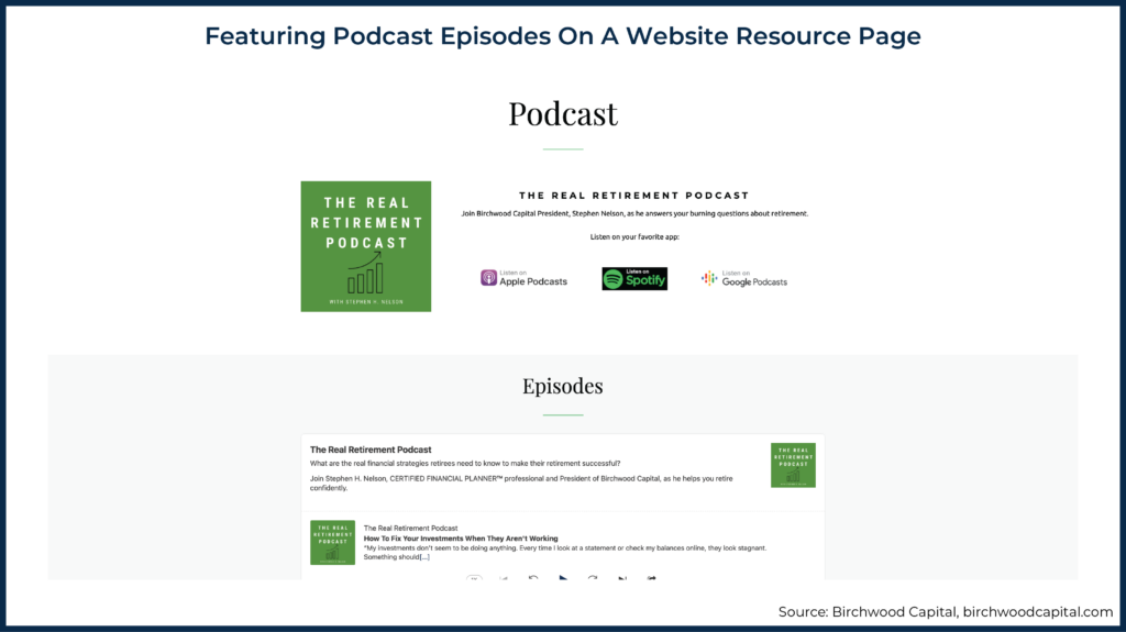
The resource section from the Birchwood Capital website is an example of how to showcase and link to different resources, such as blog posts and podcast episodes. On the Birchwood Capital website, this panel is featured on the home page, after the services information. The panel is also repeated on internal pages with a new headline, "Not Quite Ready? Explore Our Helpful Resources," as a way to engage visitors and build industry credibility throughout the site.
Opportunities To Establish Industry Credibility
If a business has yet to naturally receive any industry recognition or media coverage, advisors can seek out opportunities to earn some, though it may often require the advisors to put themselves out there to get the recognition they deserve!
Here are a few ways to do this:
- Look for press opportunities. For mentions in large publications, sign up for Help a Reporter Out (HARO) – a platform where journalists put out calls for experts to respond to specific questions. Advisors can submit a quote and get the opportunity to be featured in an article. There are also membership organizations, such as Financial Planning Association (FPA), the National Association of Personal Financial Advisors (NAPFA), and XY Planning Network, to name a few, also have active consumer media efforts that pass media leads on to advisors for them to be featured in an article.
- Contribute guest blog articles or quotes. Most large content sites accept guest contributors. The process of submitting articles generally involves pitching a topic, proposing an outline of what would be covered, and, if accepted, undergoing a full editorial review process of the article prior to publication.
- Expand the firm's expertise with certifications or affiliations. Financial certifications, such as the Certified Financial Planner (CFP) mark, tend to be signifiers of expertise. Once certified, firms can add associated logos and highlight advisors' certifications on the website to build trust with visitors. Belonging to industry membership groups, such as FPA or NAPFA, as previously mentioned, can also convey credibility, and an advisor can then highlight the membership logos on the website.
Spending time on these endeavors will not only give advisors more content and press mentions to highlight on the firm's website, but it can also help with Search Engine Optimization (SEO) in terms of building up links back to the firm's site and helping expand the advisor's own reach as a thought leader.
Longevity Trust
Longevity trust is based on how long a firm has been in business and has supported clients. Even if a financial advisor hasn't been in practice for many years, longevity trust can be conveyed in a variety of ways with a strong "About Us" or "Meet The Team" page on the website that highlights the team's experience and expertise.
A few things that can be included on an "About" or "Team" page to establish trust:
- Accreditations and credentials (e.g., CFP, CFA, CPA, MBA, etc.) can be included for all team members listed on the website who hold such designations.
- Experience and specializations in servicing a specific type of client, such as retirees, mid-career transitions, certain professions, or certain demographics.
- Images of the whole team together, or individual headshots of team members. For someone visiting a site who has never met the company's team, seeing photos can help create a personal connection as well as a sense of transparency and trust.
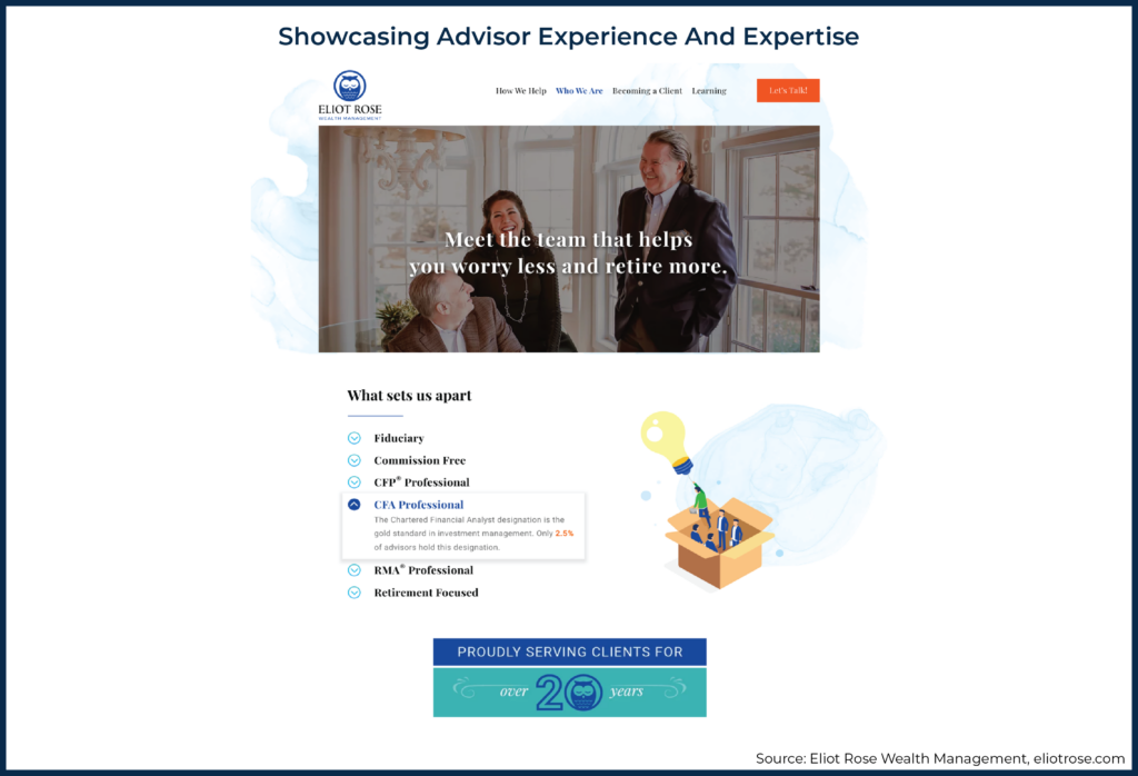
The Eliot Rose Wealth Management website has a great example of this. The "Who We Are" web page has a section called "What Sets Us Apart", where advisors' credentials and experience are highlighted, along with the message that the firm has been serving clients for over 20 years.
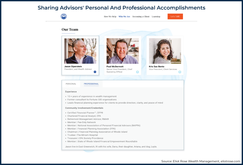
Further down on the "Who We Are" page, there is a section with headshot photos of the team. When a photo is selected, a web visitor can view the individual's biography to see both personal and professional accomplishments.
On some financial advisor websites, the content about the company and team may be split up into an "About" page that describes the full company, and a separate Team page that has headshot photos and individual biographies.
How To Implement Trust-Building Strategies Into An Advisor Site
Prioritize Strategies & Target Key Website Pages
The first step in choosing the best trust strategies that will be most relevant is to identify and understand the firm's ideal clients (or target niche), their specific needs, and the issues that are generally most important to them. This will help firms determine which metrics are most applicable to convey authenticity and credibility.
If a niche or ideal client has yet to be determined, advisors can start by writing down areas of expertise and past accomplishments in the industry, and then considering which ones will convey authenticity and credibility most effectively. To do this, consider viewing competitor advisor websites to see which awards, certifications, or resources are displayed. When speaking to potential clients, listen to what's important to them when they are selecting an advisor. Firms can also interview existing clients about their experience in finding an advisor and what criteria and information they value.
Add A Trust & Credibility Section To The Firm's Home Page
While website elements conveying visual trust can be embedded throughout the advisor's website, adding social, industry, and longevity trust strategies (e.g., awards and affiliations, key metrics, or an "As Featured In" section) to the home page of a website can help to maximize visibility, ensuring that new visitors who visit the site for the first time will see the section.
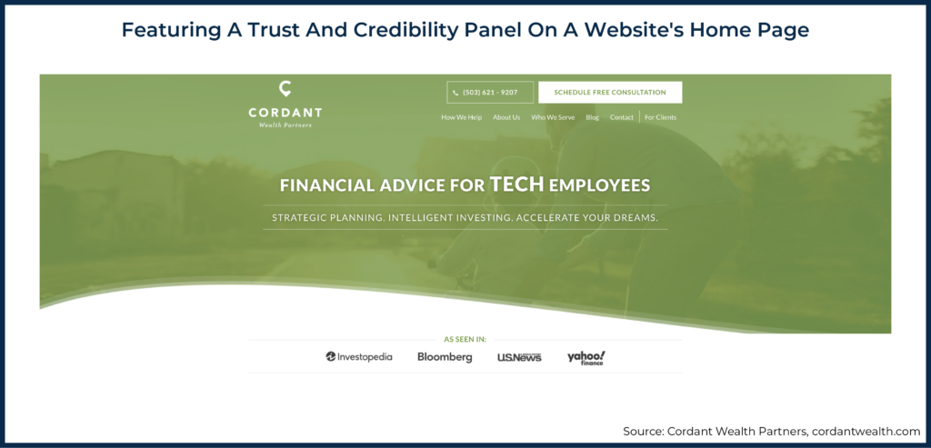
Most people view content at the top of a website page first, so a good place for a "Trust and Credibility" panel would be near the top of the home page, not buried at the bottom where visitors could easily miss it. For example, Cordant Wealth Partners includes an "As Seen In" panel at the bottom of the screen of their home page, easily visible upon opening the page.
Importantly, if this section displays logos or badges, the images should be high-quality with good resolution for clear visibility.
Highlight Expertise On The 'Service' And 'About' Pages
Another way for advisors to drive home credibility and longevity trust is to showcase their expertise for specific clients or a certain niche, in addition to their team's overall experience. One way to do this is to simply duplicate the trust and credibility panel added to the home page, and to also include it on the 'Services' and 'About' pages. The repetition helps visitors retain key information and creates continuity throughout the site.
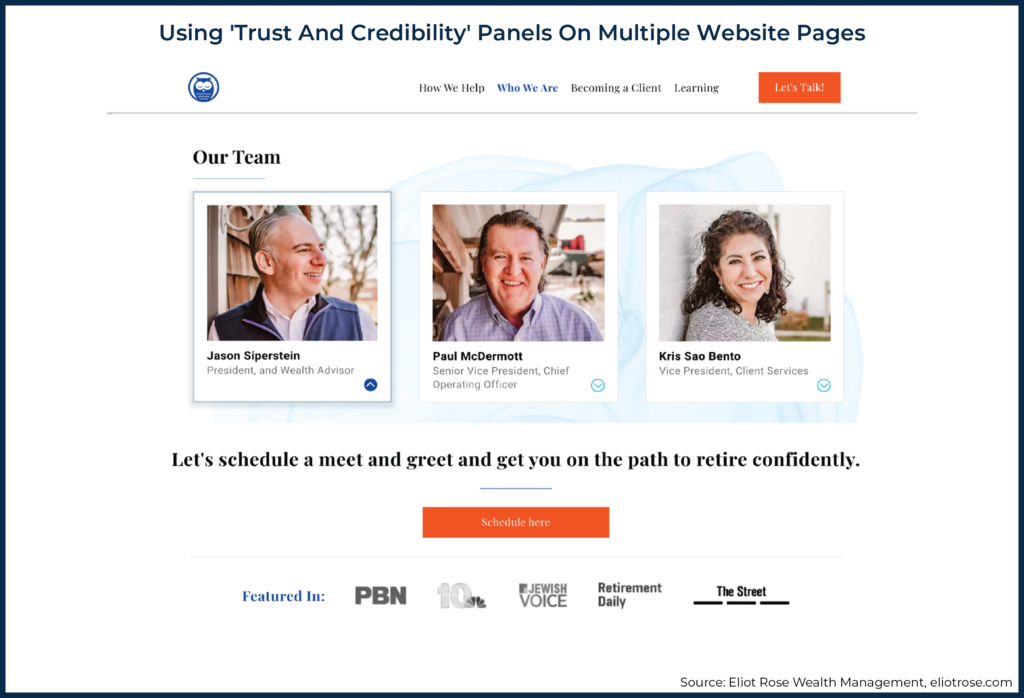
For example, the Eliot Rose Wealth Management site (shown earlier) has a trust and credibility panel at the bottom of the "Who We Are" page where it highlights the firm's press mentions. This section is repeated on the home page.
In addition to displaying a trust and credibility panel, the design and content of these pages can also be used to build visual trust. Service pages should clearly explain the firm's services and describe them in language that customers will understand.
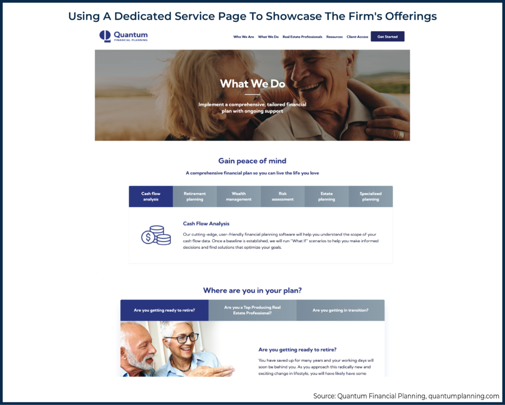
For instance, the Quantum Financial Planning website has a dedicated service page for Financial Planning (pictured below). At the top of the page, there is information about the firm's offerings. Then further down the page, the services are presented in terms of clients' scenarios in life and how the firm can assist with those challenges, such as nearing retirement or going through a major transition.
It's important to note that visitors often go to a firm's "Service" or "About" page after visiting the home page. Because the design of many internal pages is typically not given as much attention as that of the home page, firms may benefit from reviewing these mission-critical internal pages to ensure that they foster visual trust through high-quality imagery, clear messaging, and a nice interface.
Consider Creating Case Study Pages
Case studies can be a great way for advisors to illustrate how their services have helped clients by telling a story about a specific client scenario, and showing how an advisor's services led to solutions and success for the client. Notably, case studies tend to be most effective when the content focuses on the client's scenario, discussing the problems solved and how the outcome was successful, instead of just highlighting the advisor or firm and how great they might be.
When adding case studies to a site, it can be useful to include a navigational element on the site's home page to make it easy for visitors to find the case study.
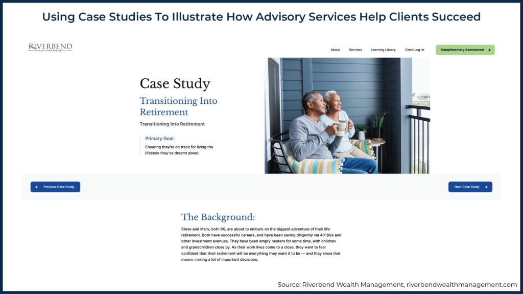
For example, the case study pictured here from Riverbend Wealth Management features a hypothetical case study, but it demonstrates the firm's understanding of a client's typical challenges and financial goals in this life scenario.
In this study, the hypothetical situation illustrates a couple transitioning into retirement and presents the primary goal at the top of the page. Most customers are goal-oriented, so this messaging not only serves to build trust that the advisor has experience with clients in this situation, but also shows potential clients that the firm understands common goals and has the expertise to help their clients achieve those goals.
Create A Resource Section To Build Advisor Credibility
Creating a section of valuable resources can also be a good way to build credibility with potential and existing clients. It positions the advisor as an expert in the industry and keeps people coming back for more information. Blogs and podcasts are two great ways to do this.
Blog: A blog is a tool where advisors can present, organize, prioritize, and archive site content. Using a blogging tool doesn't mean the section of the site needs to be identified as a "blog". Instead, it can be labeled as a page of "Resources" or "News"… or any other desired name.
A blog section should be relevant and should include topics that prospective clients would be interested in. A blog resource section can also be useful for clients if it includes financial terminology and descriptions of processes that are relevant to their financial planning goals. To come up with great content ideas, advisors can simply review some of the common questions that clients bring up in calls and interactions and write articles/resources that address those questions!
Resource sections that feature a wide array of resources should be well-organized and easy to navigate. Blog categories are high-level topics that can be utilized to organize articles into a taxonomy of options, offering visitors a useful tool to help them easily search and find these resources. For instance, a firm may create a category called "college planning" and add any articles about financial savings and planning for college to this category.
Most sites will have at least a couple of blog categories and, at most, up to 8 –10 categories. The main blog page can be set up with a menu where visitors can select a category and see all articles related to that topic. Adding a search bar to the blog section of the website can also help visitors easily search keywords and find articles on a specific topic on your site.
Podcast: For advisors and firms that host a podcast, a resource section is a great place to highlight both past and future episodes. For example, as illustrated below, Birchwood Capital dedicates a section of their site featuring podcast episodes and includes a separate post for each episode with a brief description. An invitation to subscribe to the podcast can also be a useful feature to encourage visitors to engage with the firm.
After creating a resource section, make sure to publish regularly (at least every few months). A resource section where the last item was published two years ago can send the message that the site and business aren't well maintained and that the firm may not be staying on top of the latest industry news and trends.
Use Color & Dynamic Movement To Draw Visitors' Attention
Using design elements to draw visitors' attention can be an impactful strategy for advisors to build trust and credibility messaging through their websites. Remember that visitors tend to scroll and scan, so consider using eye-catching iconography or numbers to highlight data points clearly. A huge selection of icons can be found on Flat Icons, or through a stock image site like Getty or Shutterstock.
Adding movement, such as micro animations or scroll animations, is a modern web design trend and can be a great way to draw visitors' eyes to the trust and credibility sections on a page.
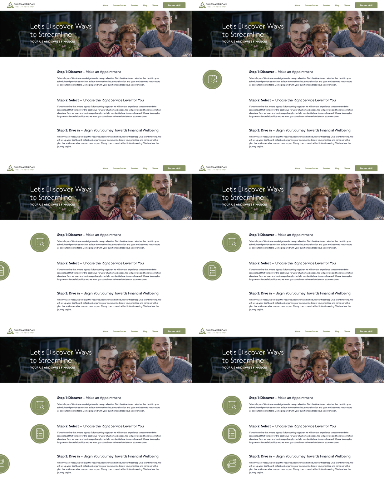
The Swiss American Wealth web page pictured below is an example of how iconography and movement can be used to enhance the messaging on the site. The goal of this page is to explain the firm's 3-step process for all new clients and to encourage a visitor to take the first step by booking a call. As a visitor scrolls, an icon moves in from the left side of the page to the text about that specific step. Each icon matches the messaging. For instance, the last icon shows two map symbols and pairs well with the third step of "begin your journey towards financial wellbeing."
Note: the GIF below is set up on a loop, but this type of scroll animation occurs one time as the visitor scrolls down the website page.
Be careful, though, when adding movement to any part of the site. These tools should be used in moderation so as to avoid distracting visitors with too much motion.
Overall, there are many ways for advisors to build trust and credibility on their websites, ranging from visual trust to social proof. Strategically implementing these elements can help to build confidence not only in an advisor's professional expertise but also in the integrity of their firm.
Building trust layer-by-layer in a firm's website is an important investment in establishing authority and credibility. Ultimately, it's well worth the time and effort needed to implement trust-building strategies, as the more trustworthy the business appears on the website, the more visitors and prospective clients will be likely to trust the business itself!




Leave a Reply