Executive Summary
For many financial advisors, a core part of the retirement planning process involves simulating whether the client's assets will last through retirement. Traditionally, these simulations take the form of either Monte Carlo analyses – showing the percentage of simulated outcomes in which the client finishes with assets remaining – or stress tests that assess plan durability under a handful of adverse scenarios. Yet while these tools offer mathematical metrics, they often fall short in helping clients connect the numbers to their real lives. The reality is that most people struggle to make confident decisions based on abstract reasoning. Although the numbers might work out mathematically, clients still need to do the mental work of translating the numbers on the page into something that feels tangible and real – something they can imagine actually living through.
One way that advisors can help bridge this gap is by using Historical Market Visualization (HiMaV) as a more intuitive alternative for illustrating retirement income strategies. HiMaVs leverage the brain's natural preference for narrative and visual information by showing how a retirement income plan – such as a risk-based or guardrails-based strategy – would have fared during actual historical periods like the Great Depression, Stagflation of the 1970s, or the 2008 Global Financial Crisis. With reliable data from more than a century of market history, advisors can anchor planning scenarios in real events that clients may already be familiar with through lived experience or cultural memory.
What works about HiMaV is that it grounds financial projections in a story-based context. Rather than modeling a generic environment of below-average returns and above-average inflation, advisors can show how the same dynamics played out during a known time period – making the scenario more accessible and relatable. For example, when clients can see how their plan might have fared during a historical market downturn they already recognize, it becomes easier to imagine how they might respond and adapt. That emotional connection supports confidence and increases the likelihood that the client will stick with their plan and stay committed through both good markets and bad.
Retirement planning, then, isn't just about getting the math right to work out between the client's desired spending level and their income and assets available, nor is it about achieving the highest Monte Carlo score. It's about developing a dynamic spending plan (e.g., a guardrails-based strategy that adjusts spending levels if the client's portfolio either exceeds or drops below specified thresholds) that clients can understand, trust, and follow consistently. HiMaVs support this process by showing how those strategies would have played out in real-life historical scenarios, helping clients grasp when and why spending adjustments might have occurred.
Ultimately, the key point is that retirement income planning is not just about statistics – it's about helping clients believe in their plan. HiMaVs give clients a powerful lens through which to view their strategy, transforming abstract probabilities into lived, relatable experiences. And when clients feel grounded in the history of what's come before, they'll be better equipped to navigate the uncertainty of what lies ahead!
Financial advisors routinely face a paradoxical challenge: The mathematical tools most valuable for financial planning are precisely the ones that clients find most difficult to internalize. This disconnect isn't merely a communication problem – it's a cognitive one. The human brain evolved to process information through visual patterns and narrative structures long before it developed a capacity for abstract statistical reasoning.
Historical Market Visualization (HiMaV; pronounced "High-Mav") is a methodology that leverages this evolutionary reality by combining visual data presentation with narrative frameworks built around familiar historical events. Unlike abstract Monte Carlo projections, HiMaV shows how portfolio strategies performed during the Great Depression, the Tech Bubble collapse, or the pandemic market disruption, creating both intellectual understanding and emotional context.
For advisors seeking to move beyond perfunctory client nods to genuine comprehension, HiMaV offers a valuable approach not only to make market dynamics more comprehensible but also to illustrate how particular strategies would have fared historically – providing a better basis for determining whether a given strategy is right for a client in the first place.
What Is Historical Market Visualization?
So, what is Historical Market Visualization (HiMaV)? Historical Market Visualization is a framework that involves backtesting particular retirement income strategies using real-world historical data to assess how a strategy would have performed if it were actually used in past markets. By visualizing the results, HiMaV helps retirees quickly and easily understand key dynamics – such as income volatility and changes in portfolio balance – associated with a given strategy.
While we're giving a name to the methodology here, the approach itself isn't new. Consider this example from a previous Nerd's Eye View post analyzing the historical volatility of Guyton-Klinger guardrails: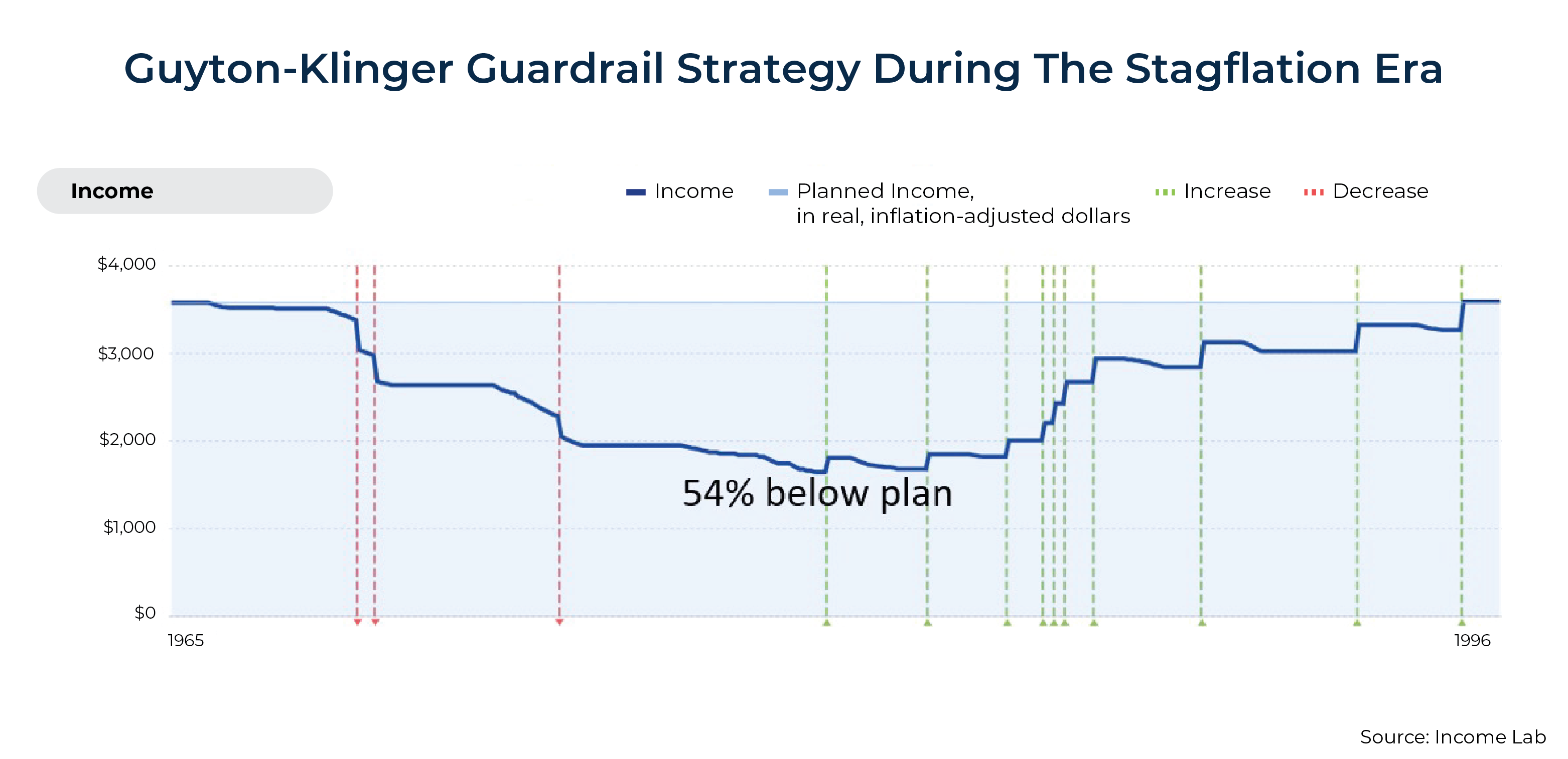
In this case, Guyton-Klinger's guardrails methodology is selected as the retirement income strategy to assess. To do this, we first solve for what a retiree could have spent given their resources at the start of a plan (1965 in the chart above). Next, we simulate the outcome using Guyton-Klinger's guardrails strategy, stepping forward one period at a time based on actual historical data to see what adjustments, if any, the dynamic spending framework would have called for.
As the chart above illustrates, the Stagflation Era would have been particularly rough for someone using a Guyton-Klinger framework – had it existed at the time. Inflation-adjusted spending would have dropped as much as 54% below the initial level, only recovering back to the initial spending level right before the end of the plan. This use of an actual strategy in a historical context is where the "Historical" in HiMaV comes from. The "Visualization" comes from presenting this historical spending experience in a way that's quickly and easily processed and interpreted by human brains (e.g., "Wow, that's a huge drop in spending – this strategy is not right for me!").
Notably, HiMaV is entirely agnostic to the particular methodology used to develop a retirement income strategy. A strategy could have spending adjustments triggered based on withdrawal rates, general risk levels, pre-set thresholds, market triggers, or any other method someone prefers, so long as we have historical data that allows us to observe if/when spending adjustments would have been triggered.

Nerd Note:
Agnosticism doesn't just apply to retirement income strategies – it can also extend to the analytical methodologies of a strategy itself. Consider risk-based guardrails; unlike withdrawal-rate driven guardrails methodologies like Guyton-Klinger, risk-based guardrails look at whether a retiree's risk levels have risen or fallen enough to justify a spending adjustment. This assessment accounts for all portfolio assets and other income sources, such as pensions, Social Security, etc.
There are numerous methodologies to assess risk in a risk-based guardrails framework, such as historical simulation, Monte Carlo simulation, and regime-based Monte Carlo simulation, among others. This might sound confusing – particularly for historical simulation. How do we use historical simulation to test a plan with guardrails set by historical simulation?
The simple answer is that we would act as if we were that person using historical simulation at that point in time. For instance, if we're simulating a historical period beginning in 1965 with data going back to 1871, and we want to start spending at a historical level that had a 90% chance of success, then we'd use data from 1871 to 1964 to find the spending level that matched the desired spending level at the time. Then, as the simulation moves forward to 1966, we would repeat the process, this time allowing the use of data from 1871 to 1965.
Relatedly, HiMaVs are most valuable when someone actually has a plan for dynamic spending adjustments to begin with. For instance, an advisor who just plugs numbers into a Monte Carlo simulation tool, reports a probability of success level back to a client, and then gives a thumbs up/down to spend based on the probability of success level isn't actually operating from a 'plan' that would tell a client if/when adjustments would be made.
This doesn't mean that an HiMaV couldn't still be produced for a client, but if the assumption is that someone will truly charge forward blindly regardless of what happens in the market (as a traditional Monte Carlo simulation assumes), then spending patterns in an HiMaV are just going to look like flat lines until the point, if any, where a portfolio is fully depleted, and someone's income drops to whatever ongoing income sources remain.
Why Is Historical Market Visualization Effective?
The Power Of Visualization
Historical Market Visualization (HiMaV) leverages the brain's remarkable capacity for visual processing—a system that evolved to rapidly identify patterns, detect anomalies, and make quick assessments crucial for survival. Psychological research consistently demonstrates that visual processing is extremely fast, activating the visual cortex to enable near-instantaneous recognition of trends, comparisons, and outliers. One study found that images could be comprehended from as little as 13 milliseconds of exposure.
This evolutionary adaptation may help explain why clients can quickly grasp the severity of a 54% spending reduction (see Guyton-Klinger above) when viewing a downward-sloping trend in a HiMaV chart, while the same information presented as numerical or verbal data might fail to trigger an equivalent emotional response.
Studies in cognitive psychology further reveal that visualization bypasses the analytical bottlenecks of working memory, potentially allowing clients to simultaneously process multiple dimensions of a retirement strategy's performance – including the identification of not just the magnitude of spending decreases during market downturns, but also their duration, recovery patterns, and relationships to portfolio balance changes (if such data are included). This instant pattern recognition enables clients to quickly assess whether a strategy would have produced acceptable outcomes (e.g., consistent income) or unacceptable results (e.g., dramatic cuts) when tested against historical market conditions that resonate with their personal risk tolerance.
For the purposes of applying HiMaVs to retirement income planning, specifically, first consider what's likely the modal plan result presentation in the advisory market today – a simple probability of success result from a Monte Carlo simulation. Let's say an advisor tells their client that they have a probability of success of 95%. Okay, great… but what does that actually mean?
Other than maybe a vague feeling of, "95% is pretty high – that's probably a good thing, right?" Most people will have no idea at all what this means for their actual retirement spending path. Moreover, unless a client has fully annuitized their wealth or has a strong preference to never adjust spending, a simple probability of success metric simply cannot convey (a) if any adjustment is likely, (b) when adjustments might be needed, and (c) how much spending would need to change.
While some, myself included, have argued that probability of adjustment would be a better reframing of probability of success (e.g., discussing an outcome with a 5% probability of adjustment instead of a 95% probability of success), I've also written about the ease of misinterpreting this reframing, too. For instance, while it's true that a plan with a 95% probability of success rate would be consistent with 5% of plans historically needed to make an adjustment to avoid depleting the portfolio, that's not the same as whether a retiree would have made an adjustment if they were proactively planning and adjusting as needed.
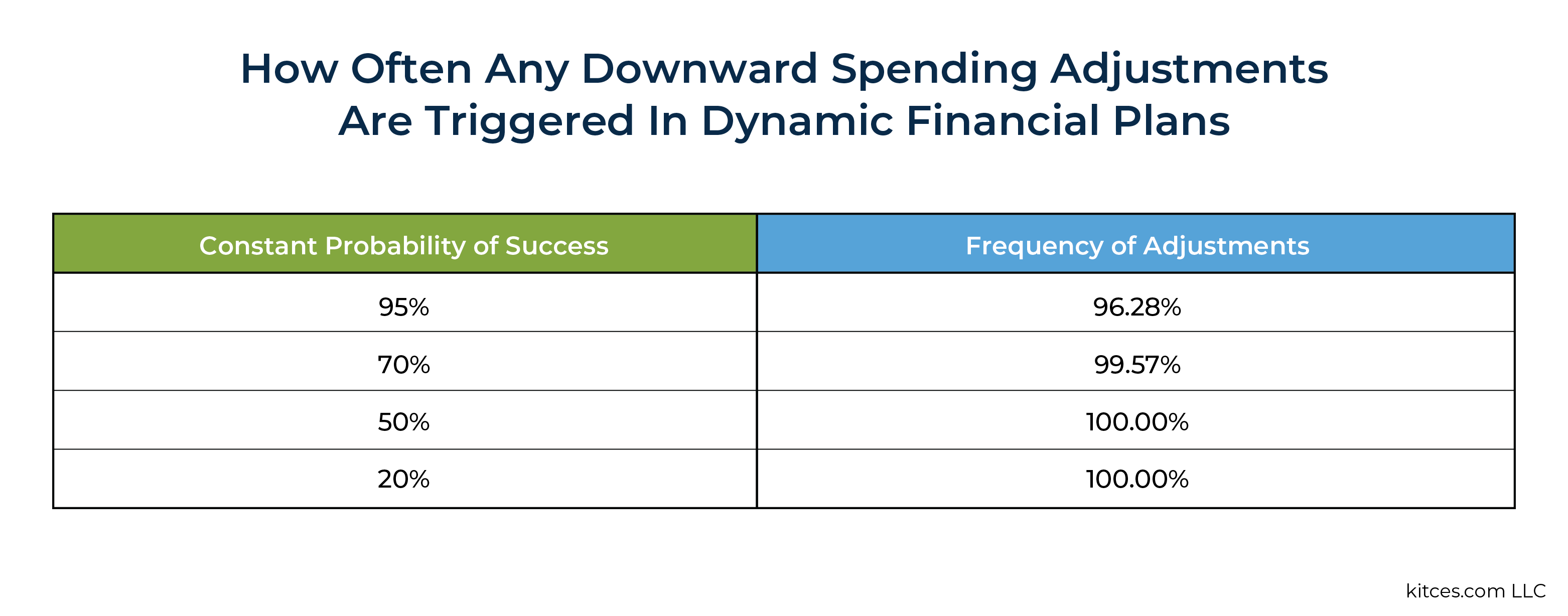
Perhaps counterintuitively, I've previously reported that when planning to a constant 95% probability of success, downward adjustments would have been called for in over 96% of scenarios! Furthermore, in 15% of cases, those adjustments would have been significant – with large downward adjustments of at least 35% below the initial spending level.
Details aside, the key point here is that none of this is intuitive – likely contradicting the general warm and fuzzy feelings someone might have from a 95% probability of success result. The degree or frequency of adjustments is not made at all clear by simply telling someone their probability of success for a plan was 95%.
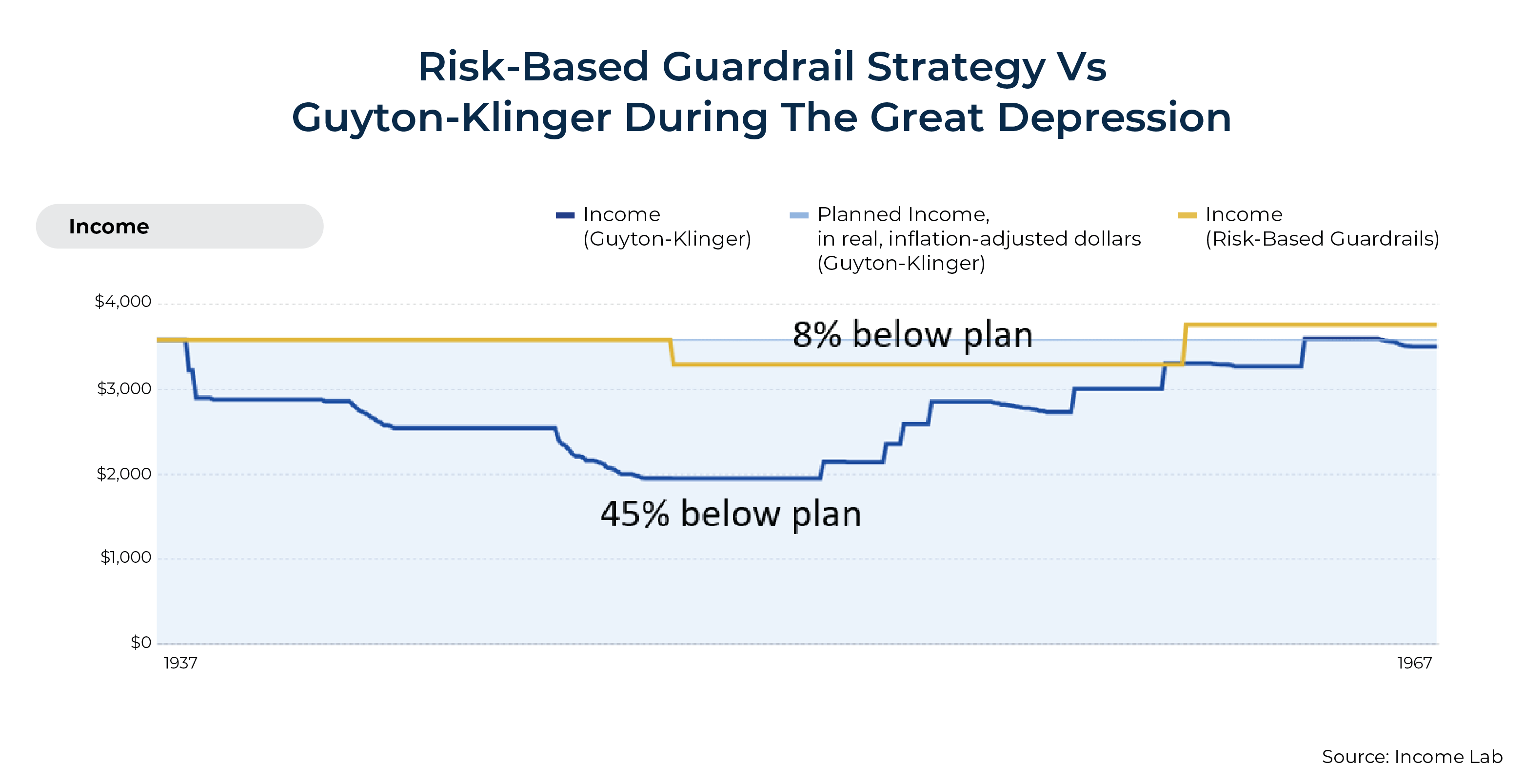
By contrast, HiMaVs make it much easier to understand the potential magnitude of downward spending adjustments. Additionally, they make it easy to compare strategies against one another. Consider the following example, which compares risk-based guardrails to Guyton-Klinger guardrails during the Great Depression:
Even before we understand what the gold and blue lines represent, we can almost instantaneously process that the blue line dips much lower than the gold line. Upon checking the key, we see that the gold line reflects a risk-based guardrails strategy, and the blue line represents Guyton-Klinger guardrails for an otherwise identical case study and starting portfolio spending amount.
In short, HiMaVs transform abstract financial concepts into immediately comprehensible visual patterns that clients can process intuitively. This lets them quickly grasp the magnitude, frequency, and duration of potential spending adjustments across different strategies in a way that probability figures alone cannot convey.
Narrative Frameworks
While visualization is an incredibly important aspect of HiMaVs, its historical context provides an equally powerful advantage – its narrative framework transforms numerical data into meaningful stories that clients can connect to their own experiences and cultural memories. HiMaVs harness the psychological power of narrative to enhance client understanding and decision-making in several ways:
- HiMaVs tie abstract concepts to tangible historical events.
- HiMaVs transform data into stories.
- HiMaVs connect to lived experiences and cultural knowledge.
- HiMaVs make sense of complex interrelationships.
Tying Abstract Concepts To Tangible Events
Abstract financial concepts like sequence risk become immediately tangible when visualized through specific historical periods like the Great Recession – transforming theoretical concerns into visible patterns of portfolio depletion and spending cuts that clients can literally see unfolding.
When an advisor says, "Your strategy would have maintained 95% of your initial spending power through the Great Recession," clients immediately grasp the implications in a way that "Your strategy has a 92% probability of success" fails to convey. This is because historical references activate existing knowledge rather than requiring complex probability assessment. These historical reference points create powerful cognitive anchors that improve retention – clients may forget specific Monte Carlo success probabilities within days, but they'll remember for years that their strategy would have weathered the Great Recession with only minor spending adjustments.
Transforming Data Into Stories
Historical narratives also naturally bring cause-and-effect relationships to life. Instead of simply showing that spending decreased during the 1970s Stagflation period, HiMaVs illustrate why it decreased (inflation eroding purchasing power). This level of understanding is something that probability of success results alone cannot provide. Monte Carlo simulations, by contrast, generally reduce all planning insights – including how a strategy unfolds over time – into a single probability of success – obscuring the sequence of adjustments that would otherwise be visible in a real-world scenario.
Research consistently supports this by demonstrating that narrative formats activate emotional processing centers in the brain that abstract statistics may not be able to reach. This creates both intellectual and emotional preparation for potential market challenges that purely quantitative approaches leave unaddressed. Cognitive psychology research shows information presented in narrative form is retained much better than non-narrative forms of information (e.g., data), meaning clients may be more likely to remember and act upon insights gained through historical visualizations during critical market events.
Well-constructed historical visualizations create a form of psychological "transportation" where clients mentally project themselves into the historical scenario – dramatically increasing engagement, comprehension, and the likelihood of informed decision-making during actual market volatility.
Connecting To Personal Experiences And Cultural Memory
For clients who lived through specific market periods, HiMaVs create powerful connections to autobiographical memory, transforming abstract financial concepts into extensions of personal experience ("I remember how worried everyone was during the 2008 crash, and now I see how my current strategy would have performed").
There's a profound psychological difference between an abstract future probability and a concrete historical outcome – clients find reassurance in "This strategy has already survived the worst markets of the past century" in a way that "This strategy has a 95% chance of success" cannot match.
Major market events like the Great Depression, Stagflation, or the Tech Bubble also function as shared cultural reference points that create a common understanding between advisors and clients of different ages, backgrounds, and financial sophistication – establishing a universal language of sorts for discussing complex concepts. When comparing two strategies, abstract probability differences (e.g., "Strategy A has 92% probability of success vs. Strategy B's 89%") provide little intuitive guidance, while historical retirement income differences ("Strategy A would have required a 5% spending cut during the Great Recession while Strategy B required a 20% cut") create immediate, actionable understanding.
Younger clients also benefit from narrative frameworks about historical periods they didn't personally experience, effectively allowing them to 'borrow' the emotional and intellectual lessons of previous market cycles through visualization rather than having to learn them through painful direct experience.
Processing potential market challenges through the lens of already-resolved historical events can reduce anxiety, as clients can see not just the worst points of market stress but also the eventual recovery, creating psychological preparation for market cycles that abstract probabilities cannot provide. Historical visualizations that span multiple market cycles naturally counteract recency bias by placing current market conditions in a broader historical context—preventing the psychological trap of extrapolating recent market behavior that some Monte Carlo approaches may inadvertently reinforce.
Making Sense Of Complex Interrelationships
Historical narratives also highlight the complex interplay of multiple economic factors. For instance, a single visualization of the 1970s Stagflation period simultaneously demonstrates the impact of high inflation, rising interest rates, and poor equity returns on a retirement strategy without requiring a separate explanation of each component. The term "Stagflation" immediately evokes a cluster of interrelated economic conditions that would require dozens of parameters to model in a Monte Carlo simulation, therefore creating cognitive efficiency by packaging complex relationships into recognizable historical patterns.
Imagine trying to present a particular illustrative Monte Carlo iteration to a client:
Mr. and Mrs. Client, you can see here that, for this particular random draw of market outcomes, inflation was high, but so were equity returns.
Confused by what this scenario is actually supposed to reflect? I think most of us would be. It's just not how our brains work. Even our best attempt to make sense of it will probably rely on some historical context (e.g., this particular iteration is more of a mix of Stagflation with a bit of the post-Great Recession bull market).
Historical visualizations, on the other hand, maintain the essential complexity of market environments while remaining cognitively manageable. They avoid both the oversimplification of single-metric summaries and the cognitive overload of multi-dimensional Monte Carlo outputs. HiMaVs facilitate sophisticated 'what-if' thinking by allowing clients to see how different strategies would have performed during the same historical period, creating comparative insights that are difficult to derive from traditional Monte Carlo approaches that lack common reference points across simulations.
Historical Market Visualizations in Practice
As Historical Market Visualization (HiMaV) tools continue to develop, they will likely evolve toward specialization, with tailored implementations designed for specific retirement income methodologies rather than one-size-fits-all approaches. Advisors who favor particular withdrawal strategies – whether Guyton-Klinger guardrails, endowment model adaptations, RMD-based formulas, risk-based guardrails, etc. – will benefit from visualization tools specifically calibrated to illustrate how these methodologies would have performed during relevant historical periods.
This specialization will likely be driven by practical need (e.g., it would be cumbersome to build out software that could accommodate any and every strategy someone might use) and philosophical alignment with a given approach (e.g., advisors who favor risk-based guardrails over Guyton-Klinger guardrails will have little need for a tool that illustrates Guyton-Klinger guardrails).
Risk-based guardrails (RBGs) are arguably particularly well-suited for adaptation among advisors thanks to their ability to customize risk settings. For instance, unlike Guyton-Klinger guardrails, which essentially provide one set of risk settings (at least without further modification), RBGs are completely customizable based on an individual's preferences. However, because RBGs can account for Social Security and other income sources to assess total risk, this also means that a set of guardrails parameters that looks conservative to one retiree (i.e., low risk of downward spending adjustment) may not look as conservative to another. For instance, one retiree may feel that a potential 10% spending cut is trivial, whereas another retiree may feel that 10% is way more than they could possibly cut back. For this reason, HiMaVs help further provide clarity when selecting a particular set of guardrails for a client.
Before diving into an example, let's first briefly review how risk-based guardrails work. In its simplest form, a risk-based guardrails strategy sets an initial spending level based on a target probability of success, and then pre-defines the probability of success levels where one would increase or decrease their spending.
While the following parameters aren't ones I would personally recommend (we'll get to some of those in a moment), they resemble how many advisors might already be informally using risk-based guardrails with clients:
- Target an initial income where the probability of success = 90%
- If the probability of success rises to 99%, then recommend increasing spending (perhaps back to a target of 90%)
- If the probability of success falls to 70%, then recommend decreasing spending (perhaps back to a target of 90%)
To actually create working 'guardrails', two additional steps are required:
- Solve for the portfolio values that would correspond to 99% and 70% probability of success levels as of today (so that someone can understand where the upper and lower portfolio values would be); and
- Solve for the new spending levels at the guardrails that would bring the probability of success back to the target of 90%.
As noted above, I would not personally recommend these guardrail levels. The primary reason is that 70% as a lower guardrail is generally too high and is going to trigger too many false positive cuts in spending. This is one of several problems with Guyton-Klinger guardrails, as the large cuts made ended up being overreactions that actually weren't needed in many cases.
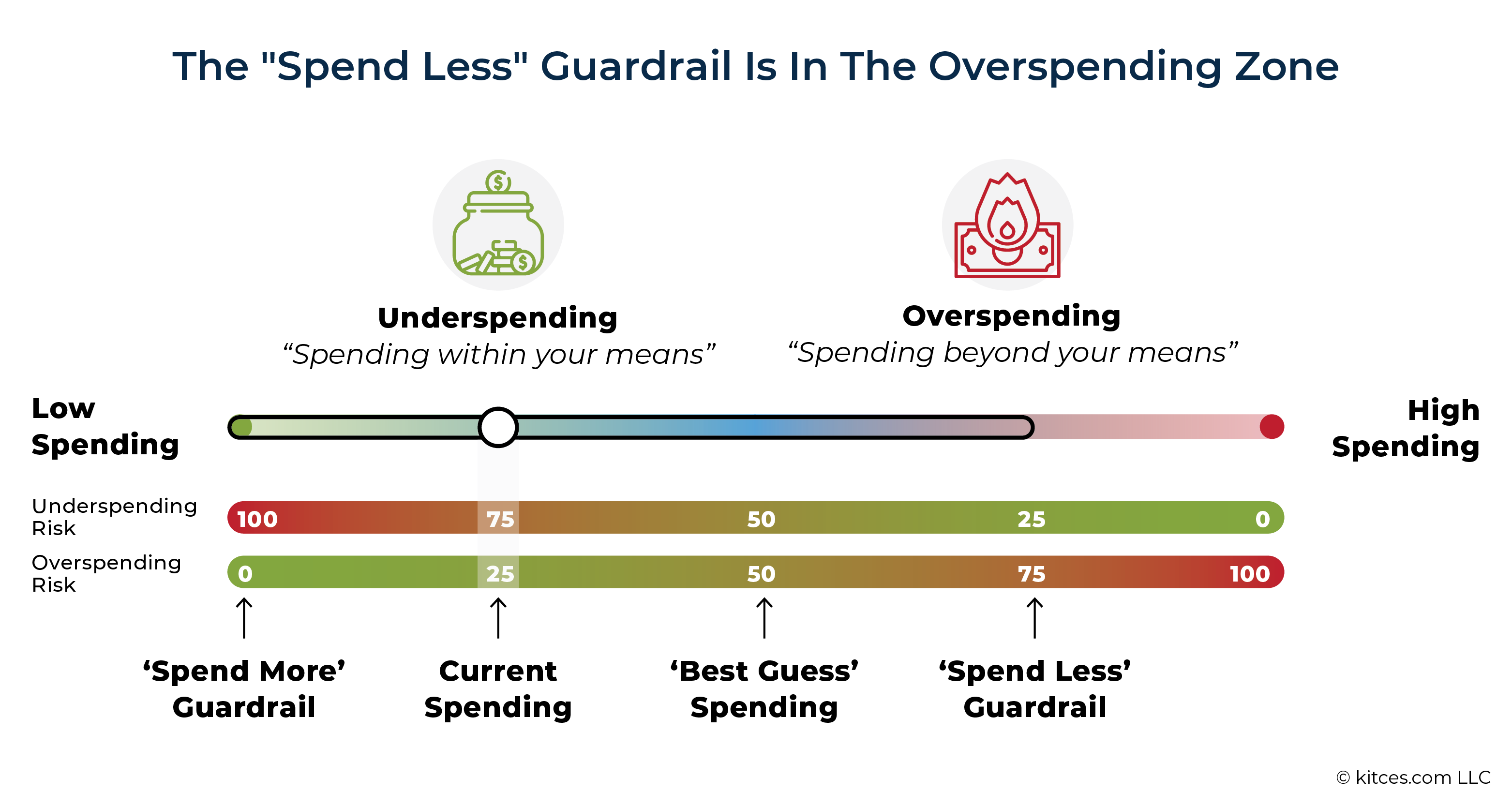
When probability of success levels are being used as ongoing tools for managing risk in a retirement income plan (rather than a set-it-and-forget-it one-time plan), the reality is that even advisors tend to conceptually struggle to understand what these risk levels represent. As Justin Fitzpatrick has noted, a 50% probability of success level is more akin to our 'best guess' for what will happen (this past article explains why a 50% probability of success is not as risky as most people think for an ongoing plan), whereas a 25% probability of success can be thought of as more of a moderate risk of overspending a plan's resources.
For discussion purposes, let's consider the default guardrails built into Income Lab.
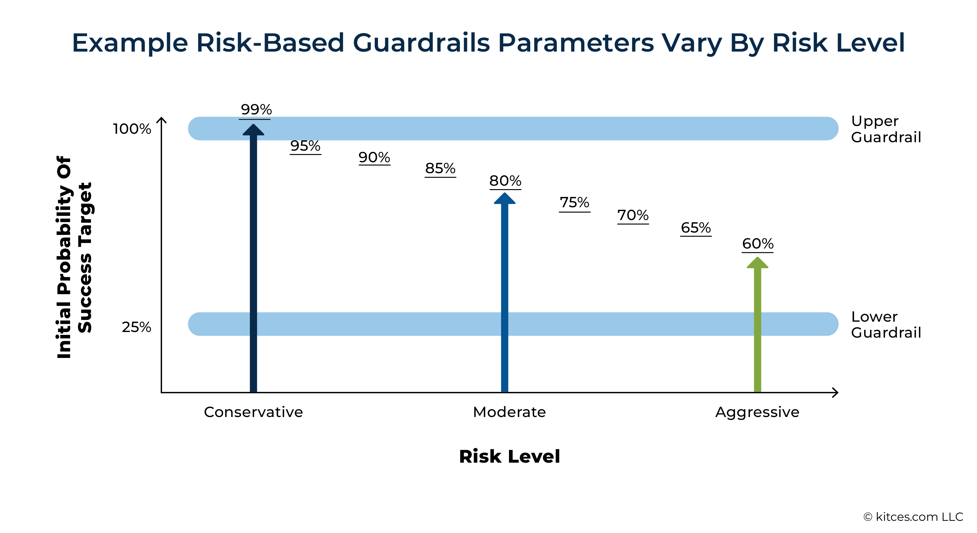
As shown in the chart below, the initial probability of success changes across different risk levels, while the upper and lower guardrails remain fixed. The gap between the initial target and the lower guardrail reflects how much buffer exists before a spending cut might be triggered. A very conservative strategy begins with a probability of success of 99% (shown on the left). Spending is increased if that rises to 100% and decreases if it falls to 25%. At the other end of the spectrum (on the right side of the graphic), a very aggressive strategy starts with a 60% probability of success target with the same upper and lower spending guardrails of 100% and 25%, respectively.
As this chart illustrates, it is actually the initial target spending level (whether it’s identified as "Conservative", "Moderate", or "Aggressive") that has the greatest impact on the risk of needing to adjust spending downward at some point in the future. The higher the initial probability of success, the lower the initial spending level and the lower the risk of ever needing to reduce that spending.
One question that may arise, however, is why the upper and lower guardrails are static? While this certainly wouldn't need to be the case – as one could come up with upper and lower guardrails that vary – it's helpful to recall Justin Fitzpatrick's reframing of risk discussed above. If a 50% probability of success is effectively our 'best guess' of what could happen, this doesn't change based on the initial target probability of success. A lower guardrail just reflects a general level where we are confident enough that a retiree may be overspending, while the upper guardrail reflects a general level where we are confident enough that a retiree is underspending.


It is also worth noting that in the Aggressive scenario illustrated in the chart above, an initial target of 60% probability of success is still slightly lower risk than our "best guess" of 50% probability of success would be.


Nerd Note:
Risk-based guardrails do have additional parameters that can be fine-tuned and adjusted. For instance, someone might want to adjust the 'speed' at which an adjustment occurs, such as hitting a guardrail and only moving some fraction of the way back to the target rather than jumping all of the way back at once. This slower adjustment speed can help smooth out volatility in a plan and help reduce overreactions.
Additionally, advisors could add parameters such as floors and ceilings to client spending. For example, a spending floor could help to maintain an essential level of spending, while a spending ceiling might place a percentage- or dollar-based limit on how much someone would spend on consumption for themselves.
For the purposes of this discussion, we're keeping things simple by not applying a floor or ceiling. However, we are implementing a 'speed' of adjustment limit on downward adjustments, meaning that if a lower guardrail is hit, spending will only increase 10 percentage points back toward the target spending level – rather than adjusting all the way at once. No speed adjustment is applied on upper guardrails.
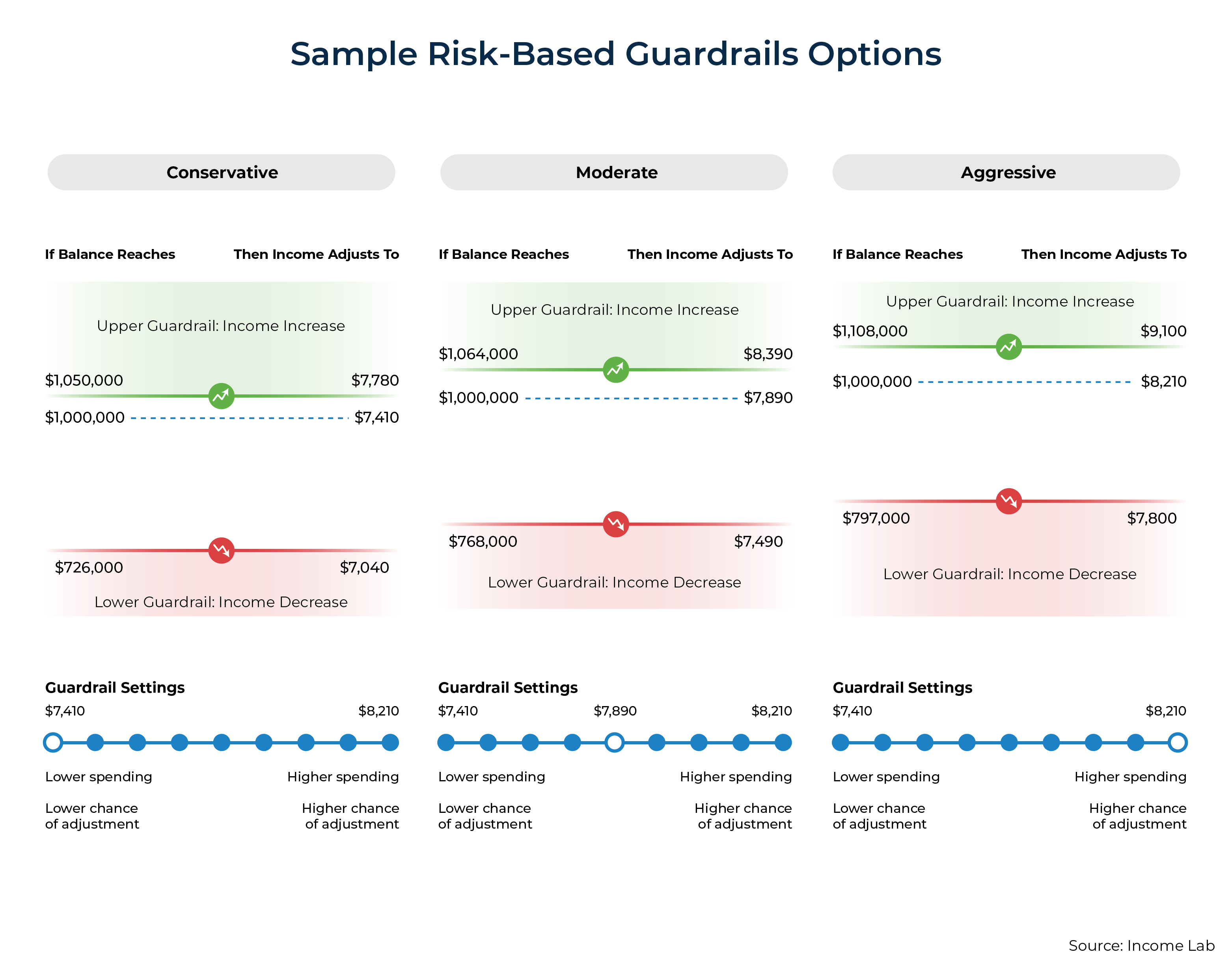
With the background on risk-based guardrails covered, let's consider the following example: John is 65 years old, currently retired, and living in California. He has $1 million in a traditional IRA, uses a 60/40 portfolio allocation, and receives $4k of monthly Social Security income. He's open to exploring a range of guardrail strategies, from more aggressive to more conservative approaches.
In a meeting with John, his advisor presents income projections and guardrails spending limits in Conservative, Moderate, and Aggressive scenarios. John sees that both the guardrails thresholds themselves and the potential amount he could initially spend vary in each of these strategies, ranging from $7,410 (Conservative) to $7,890 (Moderate) to $8,210 (Aggressive).
However, what do these numbers actually mean for John? Despite all the short-term benefits associated with RBGs – such as the ability for John to sleep better at night knowing where his lower guardrail is and how much he would need to cut if he hit it – he still faces a key question: How is he supposed to actually choose the right strategy? Which one best fits his actual long-term preferences? Just seeing the initial spending values doesn't tell him enough – the numbers alone are too abstract and don't actually paint a long-term picture of how his spending might vary under each of these strategies.
The answer here lies in Historical Market Visualizations.
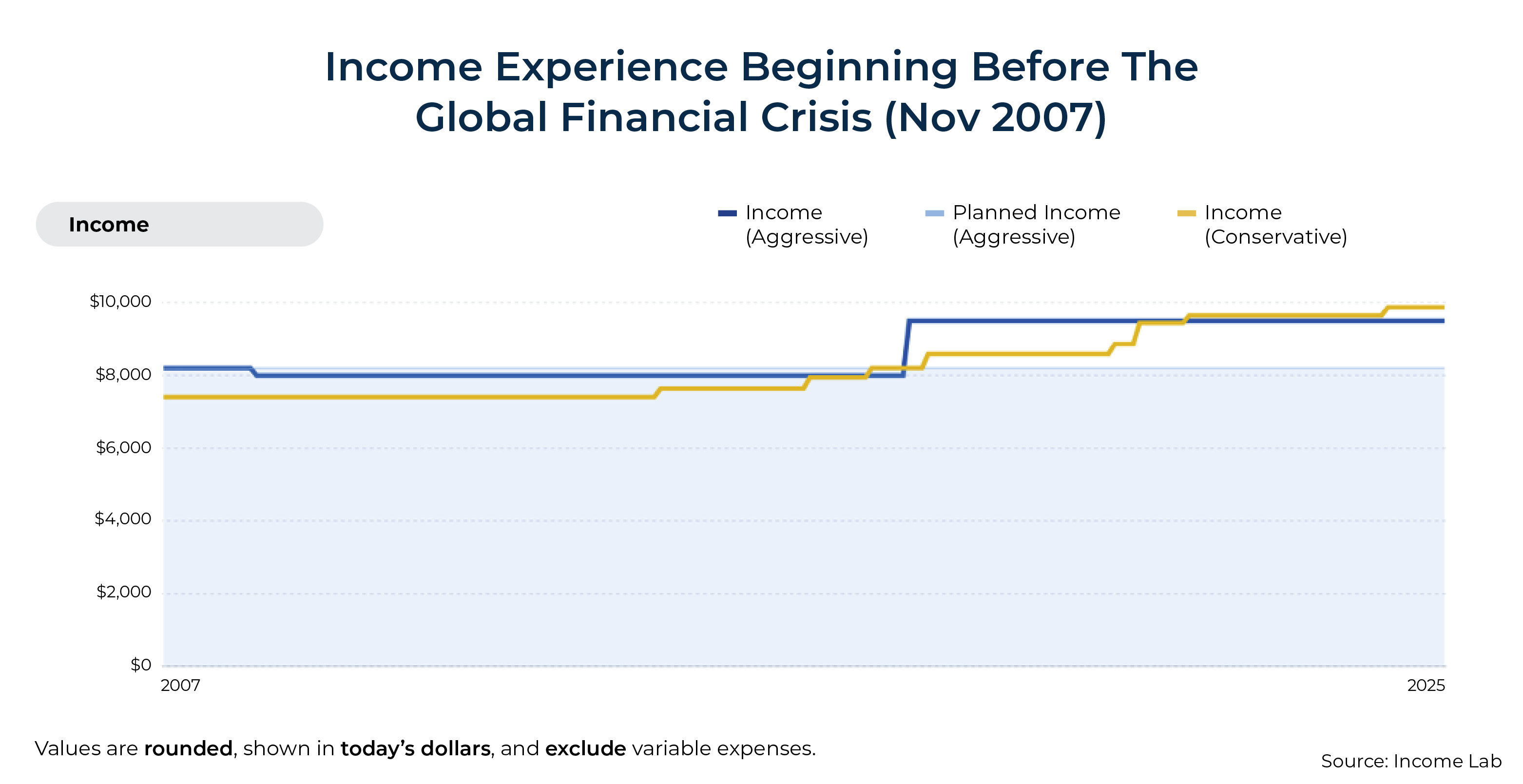
In addition to looking at scenarios individually, John's advisor can use HiMaVs that overlay multiple strategies on top of one another. Here we'll consider his Conservative and Aggressive options if John retired right before the Global Financial Crisis (November of 2007):


Nerd Note:
The moderate parameters discussed in the scenarios above are excluded from the charts below, to keep the charts easier to read and because there often weren't tremendous differences to begin with. In most cases, the moderate scenario would fall somewhere between the Conservative and Aggressive scenarios.
Looking at the chart, we can see that there were only slight differences in John's spending outcomes between the aggressive (blue) and conservative (gold) strategies. Of course, the more aggressive spending strategy started out with higher spending, but it called for a cut going through the Great Recession.
By contrast, the initial risk was so low with the more conservative strategy that John would have never hit his lower guardrail and wouldn't have needed to cut back his spending. Interestingly, despite starting at a lower spending level, the more conservative strategy eventually catches up in spending and surpasses the more aggressive guardrails strategy for a short period in the middle of the plan and then again in John's later years. However, this scenario doesn't illustrate a full retirement period since we started the projection in 2007.
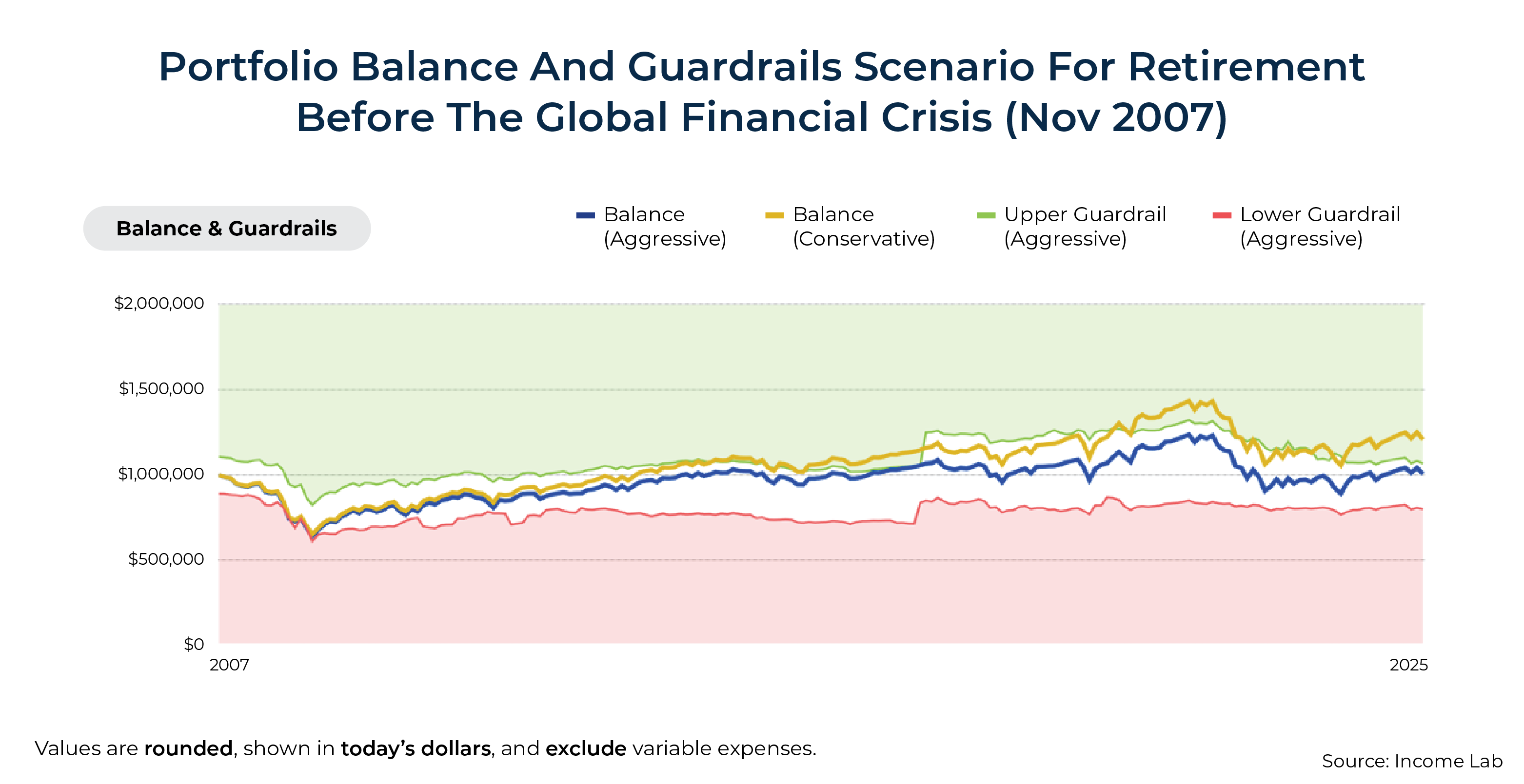
In addition to looking at how income changes over time, we can also assess how John's portfolio balances would have evolved. While the chart above reflects income in real (inflation-adjusted) terms, the chart below reports portfolio values in nominal (non-inflation-adjusted) terms.
While this particular chart doesn't show us the guardrails for both strategies simultaneously, it does show the guardrails for the aggressive strategy (green and red). More importantly, it highlights how the ongoing preference for current income over legacy preservation with the aggressive guardrails parameters leads to a greater spend-down of the portfolio. In other words, whereas a conservative strategy will give greater preference to spending less and preserving a greater portfolio balance at a given point in time, an aggressive strategy will give greater preference to spending more and not preserving as much of a portfolio value.
At the end of this particular period, the aggressive strategy roughly maintains John's initial starting balance of $1 million (blue), whereas the conservative strategy has actually appreciated to roughly $1.2 million (gold).
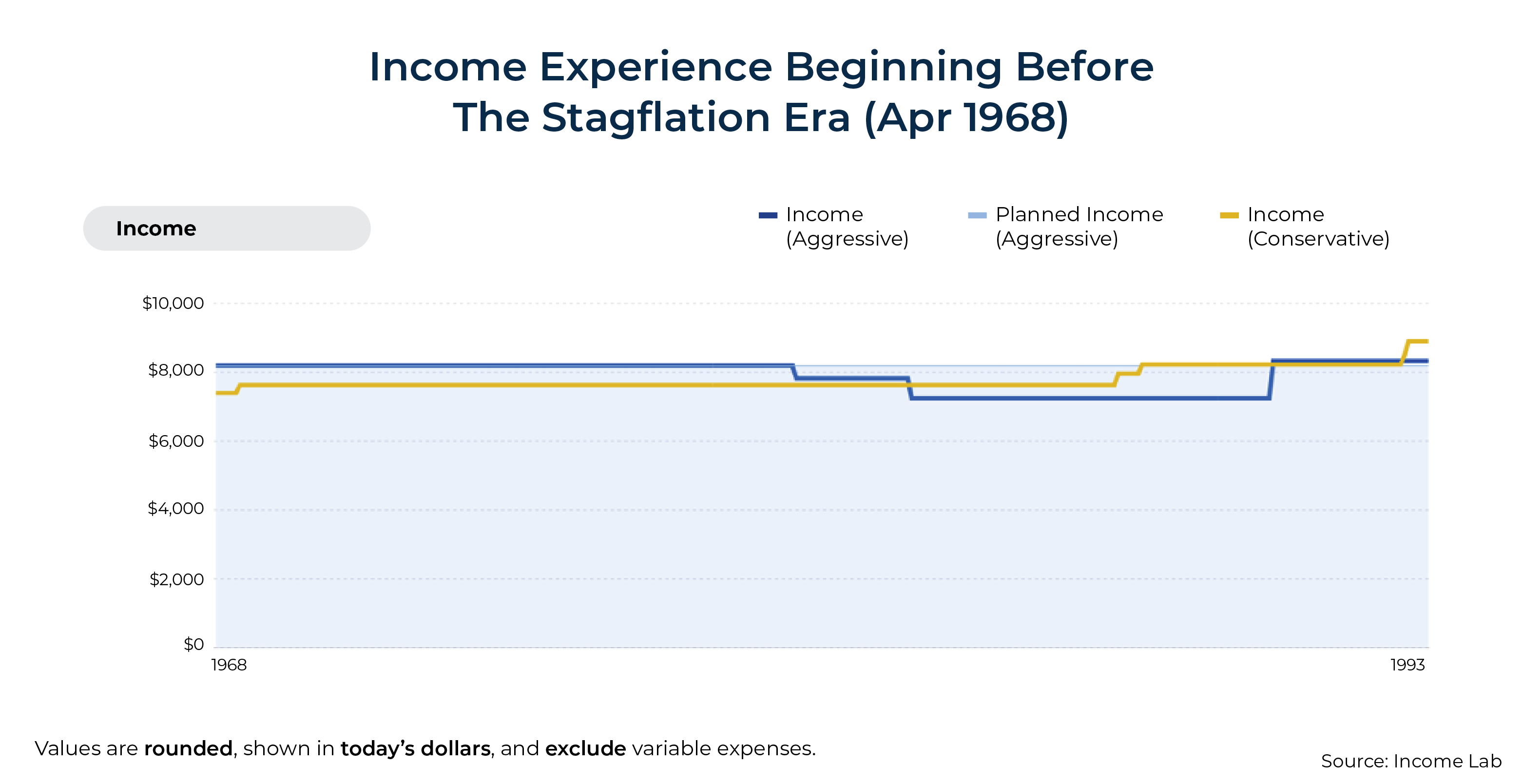
We can also look at additional periods – such as the Great Depression (1929-1939), the Post-War Decade (1945-1955), Stagflation (1968-1982), and the Dot-Com Bubble (1999-2003) – to get a general sense of which strategy might better align with a client's unique preferences. Each period presents different trade-offs between higher spending now versus reducing the risk for future spending reductions.
For instance, the graphic below compares how the same strategies would have performed for John during the Stagflation Era:
Suppose John reveals that he likes how the Conservative strategy has historically never actually hit its lower guardrail in the examples considered. He likes the idea of starting with slightly lower spending in exchange for a reduced risk of future spending cuts.
At this point, it might be helpful to explore a single strategy in greater depth, allowing an advisor to start pulling in narrative details that help their client understand how their preferred strategy performed during different times in the market. This approach can help build confidence in the strategy while highlighting the other narrative benefits discussed earlier.
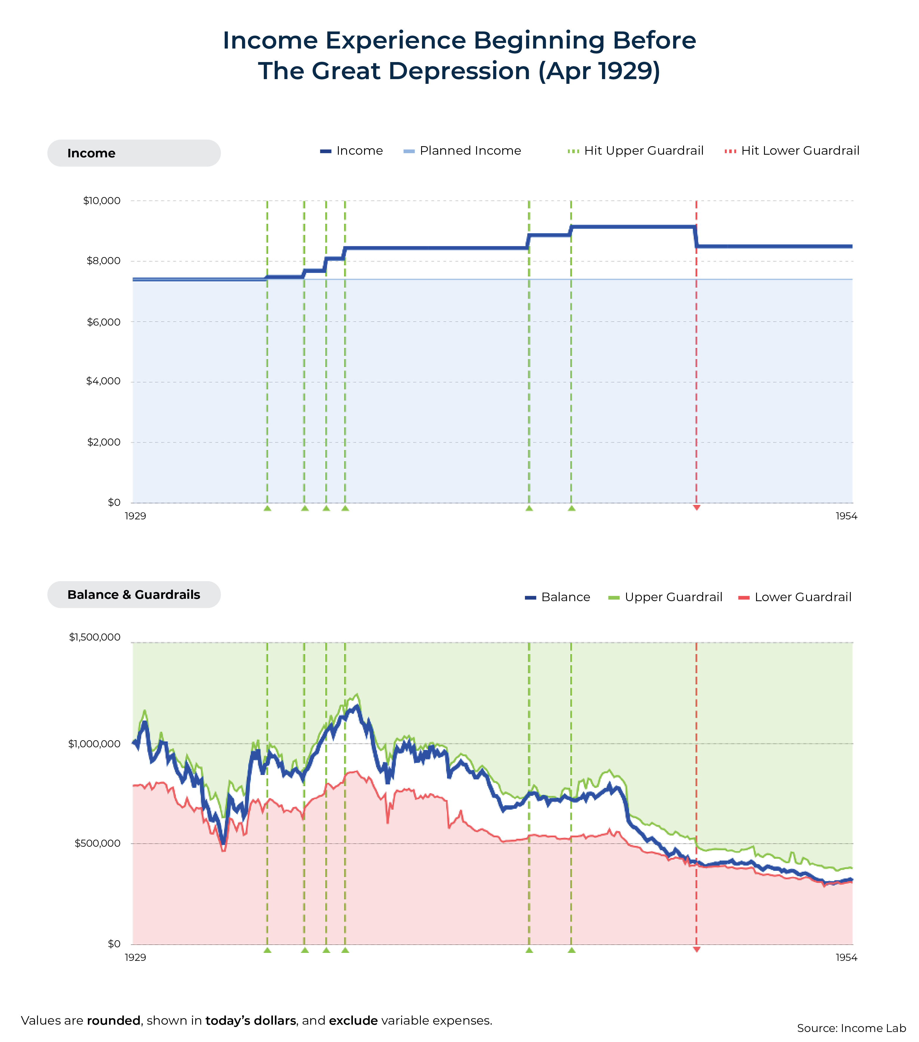
For instance, the advisor might pull up the HiMaV for the Great Depression shown below and say:
John, looking at this historical simulation, we can see something remarkable happening. This scenario reflects a retirement that began just before the Great Depression – arguably the most devastating economic time in modern American history. During this period, stock prices plummeted over 85% from 1929 to 1931, unemployment soared to 25% by 1933, and the economy experienced severe deflation averaging –6.5% annually from 1930 to 1933.
Many of us have parents or grandparents who lived through this era and whose lives were permanently shaped by the experience. Perhaps a grandmother who saved every piece of aluminum foil until her final days, or a grandfather who insisted on always maintaining a thoroughly stocked pantry with plenty of reserves even decades after the hardship had passed. These deeply ingrained habits reflect the psychological impact of living through profound economic uncertainty.
Yet, despite retiring at this precarious moment, notice how this guardrails strategy performed. During those initial devastating years, while businesses were closing and banks were failing across the country, your spending plan would have actually increased above your initial planned amount. The strategy detected opportunities to safely raise your income several times between 1930 and 1933 and again around 1937.
What's particularly striking is that, even when accounting for inflation, this approach would have sustained your entire retirement with only one spending reduction – occurring around 1949, nearly twenty years into retirement. And even then, your adjusted spending remained notably higher than your initially planned amount at the outset of retirement in 1929. Throughout this 25-year period, your portfolio balance gradually declined, but in a controlled manner that ensured lifetime sustainability.
While we plan for scenarios like the Great Depression because it represents a worst-case historical scenario, most retirements experience far more favorable conditions. In more typical market environments, these guardrails would likely trigger more frequent and substantial spending increases, allowing you to enhance your life in meaningful ways – whether that's additional travel, more time with family, increased support for the causes you care about, or whatever brings you fulfillment in retirement.
Recall that John's plan was set to an initial probability of success of 99%. While that metric alone might inspire confidence, it still remains an abstract statistic – especially compared to the tangible insights provided by a Historical Market Visualization.
And imagine, for a moment, facing tough times in the market. With risk-based guardrails, John knows exactly where his lower guardrail is and what adjustment would be called for. Furthermore, he's seen how his strategy fared through some of the toughest economic conditions in American history – without ever needing to cut spending below his initially planned level.
Contrast that with relying solely on Monte Carlo simulation. Although John may initially feel confident when he hears the good news of a 99% probability of success, he receives no further historical context for his plan's resilience. Now imagine that he encounters tough times in the market, watching his plan's probability of success fall – 90%... 75%... 50%... and lower. How will that feel? If John logs into his plan portal and sees a 30% probability of success, will he feel inspired and confident about his ability to weather this storm? I suspect not.


Nerd Note:
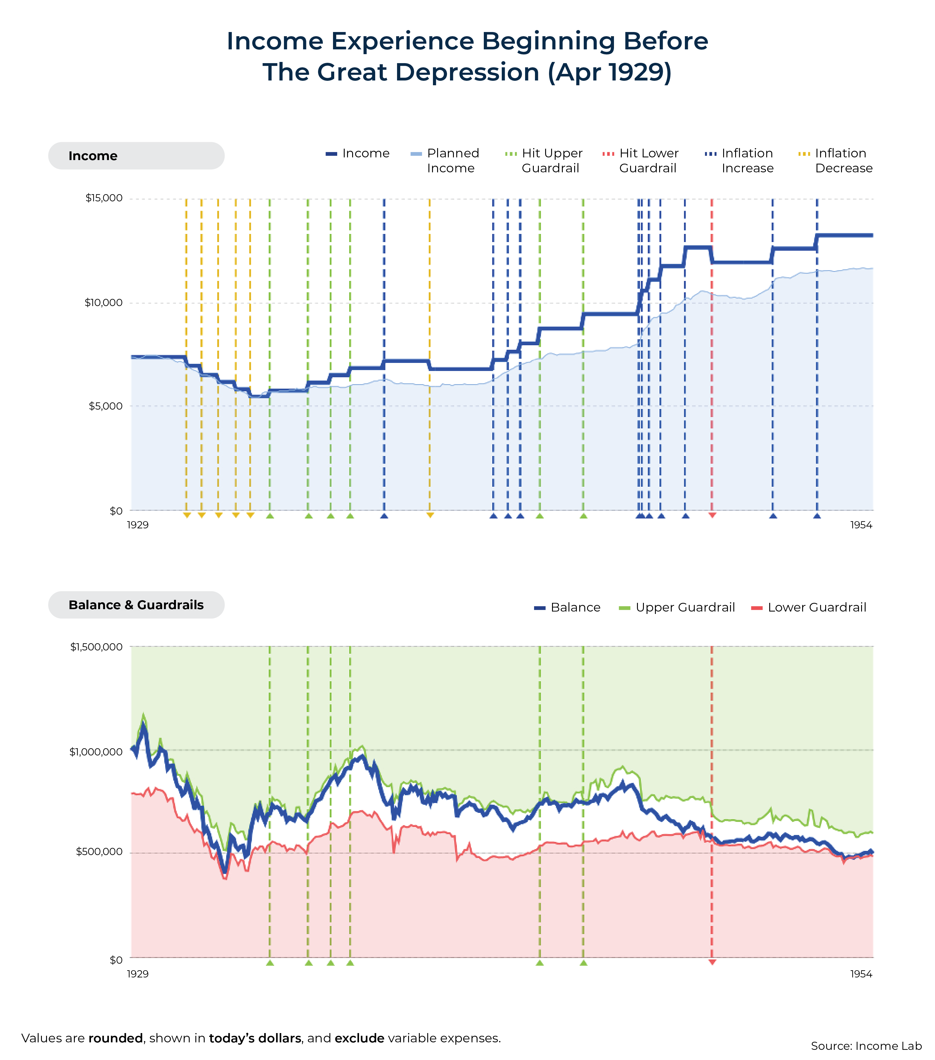
The Great Depression was a uniquely complex economic time, with deflationary pressures creating interesting implications for both retirement income spending and what it means for spending to remain 'flat'. While the graphic below would likely be too complex to present to most clients, it provides advisors with a more detailed view of how inflation and deflation influence spending adjustments in nominal terms throughout this period.
Historical Market Visualization offers a powerful way for financial advisors to communicate complex retirement income strategies to clients. By combining visual data representation with narrative frameworks built around recognizable historical events, HiMaV helps bridge the gap between abstract financial concepts and tangible outcomes that clients can intuitively understand.
Ultimately, the greatest value of Historical Market Visualization may lie in its ability to transform retirement planning from an abstract mathematical exercise into an emotionally resonant experience. When clients can visualize how their chosen strategy would have performed during periods like the Great Depression, the Stagflation Era, or the Global Financial Crisis, they gain more than just intellectual understanding – they build emotional resilience for future market volatility. This dual cognitive-emotional perspective creates a foundation for more informed decision-making and greater peace of mind.
For advisors seeking to help clients better understand the retirement landscape that may lay before them, HiMaV offers a methodology that aligns with how the human brain naturally processes information. As financial planning tools continue to evolve, those that leverage the power of visualization and narrative storytelling will likely stand out as the most effective in helping clients navigate inevitable retirement uncertainties with confidence and clarity!
Disclosure: Derek Tharp is a Senior Advisor at Income Lab. Income Lab was used in calculating the examples and visualizations included in this article.


