Executive Summary
As marketing and prospecting processes become increasingly digital for financial advisors, many prospective clients learn about advisors and what they offer not from an introductory call, webinar, or speaking event but from the advisor's website itself. Talking about money is often highly personal and can leave individuals feeling vulnerable, so choosing who to serve in such a high-trust role as a financial advisor can have immense stakes. Which is why it's crucial for websites to give prospects the ability to see themselves as clients, and to understand what beginning and maintaining an advisor-client relationship might look like. These steps can make a measurable difference in 'demystifying' an otherwise obscure process for a first-time prospect and help them move into action.
In this guest post, Mikel Bruce, CEO of TinyFrog Technologies, discusses building a prospect-focused Process page into an advisory firm's website as a crucial part of the sales funnel to get calls from prospective clients by clarifying the process, demonstrating an advisor's unique value proposition, and providing an easy way for prospects to 'raise their hand' when they're ready to act.
As a starting point, a well-built Process page performs 4 critical functions. First, it establishes expectations for the prospect around the process of becoming a client (including the type of calls involved, the onboarding steps, and how long it takes) and the general communication style of the firm. Importantly, keeping this overview simple, high-level, and prospect-focused is crucial. Second, a Process page should use language that helps prospects identify with and envision themselves as ideal clients of the firm. Third, the Process page should describe the specific (and likely niched) issues the firm addresses with its clients. Fourth, the Process page clearly shows how interested prospects can move forward in scheduling a consultation (or however a firm would like to meet with them) by offering easily accessible call-to-action tools (e.g., calendar and scheduling software tools built directly into the Process page). Process pages can also include a simple FAQ section to address questions about fees, working style, or the frequency of meetings that ongoing clients can expect.
Once advisors have created their Process page, they have a few ways to start optimizing it. First, they can build funnels that direct traffic to the Process page from different places on the website, with multiple user paths depending on the type of prospect and their pain points. Advisors may also want to A/B test various aspects of their pages – calls to action, for example, or different language – to see if one feature or another influences how many prospecting calls they get in turn.
The key point is that finding a trustworthy advisor with whom prospective clients can build a relationship is not a quick or easy process – but an advisor with an effective Process page can help prospects envision the unique value they can derive from engaging with the advisor, making it easier for them to understand the benefits of a long-term planning relationship and, ultimately, to decide to become clients!
For financial advisors who are fully immersed in the planning process on a regular basis, the steps involved in onboarding a new client may seem obvious, but that's only because they've gone through it many times over. It can be helpful to shift perspective and consider how a new client feels the first time they meet with their advisor. Are they excited to get started? Yes, probably. But probably also anxious, nervous, and unsure of what lies ahead.
The reality is that many prospective clients may be interacting with a financial professional for the first time in their lives. And even those who have worked with an advisor before may not remember what the new client experience was like. In short, what's clear to the advisor may be a mystery to the prospect.
The best way for advisors to dispel any confusion and effectively communicate their services, benefits, and processes is to clearly define them on the firm's website. This will give potential clients a glimpse of what it will be like to work with their advisor and set the expectations of a working relationship. It can also significantly increase engagement on the firm's website.
An impactful and easy-to-navigate way to do this is by creating a "Process" page. Along with a "Home" page and "About Us" page, the Process page is a fundamental component of any high-functioning financial advisor website. It serves several specific and critical functions by providing information that readers can use to make a determination about the firm (just as the firm's other key website pages should).
4 Critical Functions Of A Website's Process Page
A Process page, although simple by nature, serves several important purposes on an advisor's website. Not only does it help people feel less anxious about what to expect, but it gives readers an opportunity to self-select (or unselect) as ideal clients. Let's take a look at the 4 specific functions of a website Process page and how each function plays a role in converting readers into prospective clients.
Create Expectations Of The Working Relationship
Imagine you're planning to remodel your home. You're not well-versed in the world of construction, but you have a general idea of how things work. Now let's say you're looking to hire someone, but they've given you no indication of how long the project will take, what aspects of the project you need to be involved with, or how to get in touch if you have questions.
The lack of clarity surrounding the process would certainly give you pause. First impressions are invaluable, as people expect companies to put their best foot forward when trying to attract new clients. If a company is making a bad impression right out of the gate, you can only assume it's going to get worse as things move ahead.
Additionally, when it comes to having an outsider involved in something as personal and intimate as your family home (or personal finances, in a financial advisor's case), you need to feel like you can trust that person implicitly. In this scenario, however, the third-party professional isn't providing the information necessary to help you feel comfortable and confident in their ability to address your needs.
Allowing a professional to take a deep dive into your financial life requires an immense amount of trust. From the moment a prospective client lands on an advisor's website, they should start to subconsciously feel that trust building as a result of the information they are provided.
The purpose of the Process page is to create a valuable connection with visitors by replacing their assumptions or uncertainties with clear and realistic working relationship expectations. The Process page helps them understand how long the onboarding process will take, how involved they'll need to be, how often the advisor will meet with them, and what it'll be like once they become a full-fledged client.
Help Readers Self-Identify As Potential Clients
Most advisors don't consider themselves a jack-of-all-trades. Rather, they prefer to work with a certain type of client or niche. Maybe an advisor has a net-worth minimum or prefers helping people in a particular life stage (such as retirement). Perhaps they have a knack for helping people with more specific and complex concerns – business owners, corporate executives, farmers, military families, etc. The niche could even relate to the values, interests, or characteristics of clients, such as philanthropic families or socially conscious investors.
Whoever advisors prefer to work with, they can use their Process page to help those people self-qualify as the ideal client for their firm. This can be done by listing ideal client characteristics, sharing case studies, or incorporating language that speaks more subtly to the target audience.
Say a firm works with healthcare providers, for example. Their website Process page could incorporate language specific to their circumstances, such as, "We know your schedule is busy and often unpredictable. We can meet you at a location and time convenient to you, such as a coffee shop near your practice."
Reinforce The Benefits Of Working With The Firm
While the Process page is designed to guide prospects through the next steps of working together with an advisor, it's also an ideal opportunity to reiterate the firm's Unique Value Proposition (UVP) and benefits. It's important to clarify that the Process page shouldn't be the first place readers learn about the benefits of working together. The Process page typically falls closer to the end of the user journey of the website, meaning that, by the time users view the process, they've likely looked through the website's other pages (such as the Home page, About Us, Services, etc.). Instead of introducing benefits or the firm's UVP for the first time on the Process page, they can be weaved into the steps and supporting copy where it makes sense.
Provide Practical Information Regarding Next Steps
Last but certainly not least is the more pragmatic purpose of a Process page: sharing important information prospective clients will need to know in order to move forward. The Process page should show visitors how to schedule a consultation and provide anything else that will be helpful to know when reaching out to the firm for the first time. It can also tell them how often they can expect to meet with an advisor, how the firm will communicate with them, and any other details to help them prepare ahead of the first meeting.
Is A Process Page Really Necessary?
It's worth reiterating that what an advisor may consider common knowledge may not be obvious to others outside of the financial services industry. By providing a Process page for future clients, advisors can demystify the experience and ease the concerns of prospects. They won't have to feel like they're leaping into the unknown, because the Process page will answer their biggest questions and create a clear path forward.
In fact, a Process page can be a very powerful conversion-focused tool when built with intention. It provides the right information to reduce friction and clear away any obstacles standing in the way. A good Process page should give prospects the confidence and clarity needed to book a meeting with the firm.
Below are some real-world examples to help better demonstrate what a conversion-focused Process page looks like.
Define Financial
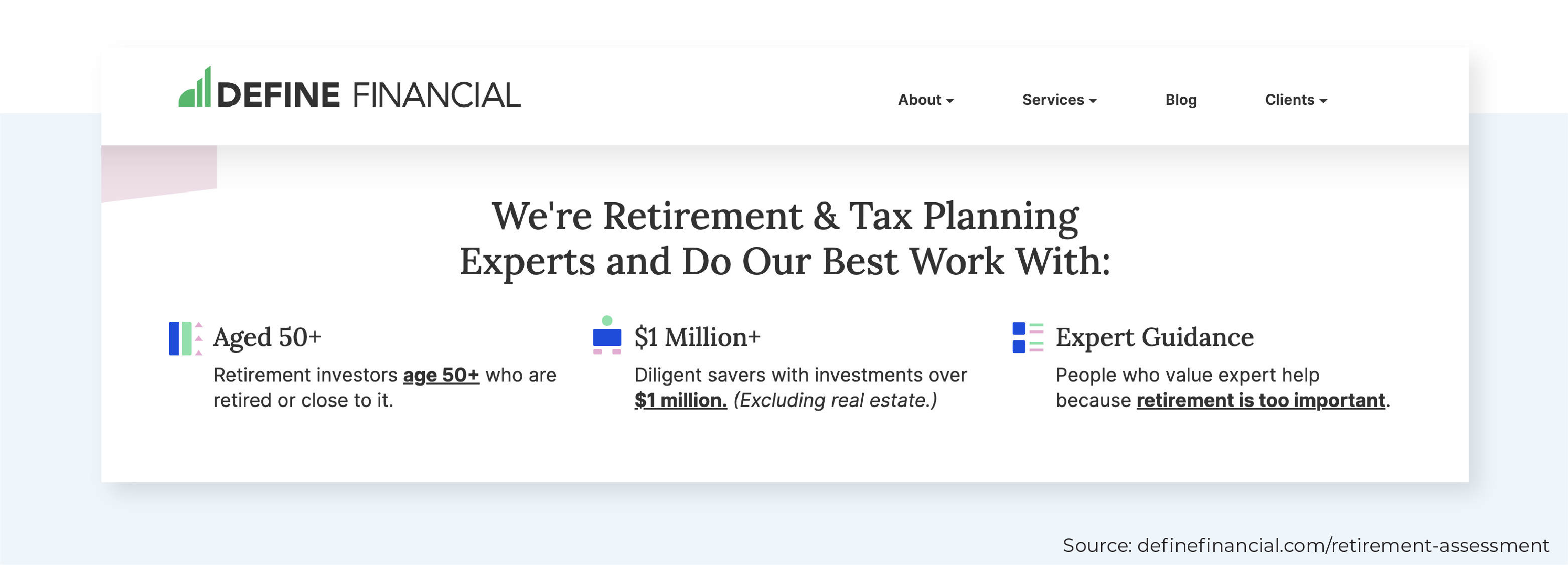
Define Financial takes a unique approach by introducing its process as an initial "free retirement assessment".
First, they lay out their ideal client characteristics (aged 50+ with $1M in investment assets and seeking retirement guidance) to help readers who meet those criteria self-identify:
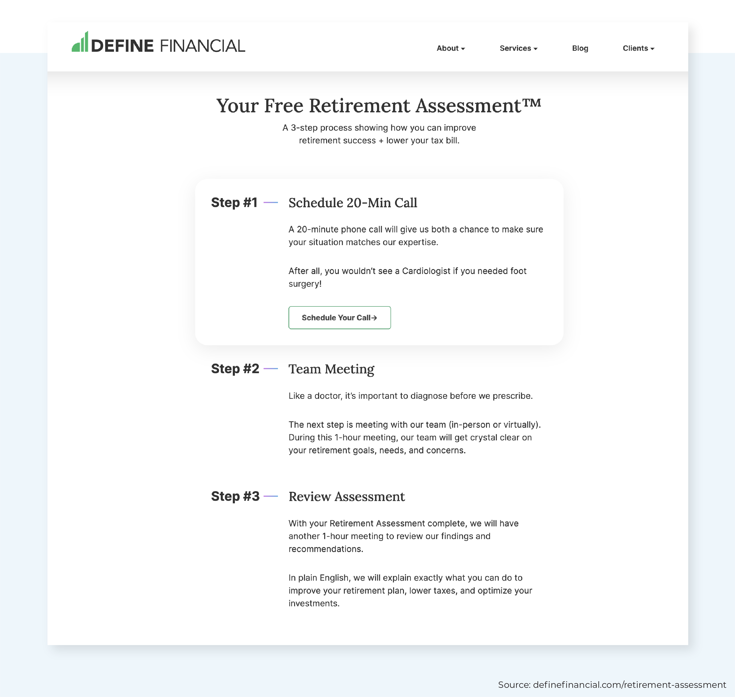
Then, they provide a detailed list of the next 3 steps in the process (but not too detailed, which is key): schedule a 20-minute call, meet with the team, and review the retirement assessment. The firm sets expectations by mentioning how long each meeting is anticipated to take.
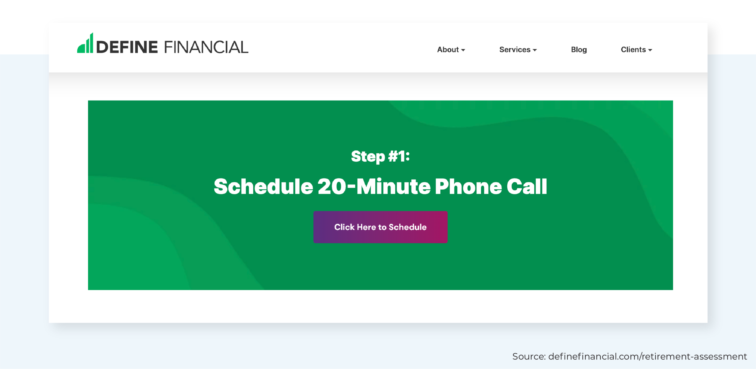
In 3 separate spots on its Process page, Define Financial includes an online appointment scheduling tool, which allows viewers to schedule a meeting in seconds. They even embed a calendar directly on the page, meaning viewers don't have to leave the advisor's website to book a call. Again, they're masters at reducing obstacles and making it as easy as possible for potential clients to get in touch with their firm.
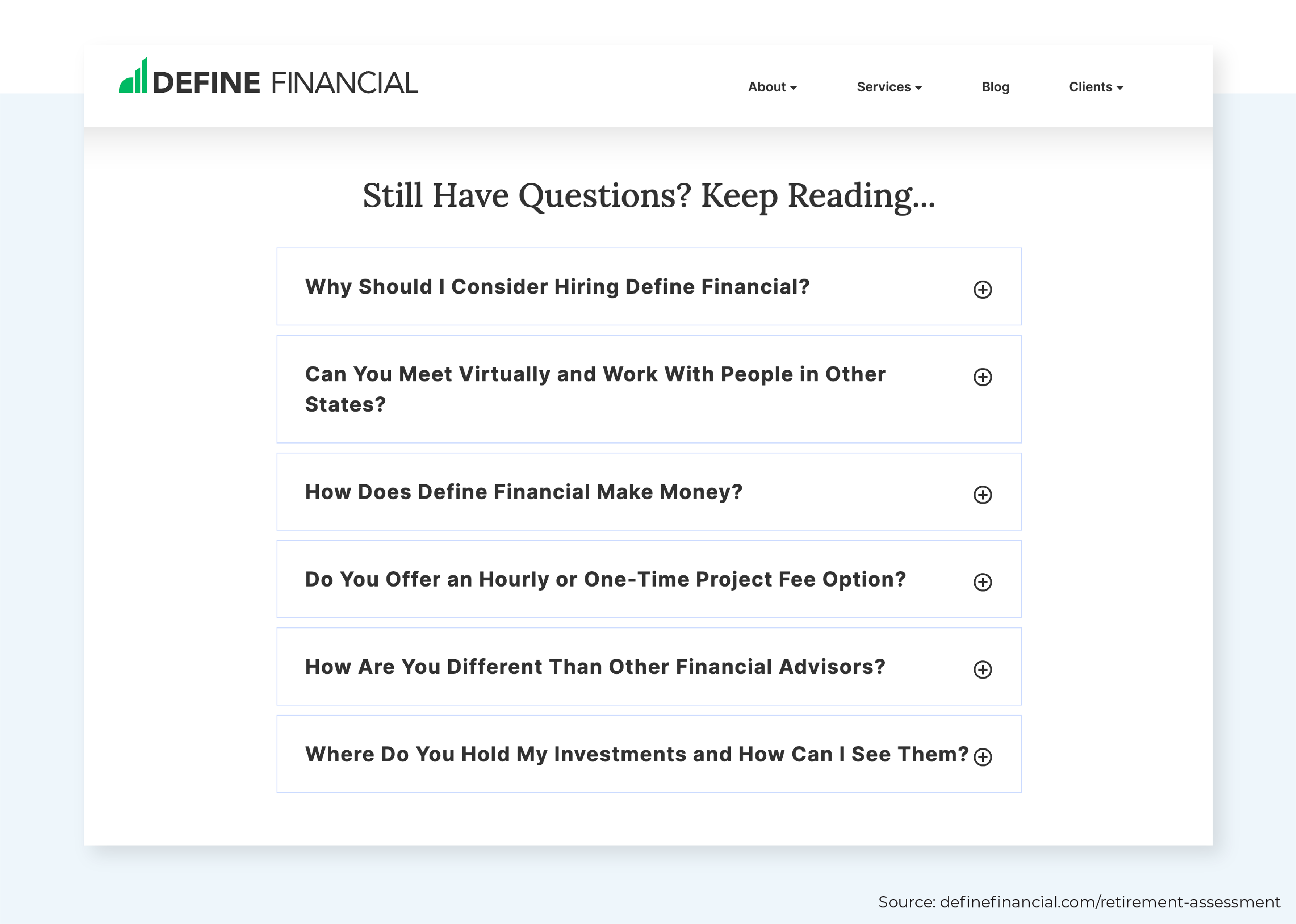
And finally, they take the time to address any lingering questions or hesitations readers may have and incorporate their Unique Value Proposition (UVP) (being retirement and tax planning experts with an intentionally limited clientele) onto their Process page in the form of FAQs.
Three Oaks Wealth
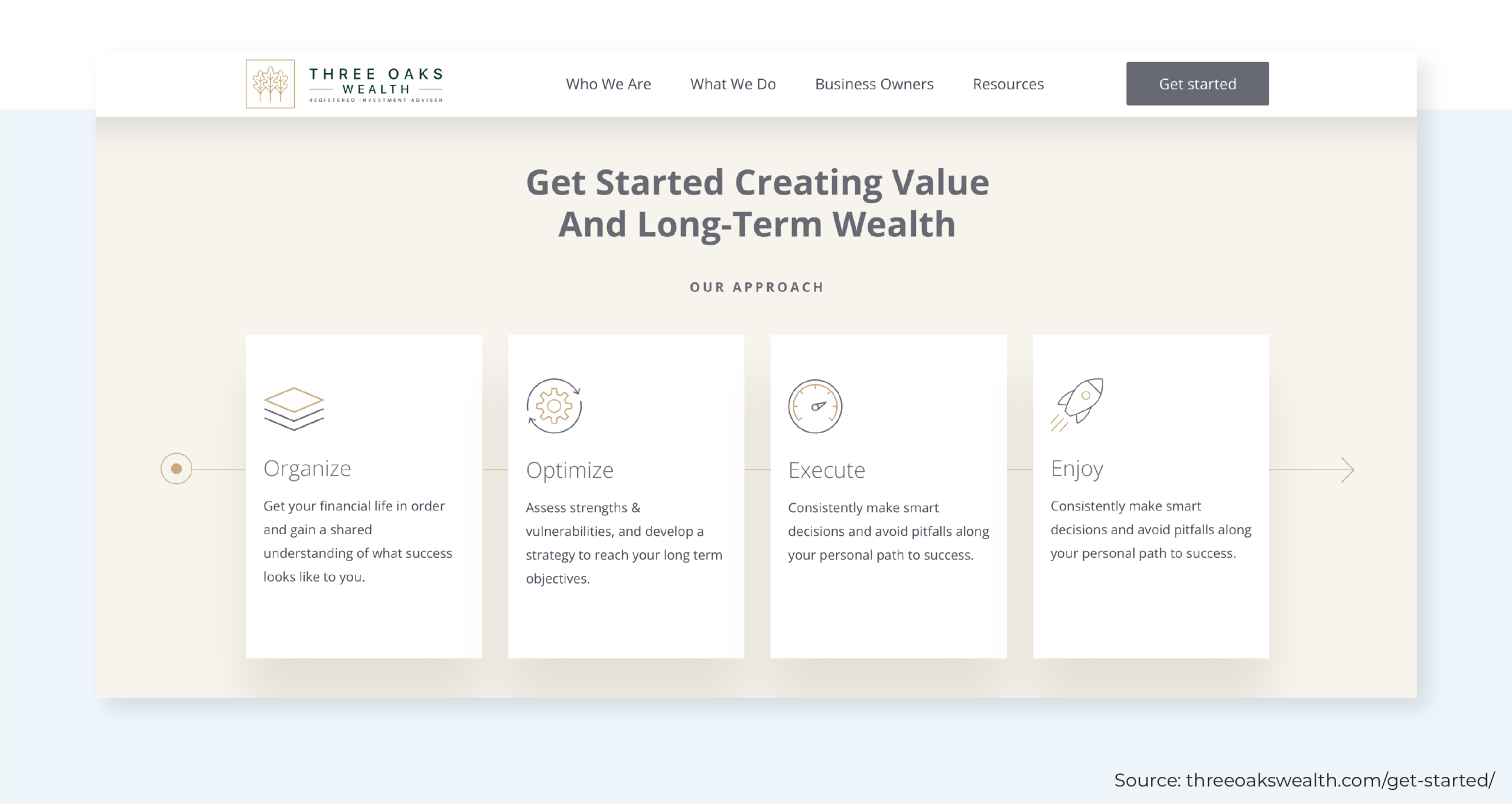
Three Oaks Wealth offers a visually appealing and easy-to-navigate "Get Started" Process page to guide visitors toward scheduling an introductory call via Calendly.
The first section of the page introduces the firm's approach, distilled into 4 key objectives: organize, optimize, execute, and enjoy. The simple layout reduces confusion and hesitation by outlining the firm's focus and what people can expect with Three Oaks as their financial partner.
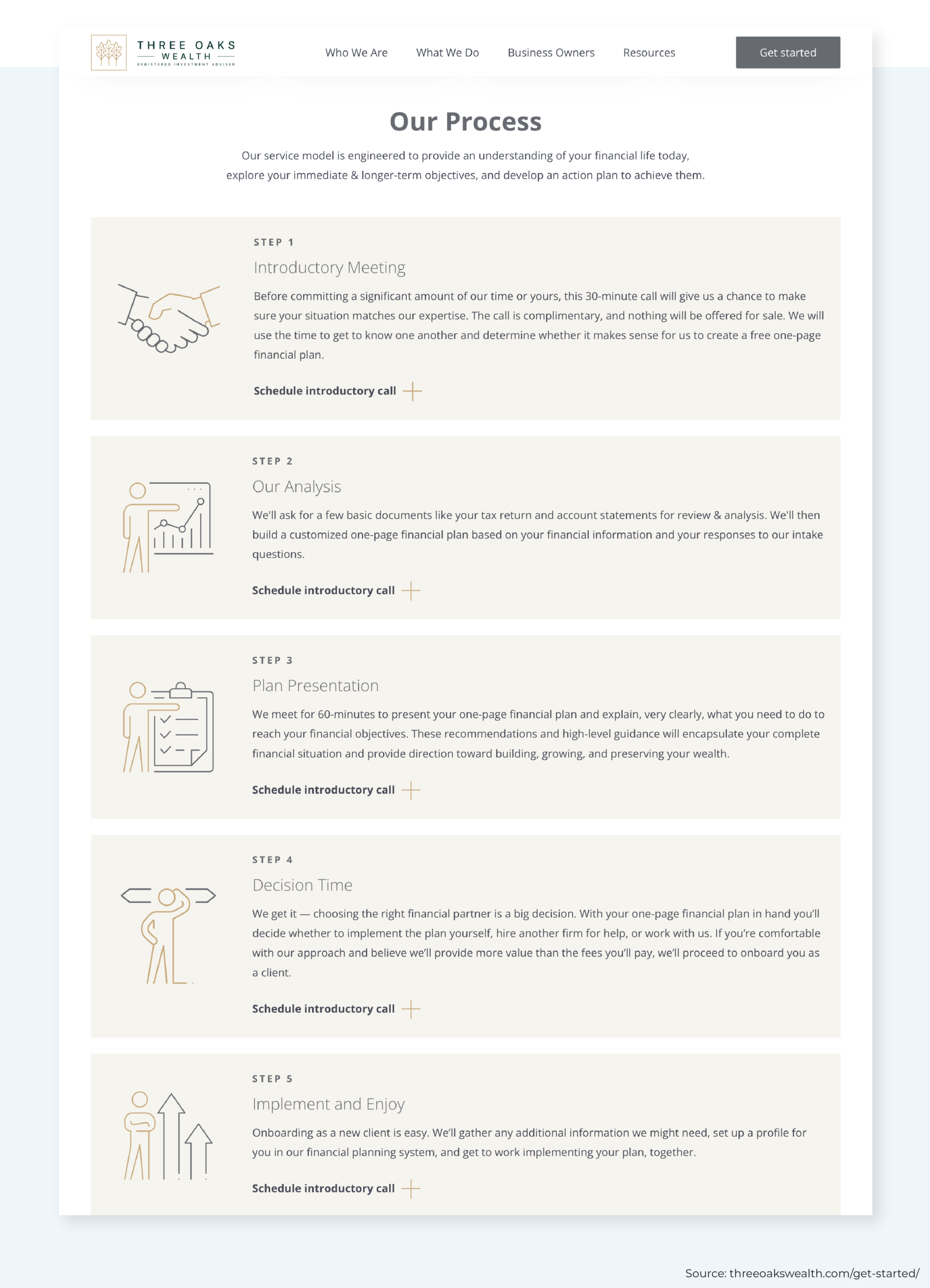
From there, they introduce their 5-step process, which consists of 1) an introductory meeting, 2) a preliminary analysis to create a 1-page financial plan, 3) another meeting to present the plan, 4) the prospect's decision to move forward or self-implement the plan, and, if the prospect engages the firm, 5) onboarding and implementation of the plan. Each step offers a "Schedule introductory call" link to make it easy for people to get started.
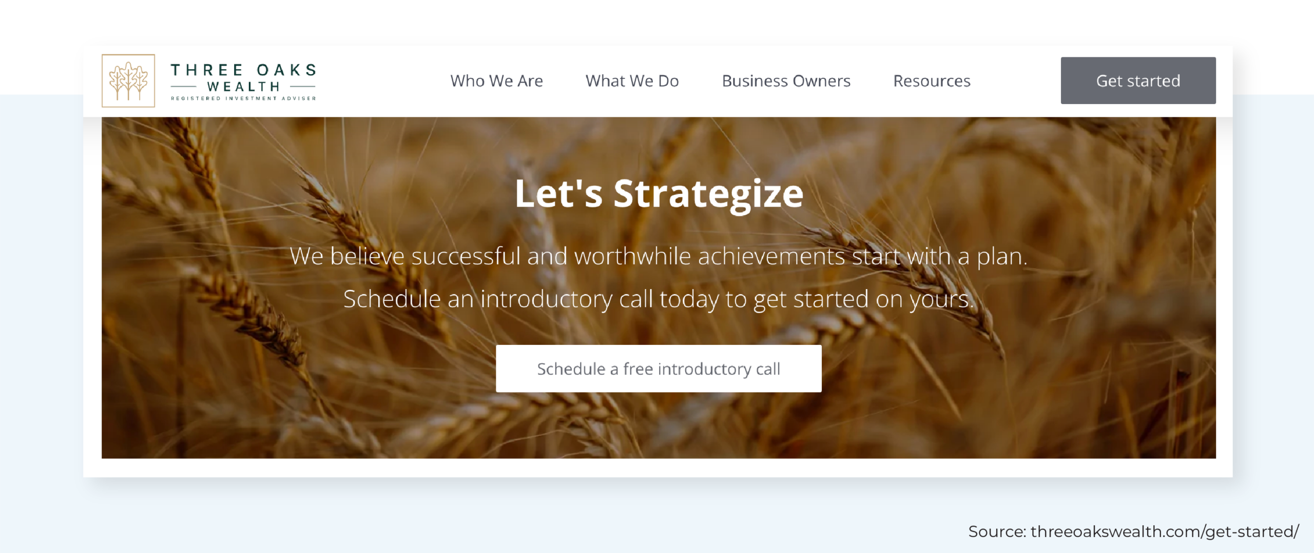
Three Oaks makes it clear what action they want viewers to take and removes any difficulty by providing multiple entry points to their scheduler throughout their Process page and the rest of the website. Unlike Define Financial, the primary call-to-action section links to a Calendly scheduler rather than embedding the calendar directly on the page. While embedding a calendar directly on the advisor's website creates fewer steps for the user to book a meeting (without leaving your website), using a button to link out to a calendar can provide a cleaner look (especially if there are multiple advisors or meeting options available to the visitor).
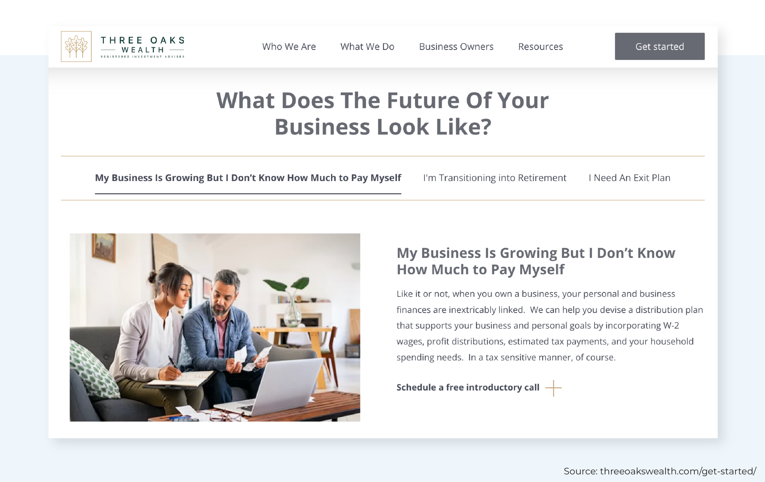
For prospects who are still unsure if Three Oaks is the right fit after reading about the firm's approach and 5-step process, the Process page also lays out the 3 most common scenarios that the firm's clients face: 1) My business is growing, but I don't know how much to pay myself; 2) I'm transitioning into retirement; and 3) I need an exit plan. The accordion-style layout briefly shares how the firm's process is tailored to help people navigate these specific situations.
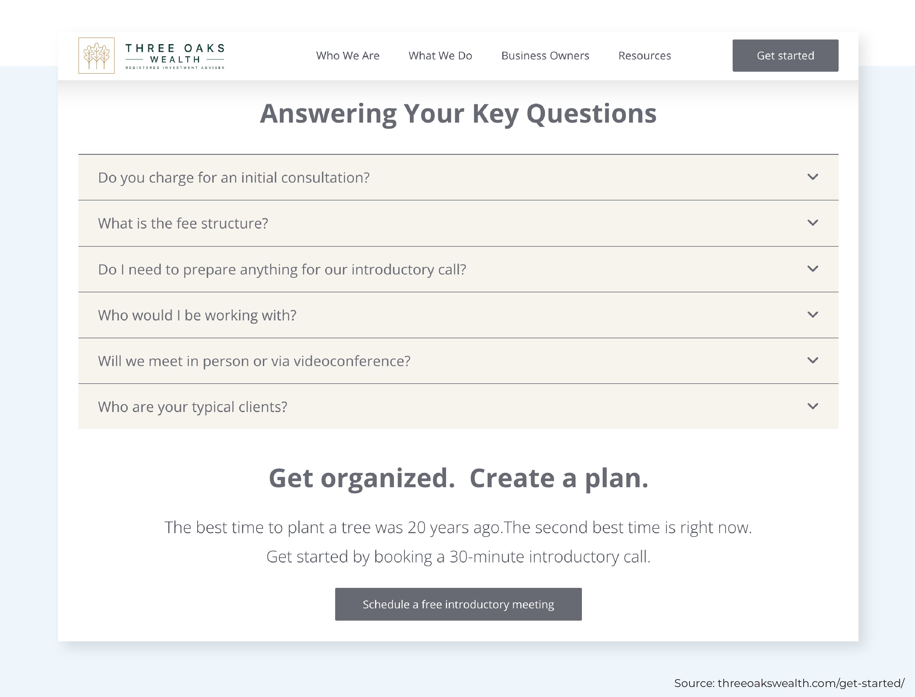
Three Oaks then offers one final opportunity for people to find the answers to their unanswered questions with a simple FAQ section (addressing common questions about fees, working style, and typical client profiles) before calling people to action once more.
Heisten Financial
Heisten Financial provides another excellent example of a conversion-focused Process page.
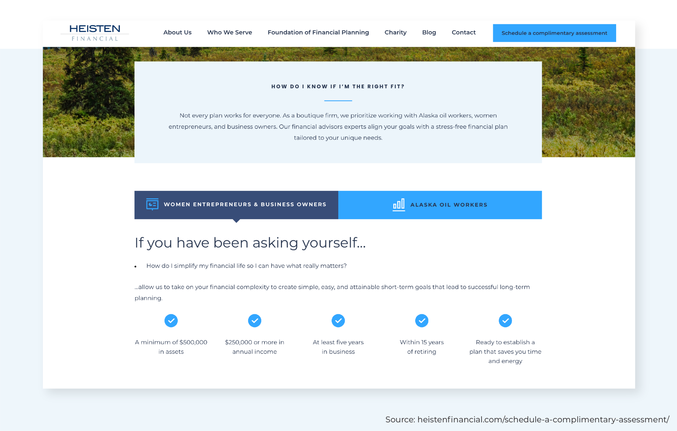
Right off the bat, this Process page encourages the reader to ask, "How do I know if I'm the right fit?" and provides the information they need to decide on their own. With such unique niches (Alaska oil workers, women entrepreneurs, and business owners), this firm has opted to put its ideal client characteristics front and center, including specific details around minimum assets ($500k), income levels ($250k), and time in business (5 years), as well as focusing on clients within 15 years of retirement.
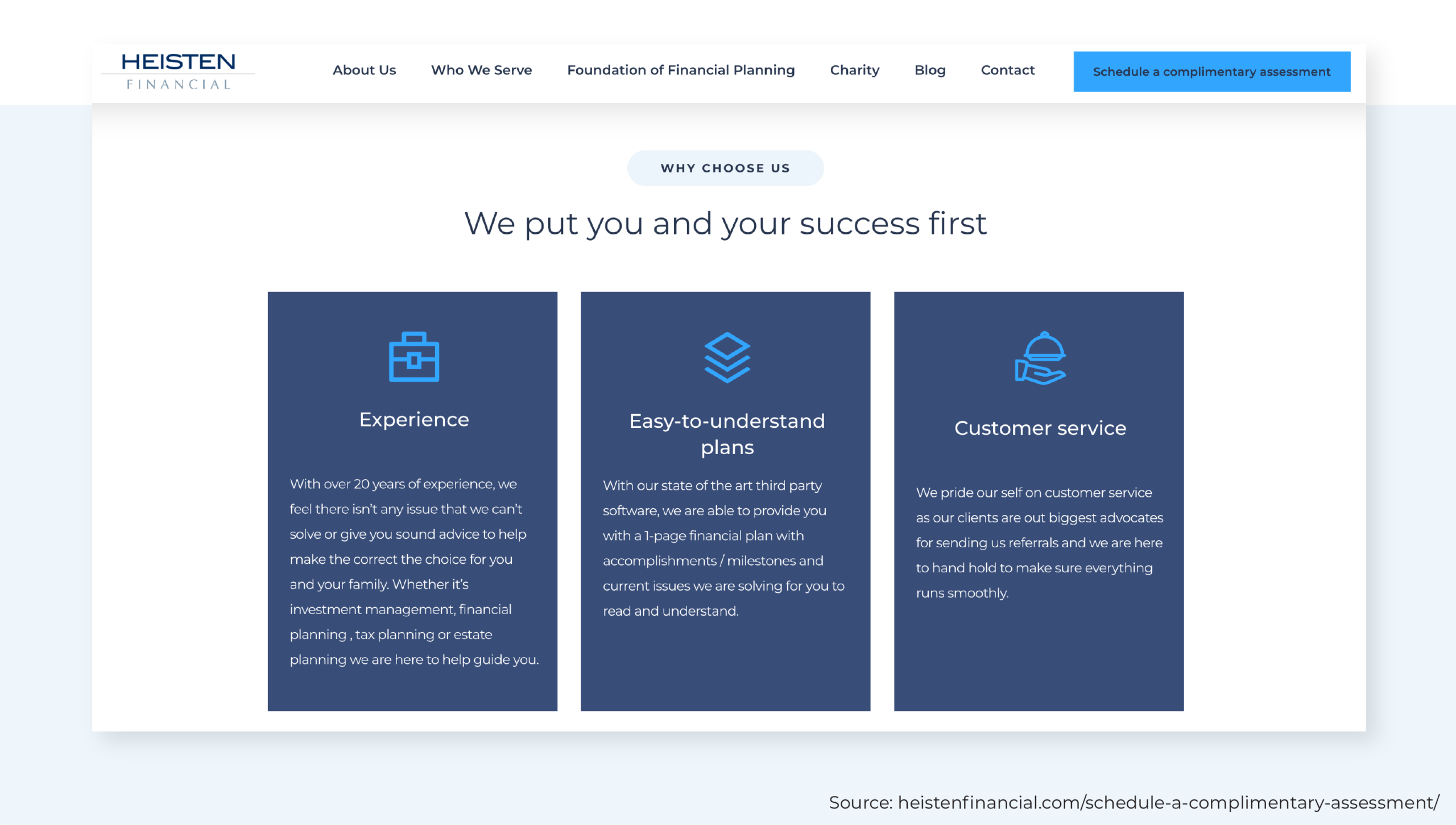
After providing a brief description of their process, the firm shares 3 clear benefits of working with them – highlighting their experience, easy-to-understand plans, and customer service – again, an effective method for removing client hesitation or objection.
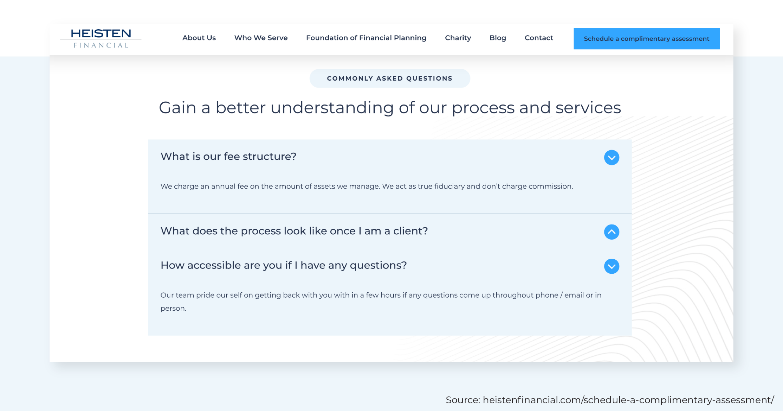
In setting clear client expectations, this FAQ section is succinct enough not to feel overwhelming, yet it's still able to set the stage for a successful long-term client relationship. Without ever having to email or call the firm, readers know how they'll be charged, what the team's communication style is like, how often they'll meet with their advisor, and other important information.
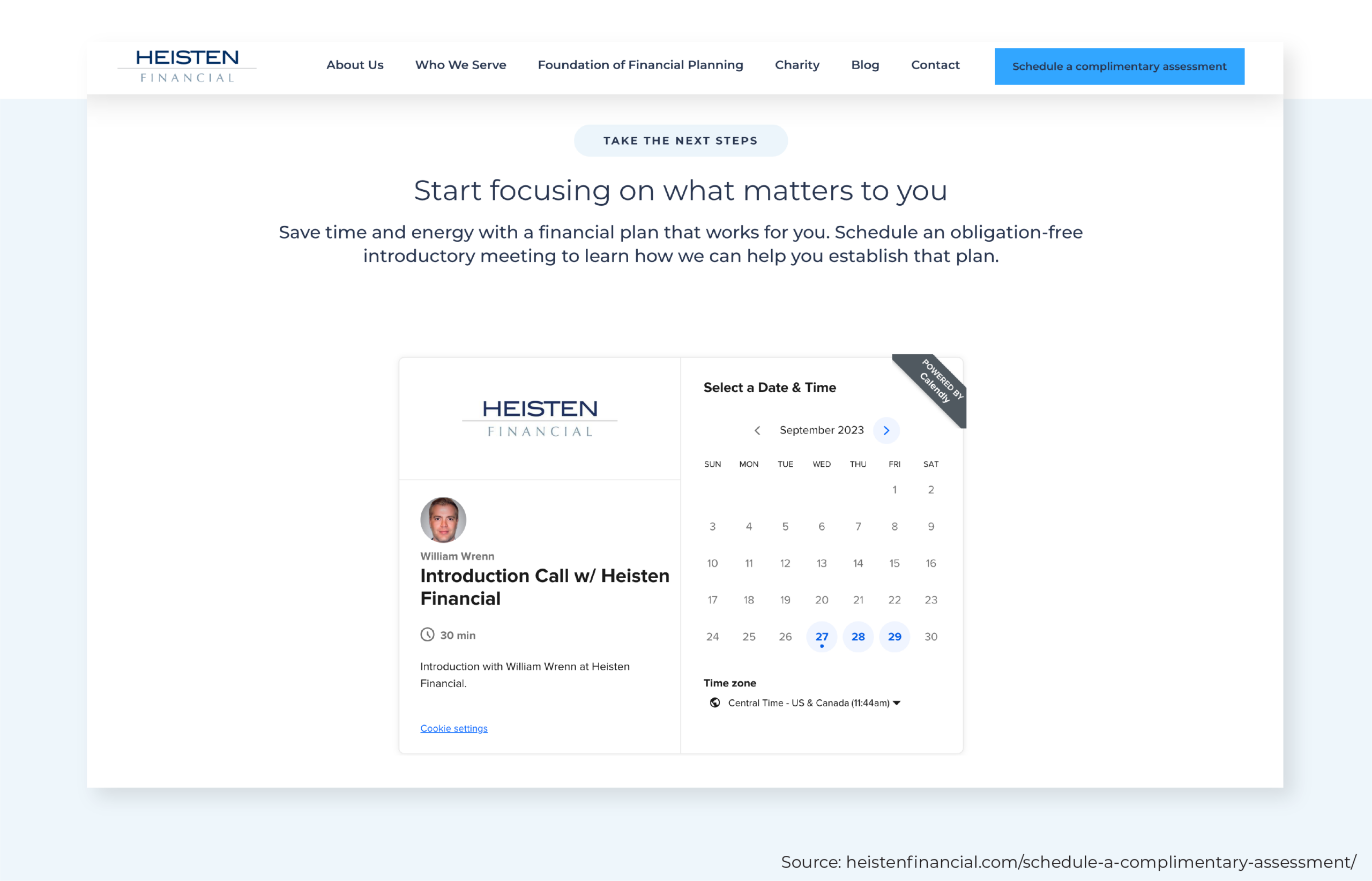
Just like Define Financial, this firm has opted to embed an online scheduler directly on its Process page and encourages prospective clients to schedule a meeting.
How To Create An Effective Process Page
As seen in the high-performing examples above, there are some common elements and themes that can be integrated into the Process page. When built effectively, the Process page can serve as the first real touchpoint in what will hopefully become a long and prosperous client relationship.
When firms answer a prospect's biggest questions right off the bat and set clear expectations, the initial meeting will be that much stronger. Even before meeting their advisor, prospects will feel more comfortable letting their guard down and sharing those important yet intimate details regarding their finances, goals, and concerns.
The question is, what goes into creating a successful Process page that converts readers into future clients?
Keep It Succinct
There's a distinct difference between clarifying the prospect's next steps and overwhelming readers with too much information. The onboarding process, in general, is fairly involved. But at this point, the reader is just that – a reader. Just by viewing the firm's Process page, they aren't yet committing to anything.
Speaking in sales terms, they haven't reached the bottom of the sales funnel just yet. In fact, if this website visit is their first interaction with the firm, they may still be at the very start of that sales funnel.
While expectations can be set throughout the page's content, it's best to save detailed resources (such as a welcome packet or checklist of documents to bring to the initial meeting) until after a call has been booked. Remember, the Process page is all about building the foundation of trust between the advisor and prospective client by reducing obstacles. The more unnecessary information they are burdened with, the less effective the Process page will be.
Keep the steps light and client-focused. Don't bog readers down with the details of what documents they'll need to collect or how often they can expect to receive the firm's email newsletter. Stick to the "need to know".
Consider the language used and the brevity of the first steps in our previous examples:
Define Financial: A 20-minute phone call will give us both a chance to make sure your situation matches our expertise. After all, you wouldn't see a Cardiologist if you needed foot surgery!
Three Oaks Wealth: Before committing a significant amount of our time or yours, this 30-minute call will give us a chance to make sure your situation matches our expertise. The call is complimentary, and nothing will be offered for sale. We will use the time to get to know one another and determine whether it makes sense for us to create a free one-page financial plan.
Heisten Financial: We listen to you to fully understand your objectives, your perspective on risk, and your liquidity needs. We then devise a plan to support your personal goals through professional investment management and strategic planning.
In a couple of sentences, these firms provide just enough information for readers to understand the gist without feeling overwhelmed by what's ahead.
Not only should Process-page descriptions be brief, but the number of steps included should be minimal as well. In fact, the majority of successful Process pages only include 3 or 4 steps. Anything more risks overwhelming the reader.
While the process will differ for every firm, the steps generally tend to include:
- Step #1. Discovery call, consultation call, initial meeting;
- Step #2. Plan building, research, second meeting (usually with more of an emphasis on document review);
- Step #3. Implementation, portfolio creation, contract signing; and
- Step #4. Ongoing management, monitoring, annual reviews.
What happens if advisors overwhelm their website visitors? The answer is pretty simple: They leave the website and move on to the next one.
Looking back at the example websites shared earlier will show that although many elements are included – process steps, ideal client avatars, FAQs, and online schedulers – no one element is too 'heavy' or overwhelming for the reader to digest. These firms keep the information brief and leverage attractive design elements to ensure the reader stays engaged.
Share Ideal Client Characteristics
The Process page can (and should) include more than just the firm's onboarding steps.
Despite the importance of helping readers self-identify as ideal clients, advisors don't always embrace the idea of calling out who their target audience is. They feel as though they're boxing themselves in or creating an exclusionary environment that discourages the majority of readers from reaching out.
In reality, creating and displaying ideal client characteristics or criteria helps a firm's target audience know they're in the right place. It's what separates an advisor from the one next door or the next website down on Google.
Few aspects of a person's life are more personal than their finances, which means that prospects are picky and will go the extra mile to find the right fit. Not only does incorporating client pain points and criteria help firms avoid unqualified leads, but it also helps their ideal clients know that the advisor will understand what they're going through and will be able to address their specific needs.
Firms that specialize in helping young, affluent professionals with complex equity compensation packages will have an area of focus and expertise that will be more attractive to some readers than others. Incorporating that information into the Process page may reduce the number of leads received, but it will also increase the caliber of prospects coming through the firm's inbox.
Include A Clear Call-To-Action (CTA)
An effective call-to-action (CTA) clearly articulates the step the firm would like the website visitor to take once they land on its Process page.
Throughout the website, firms are more than likely to include CTAs such as:
- Call our office;
- Email us;
- Fill out an inquiry form;
- Download a checklist or e-book;
- Sign up for our newsletter;
- Follow us on Twitter/LinkedIn/Facebook; or
- Schedule an initial consultation.
The Process page, however, should be clean and simple by sticking to a single CTA. Most likely, firms want to use this valuable real estate to encourage visitors to schedule a meeting – whether that's via an online scheduler or reaching out to the firm first is up to the advisor. Incorporating multiple CTAs will be confusing to the reader; it forces them to make a choice, which creates more cognitive friction (remember, the Process page is designed to reduce friction, not add to it).
Don't Forget Doubt Removers
Speaking of cognitive friction, the space around CTAs can be used to eliminate lingering doubts or hesitations. A "doubt remover" is marketing slang for the text around a CTA that's specifically meant to address concerns that could stop a firm's target audience from taking the next step.
In an advisor's case, this could be text that reminds the reader that the introductory call is complimentary or "obligation free", as Heisten Financial puts it on their Process page. It can reiterate the benefits of working with an advisor, such as saving time, organizing their financial life, retiring with confidence, etc. This can be a great place to incorporate language that taps into the emotional or 'softer side' of financial planning.
A/B Test The CTA
What a firm assumes its target audience will respond to and what it will actually respond to may turn out to be 2 different things (especially for firms that don't have access to a marketing or design guru). The good news is that websites are dynamic and give firms the flexibility to make changes as needed.
Because a CTA is what stands between the advisor and their prospective client, it's certainly worth testing out various options to find what works best. To do this, firms can conduct what's called A/B testing on their website.
A/B testing is a User Experience (UX) testing method that takes 2 versions of 1 item (in this case, the call-to-action) and puts them in front of an audience to determine which is more effective. Typically, only 1 element from that item will differ between versions A and B. If there is a "Schedule a Call" button, for example, perhaps version A has a red background and version B has a blue background.
After 1 set of A and B versions is tested, different elements can be changed in subsequent tests to help firms find the configuration that creates the highest conversion levels. Aside from color, other aspects of the CTA on a Process page can be tested, including the following:
- Whether it's text-based (appears as a hyperlink within the copy) or button-based (a standalone graphic element);
- Size of the CTA;
- The text ("Schedule a Call" vs. "Schedule a Consultation");
- Placement on the page; and
- Action item (scheduling a call, emailing, filling out a form, etc.).
Leverage Online Scheduling Software
The financial services industry may have initially been slow to adopt technology, but leveraging the abundance of available platforms and apps has practically become a prerequisite for firms looking to grow in 2023 and beyond.
Online scheduling software offers a simple, straightforward way for people to get in touch with their advisors. The programs vary widely in terms of cost, integration capabilities, customization capabilities, and user experience. Advisors can do their own research and testing to find one that works for them and their firm.
Whether embedded directly on the Process page (like Define Financial) or just a click away (like Three Oaks Wealth), online schedulers make it as easy as possible for leads to connect with advisors quickly. Scheduling through most of these software options is easy on phones, tablets, and computers and can be more efficient than picking up the phone (which prospects and clients may choose not to do after office hours) or typing out an email. Essentially, an online scheduler can serve as an around-the-clock lead driver, and its simplicity will make it more likely that people will book through it.
Most online schedulers can do the follow-up work as well, which saves the firm time and hassle – while also eliminating the risk of having leads slip through the cracks. Most platforms will automatically create a calendar invitation for the meeting and send customized appointment reminders to reduce the chance of a no-show. Advisors may also have the ability to create a flow of follow-up emails, which will automatically be sent to participants after the meeting.
Common meeting scheduling apps include:
- Calendly: A flexible option with 4 tiers of service, Calendly integrates with other sales and marketing platforms to provide a fully aligned booking process.
- OnceHub: OnceHub offers users unique options like live chatting or instant video calling, which can help move the sales process along even faster for interested prospects.
- Acuity: With the ability to customize nearly every aspect of the online scheduler, Acuity offers a seamless user experience while integrating with over 500 other apps.
- Engageware: Claiming the top spot for most appointments booked, Engageware is a well-established online scheduling software with options for any financial service provider, large or small.
Address Any Lingering Objections
The 3 example sites presented earlier – from Define Financial, Three Oaks Wealth, and Heisten Financial – all strategically include FAQ sections toward the bottom of their Process pages. Consider the Process page journey that a firm takes their readers through: They've helped the reader self-identify as an ideal client, walked them through the process using easy-to-understand and succinct language, and given them several opportunities to book a meeting directly from the website. If readers are scrolling to the bottom of the page and haven't taken the desired action (schedule a meeting), that means their concerns and mental hurdles haven't been addressed yet.
The FAQ section is the firm's opportunity to combat any remaining concerns or anxieties readers have about contacting the firm. It will help them understand who the firm is, what sort of obligation they'd be under if they were to book a meeting, how the fee structure works, what areas of expertise are offered, or anything else that might be causing friction. Again, brevity is key here. The FAQs shouldn't overwhelm them with information but rather provide a high-level answer to help ease their initial anxieties.
Optimizing The Rest Of A Website To Support Its Process Page
While a thoughtful and strategic Process page is critical to optimize conversion, it's just 1 piece of the puzzle. The rest of the website should create a visitor journey that naturally leads visitors to the Process page. In fact, an effective, conversion-focused website incorporates multiple user paths based on the type of visitor and their pain points.
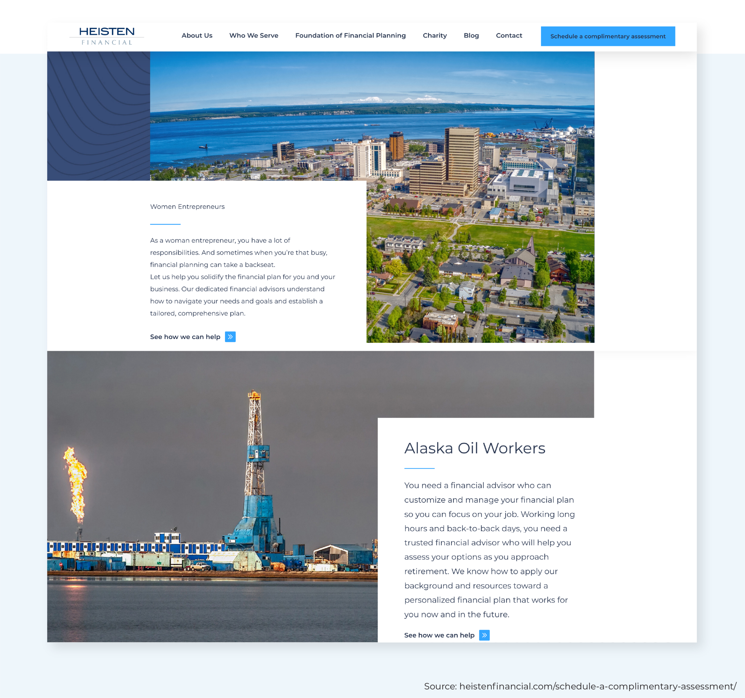
Take Heisten Financial's niches – women entrepreneurs and Alaska oil workers. 2 groups of people with very different life journeys and financial challenges. Because it doesn't make sense to send these groups on the exact same visitor journey through their website, they developed separate ultra-focused "Who We Serve" pages to speak directly to a specific audience and address their unique needs.
From there, readers can click around and learn more about the firm – all while gathering the information they need to identify as ideal clients. By the time they make their way to the Process page, they're already well-positioned to take action because they've experienced a strong and informative user journey.
It is incredibly valuable for firms to change the way they approach their website's Process page. Too often, advisors put little effort into creating it or, worse yet, skip having one altogether. But when firms develop a thoughtful reader-focused page that incorporates some of the elements mentioned above, they transform a static or generic page of copy into a dynamic conversion machine.
Imagine being in the shoes of someone who's never worked with a financial firm before and giving them everything they need to feel comfortable and confident to move forward with the first meeting. When a firm's copy and design are compelling enough, its Process page will eliminate objections, drastically reduce friction, and make it as easy as possible for readers to become future clients!




Leave a Reply