Executive Summary
Retirement income planning is often one of the primary reasons prospective clients approach a financial advisor. In a world of increasing longevity and declining reliance on defined benefit retirement plans, being able to give clients an estimate of how much they can ‘safely’ spend each year, given their available assets, is a major part of an advisor’s value proposition. To do so, advisors often rely on Monte Carlo analyses, which provide the probability of a particular course of action being ‘successful’ (and, therefore, implying the corresponding probability of ‘failure’). However, the typical presentation of Monte Carlo results via a single probability-of-success outcome can make for a cumbersome process of guessing and checking plan results to get a sense of the range of plan outcomes for a client across different levels of spending.
A potential solution to ameliorate this problem and allow for easy comparison across various spending levels is to leverage technology to graphically display curves that relate a client’s spending levels with corresponding risk outcomes. These “Spending Risk Curves” can be far more insightful than a single probability-of-success result, and very useful for an advisor to gain a higher-level understanding of a client’s financial options by visually illustrating the trade-offs between a client’s spending choices and risk in retirement.
At their core, Spending Risk Curves show the trade-off between risk (framed in terms of probability of success or otherwise) and spending in retirement planning (i.e., as annual portfolio withdrawals increase, so does the spending risk level) based on a client’s particular circumstances (e.g., mixes of ages, longevity expectations, or Social Security benefits). In this way, Spending Risk Curves give advisors an idea not only of the full range of options for the initial risk/income levels, but, when combined with Spending Risk Curves at different portfolio levels, can also of the future adjustments to spending that might be needed (these could be to the upside or the downside, depending on portfolio performance) to keep the client at the desired risk level.
Ultimately, the key point is that Spending Risk Curves are highly versatile tools that can help advisors better conceptualize the range of outcomes associated with different spending levels for their clients, so that they can more easily design relevant and suitable financial plans. By understanding the full range of spending options at all levels of risk for a given client’s situation and being able to estimate future spending adjustments that might be needed to maintain a desired level of risk, advisors can not only give clients a more accurate view of their choices but also communicate what changes to spending might be needed down the line to keep their plan on track. In the end, this can lead clients not only to make better-informed decisions but also to have more confidence in their financial plan!
Spending Risk Curves Offer A Versatile Method To Visualize Retirement Planning Results
Visualizations can be powerful tools for quickly communicating information, and the adage that "a picture is worth a thousand words" expresses how valuable images can be to get information across in an efficient and effective manner. Yet, because financial planning is a highly abstract field, good visualizations to explain financial planning principles to clients can be hard to come by. Nonetheless, it certainly is possible to effectively capture abstractions through good visualizations.
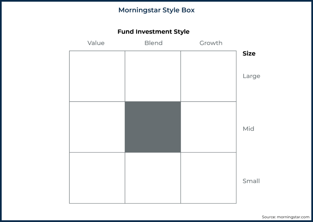
For example, the Morningstar Style Box is arguably one of the most successful visualizations of an abstract concept in all of financial planning – despite the fact that visually capturing concepts as intangible as the size premium and the value premium of a fund might sound like a rather challenging thing to do.
When it comes to retirement planning, many advisors have traditionally relied on highly abstract Monte Carlo analyses to model retirement scenarios for their clients. And while there may be many limitations when it comes to Monte Carlo simulations (and particularly the overemphasis on the probability of success/failure while not accounting for the magnitude of success/failure), there certainly may be better ways to convey results – both to advisors and clients.
It has been previously argued that probability-of-success-driven guardrails (expressed in dollars rather than percentages) are a better way to communicate Monte Carlo results to clients. Furthermore, in addition to the communication advantages of speaking to clients in terms of a monthly spending budget and potential adjustment points, risk-based retirement income guardrails provide significant analytical advantages for capturing the nuances of a client's unique situation.
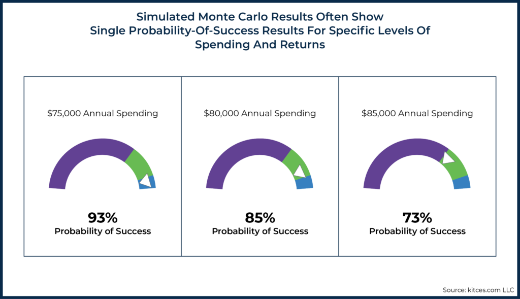
However, sometimes methods for visualizing results may be useful to professionals even though they aren't ideal for clients. Similar to how an EKG readout is useful for physicians (and ultimately benefits the patient) even though patients don't need to know how to read such results themselves. Spending Risk Curves are one such technical visualization that can be beneficial for advisors, even if they ultimately aren't a client-facing visualization. The conventional method of displaying probability-of-success results is a probability of success dial. One of the real challenges with these conventional methods for displaying simulations (whether Monte Carlo, regime-based Monte Carlo, historical, or any other method) is that results are often conveyed in a manner that doesn't allow for easy comparison across various spending or risk levels.
Consider, for instance, a simulation that tests a retirement-spending level of $80,000 with a 5% projected return. The result may show a plan with a 93% probability of success. However, if advisors want to go beyond this initial result, they would typically have to engage in an onerous task of 'guess-and-check' to explore the risks of different spending levels. Perhaps running a few different scenarios could arrive at a summary of results, like the following:
The advisor would then evaluate the various outcome scenarios and decide which scenario and its associated probability of success may be acceptable to the client.
How Spending Risk Curves Work
A major downside of this guess-and-check approach is that it can be quite tedious. If the advisor ultimately knows that their client would accept a 90% probability of success (or rather, a 10% probability of adjustment), there's no easy way to home in on a particular target or to easily understand which changes to assumptions would most readily get them to the desired threshold.
However, instead of grappling with a trial-and-error-based approach, advisors can instead leverage technology to graphically display information about a range of spending levels in what we'll call a "Spending Risk Curve". This kind of visual representation can be very useful for gaining an understanding of the tradeoffs between an individual's spending choices and risk in retirement. This higher-level understanding of someone's financial options can be far more insightful than a single probability-of-success result.
For example, let's examine a simple scenario in which 30 years of retirement income is to be funded via inflation-adjusted withdrawals from a 60/40 stock/bond portfolio (assumed average real return: 6.05%; standard deviation: 10.7%).
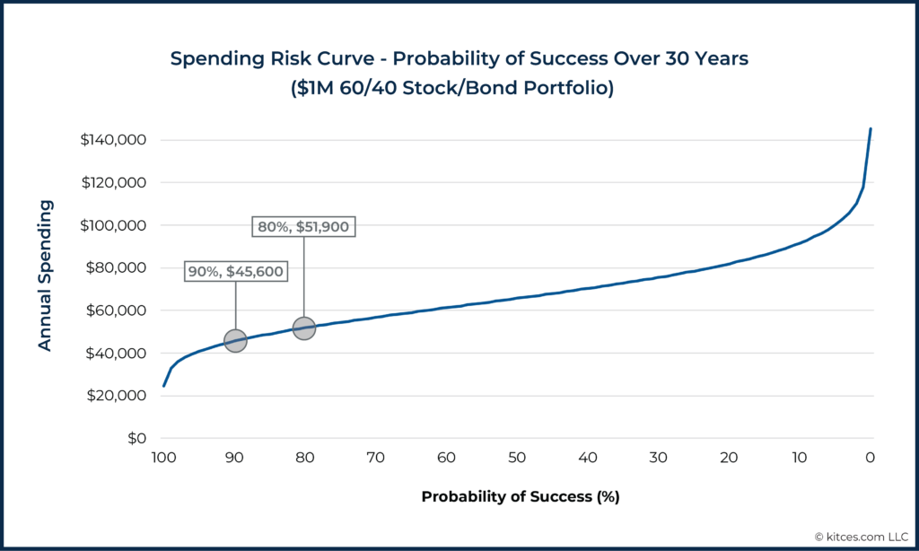
The curve below shows the level of annual withdrawals available at each probability of success, averaged across 100 runs of a 1,000-scenario Monte Carlo analysis.

Nerd Note:
It might seem odd to show the 100% probability-of-success outcome on the left-hand side of the x-axis and the 0% probability-of-success outcome on the right-hand side of the x-axis. We're doing that intentionally because we'll eventually be proposing the use of a "Spending Risk" measure (1 – Probability of Success) in lieu of "Probability of Success," and we simply wanted to maintain continuity in the visual presentation of the curves above.
This curve is useful because we can easily visualize the tradeoff between risk and spending (as withdrawals go up vertically, the probability of success goes down as we move to the right), a clarity that can help in evaluating tradeoffs in retirement income planning. This graphic tells us that a plan to withdraw $45,600/year (adjusted over time for inflation) from a $1 million 60/40 portfolio for 30 years has an estimated 90% probability of success, but that by accepting a lower, 80% probability of success, this household could withdraw $51,900/year – 14% more income in exchange for ten points of risk.
Moreover, there's a lot that we can quickly glean from the shape of such a curve for a given plan. For instance, the curve above also highlights just how dramatically spending falls off for those trying to achieve that last 10% in their probability of success – while going from 90% success to 80% increases spending by 14% from $45,600 to $51,900, moving from 90% to 100% success cuts spending down by more than 40% (!) to below $25,000/year given the shape of the income curve!
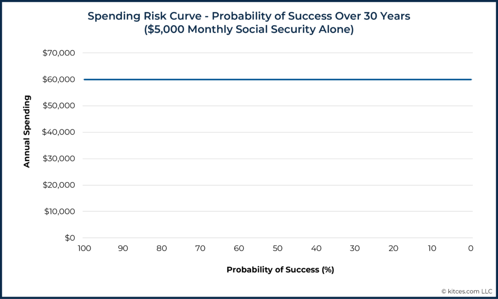
On the other hand, in the extreme example of someone who depends entirely on Social Security, or another guaranteed, inflation-protected source of income, the Spending Risk Curve will be flat. The example below shows the Spending Risk Curve for a family who receives $5,000/month in combined Social Security income.
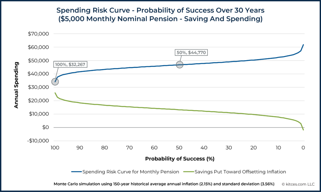
Another extreme case, shown below, is a household that depends entirely on a $5,000/month pension that is not adjusted for inflation. When there are no other savings available, a certain amount of the incoming cash flow will have to be saved in order to offset future inflation. As a result, the income curve shows that annual spending is under $45,000/year with a 50% probability of success, and must drop from a nominal $60,000/year down to only $32,267/year to sustain a 100% success rate.
While the first Spending Risk Curve we saw (illustrating a $1M 60/40 stock/bond portfolio), shown earlier, reflects the effects of sequence-of-returns risk for a household that depends entirely on portfolio withdrawals for its income, the nominal pension example, shown above, isolates inflation risk as much as possible (although the funds that are saved to offset future inflation are invested, so some sequence-of-returns risk still remains).
This figure helps highlight how much of the family's nominal paycheck would have to be saved in order to offset the potential impact of future inflation. As time goes on, the amount saved from the pension will go down, and the amount spent will go up. Eventually, as inflation accumulates, the household would switch from saving to an investment account to withdrawing from it in order to maintain their standard of living level.
Furthermore, the curves in the pension graph show a range of choices from which this family could choose: how much standard of living are they willing to give up in order to protect themselves from inflation risk? Or, conversely, how much inflation risk are they willing to accept in exchange for a higher current standard of living?
Replacing "Spending Risk" For "Probability Of Success" Can Help Clients Make More Rational Decisions
As we and many others have noted, framing risk using probability of success and failure (as in the graphs we've seen so far) can lead to misunderstanding of results, heightened perception of risk, and depression of standard of living. At the extreme left end of the curve above (i.e., at a probability of success of 100%), we see that this family would have to save ($60,000 – $32,267) ÷ $60,000 = 46% of their first year's pension payment into an investment account to be on track to offset inflation over the next 30 years. (As noted, the annual savings amount would be reduced over time as inflation adjustments increase the amount of nominal income that the family spends from the incoming cash flow.)
This extreme standard-of-living restriction would allow them to make up for the worst possible inflation experience in the simulation, but such a large inflation-offsetting fund is unlikely to be needed. In fact, it would only be needed if their 'sequence of inflation' is the worst considered in this model.
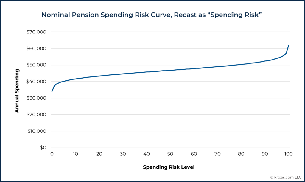
The graph below re-casts the nominal pension example's x-axis in the more neutral terms of "spending risk". Framed in this way, this information can help families make decisions about the income/risk tradeoff that are less tied to emotion.
For example, it is now clearer that a spending risk level of 50 is in the middle – the median, the "best guess" – of the curve. At this average risk level, this family would only have to save ($60,000 – $46,800) ÷ $60,000 = 22% of their first year's pension payment, allowing them to spend $46,800 ÷ $34,100 = 137% of what they could if they were to maintain a spending level at a risk of 0.
For some households, advisors may advise that taking median risk is worth it for this sort of increase in the standard of living. In other cases, advisors may not believe this is a good tradeoff to make. But the decision can be made from a more well-informed position. Notably, this does not necessarily mean that the advisor needs to show the Spending Risk Curve to the client. Similar to how advisors may understand an efficient frontier graphic, even if the visualization may not mean much to a client, the advisor can use a Spending Risk Curve as a visualization to better understand the range of options simulated for a client without needing to iterate through a guess-and-check process.
By moving away from the unrealistically binary success/failure paradigm and instead focusing on the gradual shift in risk as retirement income rises, this transition to the generic "Spending Risk" from the more technically-based measure of "Probability of Success" permits a conversation about what risk means, and how someone might adapt to changes in risk.
Typically, risks in retirement can be handled through adjustments to behavior. Moreover, this better addresses how the reality of "Probability of Success" does not accurately reflect one's outcomes in retirement if one takes a dynamic approach and makes adjustments in future spending. Notably, this visualization alone doesn't address the adjustment question, but we'll look at a more advanced series of curves plotted on a single chart later that can provide more of this insight within a risk-based guardrails framework.
Furthermore, this shift in terminology to "Spending Risk" (from probability of success) has the advantage of making spending-risk-curve visualizations more closely match the 'efficient frontier' graphics familiar from the investment management world, where the x-axis explicitly shows risk rising as we move from left to right and the y-axis measures the estimated reward for taking on additional risk and the costs of taking less risk.
Notably, talking about retirement spending risk in more general terms also aligns with the common practice of discussing investment risk in general terms. Many advisors will talk about investment risk in terms of being highly risky, highly conservative, or somewhere in between, but advisors don't generally talk about investment risk with clients primarily based on some technical measures of risk. Likewise, the "Spending Risk" framing shifts the focus more generally to the riskiness of a given level of spending rather than a technical measure of risk. Just as when discussing investment risk advisors may add context with specific measures of magnitude, such as measures of “drawdown”, spending risk curves can also help advisors develop specific, client-friendly measures of possible spending adjustments, as we’ll see below.
The Generalizability Of Spending Risk Curves
As the earlier Spending Risk Curve examples have shown, one powerful advantage of the risk curve visualization is that it can be applied to a huge range of situations. While we focused only on three fairly simple examples above, each example covered very different situations: plans funded 100% by portfolio withdrawals, 100% by Social Security, and 100% by a nominal pension.
In practice, though, the plans of real-world households are typically a mix of these and other factors, with differences in the timing of cash flows and withdrawals. But the risk curve, even for a realistically complex situation, would be no more difficult to interpret than these simple examples. Spending Risk Curves can be explored for households with mixes of ages, longevity expectations, investment portfolios, Social Security, and other cash flows, including flows with diverse inflation treatments and so on. The result will always be a single curve showing the amount of income available at each risk level.
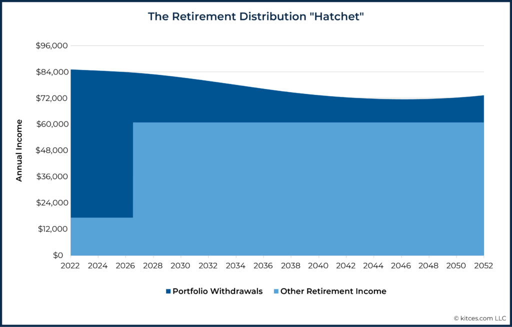
We've noted elsewhere that capturing all of this 'messiness' inherent in a given individual's financial plan is a major benefit of total risk-based guardrails versus withdrawal-rate-driven guardrails such as Guyton-Klinger's guardrails. Given the "Retirement Distribution Hatchet" that is typically observed in changing portfolio distribution rates (due to deferring Social Security [blade of the hatchet] and the Retirement Spending Smile that leads to a gradual decline in real spending [the handle of the hatchet]), approaches that use static withdrawal rate targets/assumptions are going to be of limited real-world value to retirees.
Notably, similar to how risk-based guardrails capture the reality of the Retirement Distribution Hatchet, the Spending Risk Curve does the same.
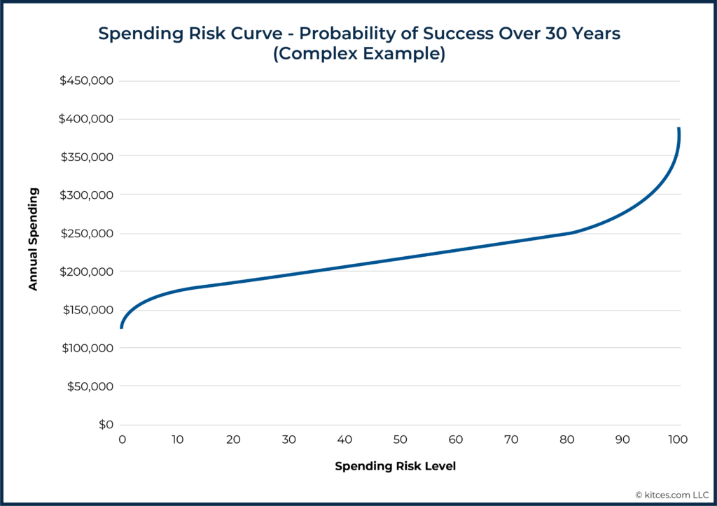
For example, the following curve corresponds to a plan to fund 30 years of ’smile’-shaped retirement spending from a $2 million 60/40 portfolio with the following income sources:
- $3,500/month Social Security (with $1,500 of this beginning in two years);
- $800/month single-life nominal pension; and
- $1,000/month in rental income with a projected 3% annual increase.
This plan includes a $500,000 legacy goal, in today’s dollars.
Note that because this example includes the retirement smile, we see current spending for each risk level, but the plan includes reductions in spending over time.
This ability of holistic risk measurement to capture complex situations is one of the primary reasons that holistic spending risk is better suited to dynamic income planning (that factors in a range of potential income sources) than more well-known systems that depend only on portfolio withdrawal rates. We’ll now turn to an example of how holistic Spending Risk Curves can help planners improve their dynamic income planning.
Risk Curves Move: Using Risk Curves To Illustrate Dynamic Income Planning
An important place where Spending Risk Curves can lead to insights for planners is in the area of dynamic income planning with total-risk guardrails. Spending Risk Curves can help explain visually how certain spending levels might be chosen and how risk-based guardrails can be set. They can also be used to illustrate what happens to risk over time as plans evolve.
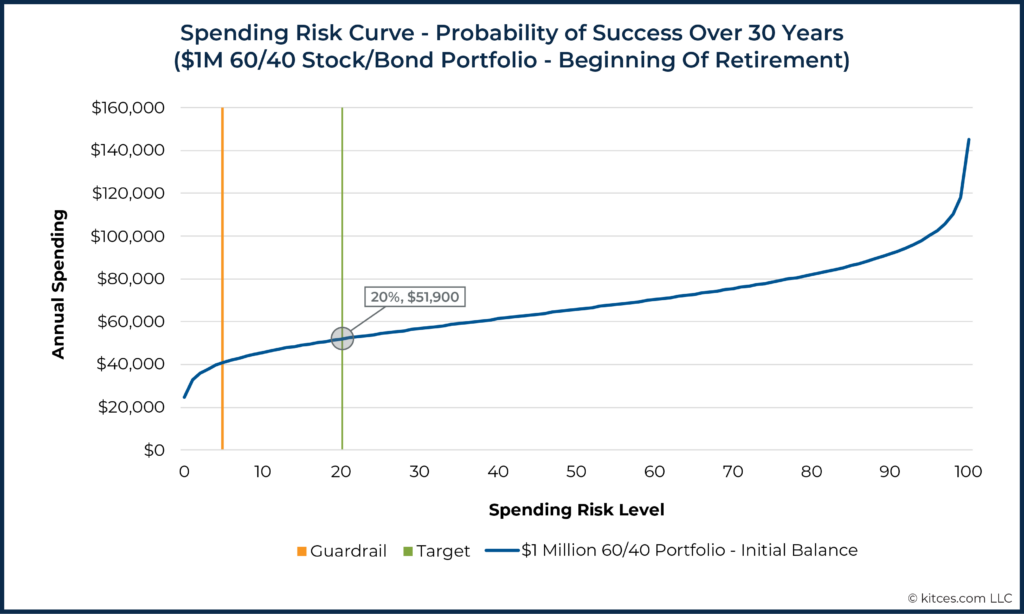
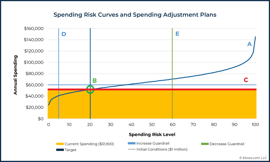
Imagine, for example, that an advisor recommends the example household with the $1 million 60/40 portfolio spend at a risk level of 20 (about $51,900/year, as illustrated below). To be clear, a risk level of 20 is not necessarily appropriate for everyone, but an advisor might arrive at this recommendation because they believe that, for this family, this choice provides a reasonable risk buffer. It is well below the ‘best guess’ level of 50, but is not anchored to the worst-case scenario in the analysis.
Dynamic planning for this situation would also involve setting a risk level below 20, at which this household would plan to increase its overall income. As the household continues to withdraw $51,900/year, and as the advisor monitors the evolving risk of this retirement income plan, the advisor will almost certainly find that the same spending level no longer corresponds to a risk level of 20.
Typically, the spending risk level will have shifted higher or lower, depending on portfolio performance, unexpected cash flow activity (e.g., larger or smaller withdrawals than were planned for), higher or lower inflation than expected, etc.
Let’s say this plan stipulates that if the risk that the household takes by continuing its spending ($51,900 in this example) ever reaches a risk level of 5, they will increase income back to the original risk level of 20. We might visualize this initial target income (green line) and income guardrail (orange line) as noted below.
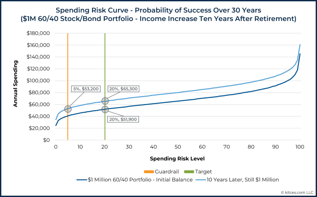
Ten years later, imagine the portfolio has had returns sufficient to counteract all withdrawals and still has a balance of $1 million. At this point, because the plan is now shorter, the Spending Risk Curve has shifted up. That’s because, all else being equal, a shorter plan will allow for more income than a longer plan at all risk levels.
The graph below shows both the original situation and the (higher) curve after ten years.
In reality, of course, differences across time are typically very complex, with changes not only in longevity expectations (and therefore plan length) but also in portfolio balance, inflation level, planned changes to spending needs (such as following the “retirement smile”), etc. In this example, we isolate the plan length for clarity.
We can see in the graph above that the original income of $51,900, which corresponded to a spending risk level of 20 when retirement began, is now below the spending risk guardrail of 5. If this household were spending at a risk level of 5, it would be spending $53,200.
In other words, risk has gone down substantially. When this happens, the plan calls for a return to the risk level of 20, which now holds an income of $65,300/year. In other words, this household can now enjoy 26% more income without taking on any more risk than they did at the beginning of their plan.

Nerd Note:
In a complete example, inflation would have to be accounted for explicitly. We’ve used constant figures here to avoid confusion. A $1 million portfolio after 10 years, assuming a 3% annual inflation rate, would be worth about $744,000 in the plan’s original dollars. A constant nominal income of $51,900 would be just $38,600, as measured with dollars from the plan’s beginning point. In practice, it is likely that this plan would have involved (several) inflation adjustments to this income in the intervening ten years to keep purchasing power relatively constant.
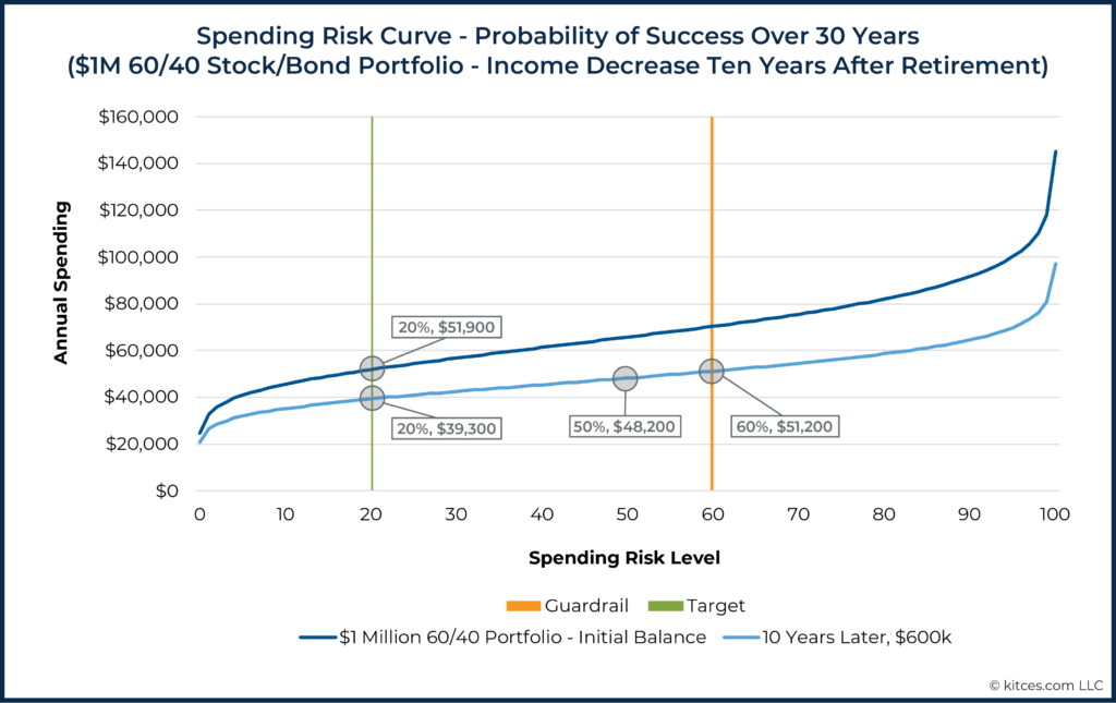
Total risk guardrails can, of course, also be set for income decreases. Let’s imagine this plan included a guardrail to reduce income if the risk level of the then-current spending ever reached a spending risk level of 60. Furthermore, imagine that after 10 years, the portfolio was worth not $1 million but $600,000.
In this situation, the risk curve will have shifted down, and the original income level of $51,900 now has a risk greater than 60. The graph below contains both the original Spending Risk Curve and the new, lower curve that reflects both a shorter plan length and a lower portfolio balance.
There are various ways a planner could choose to react to this situation. The advisor might choose to rip the band-aid off at this point and advise the client to return to a risk level of 20. However, a household might prefer not to take drastic evasive action in such a situation. After all, if the risk has increased to this extent (e.g., because of a recent bear market), the chances that risk will continue to rise could be lower than it was before (i.e., greater likelihood that the market will now recover after the bear market).
Perhaps the original ’risk buffer’ has done its job, and the household doesn’t need to refill the risk buffer completely. Instead, the plan could be to ‘tip-toe’ back down the risk curve – partway toward the original target risk.
For example, the household could reduce income to a risk level of 50, for a 7% reduction, or about 25% of the way between the upper guardrail (spending risk level 60) and the original risk target (spending risk level 20). If risk continues to rise, the household can continue to make further reductions. However, if risk reverses course, as happens in typical market cycles, they will not have over-corrected.
There is no one right way to react to hitting a guardrail, but this example explores some typical options that may match client preferences:
- Income Increases: When increasing income, it is typical that a household would want to move quickly and capture the additional possible standard of living. Furthermore, since a quick move up simply resets the original risk buffer, it is not actually taking the household to a higher risk level than they were comfortable with originally. Furthermore, if the risk has been going down, this means that the household has been living through relatively good times. A resetting of risk may feel reasonable and comfortable in this situation.
- Income Decreases: Households will typically not be as excited about large decreases in income. They may prefer a series of smaller reductions over time instead of making a single large decrease. Again, however, it is important to note that setting guardrails and plans for reacting to these guardrails is customizable, and there is no one-size-fits-all solution.
Advisors may wonder what risk levels are reasonable for setting guardrails. Again, there is no single right answer. However, the Spending Risk Curve does make explicit the fact that an income-decrease guardrail set below a risk level of 50 would be extremely low. If a household were to decrease income at a risk level below 50 (i.e., a probability of success above 50%), they would be reducing income while the chances that such a reduction would ever be needed are still below 50%! Recall that a risk level of 50 is the median. The analysis estimates that half the time we will not need a reduction, and half the time we will. Therefore, settings of 60, 70, or 80 are not as outlandish as they might seem for those who plan with probability of success.
Once a set of income targets, adjustment guardrails (based on holistic spending risk, as shown in the Spending Risk Curves discussed here), and adjustment plans have been established, an advisor can use risk curves to discover the portfolio changes that, over the short term, would lead to an income adjustment. To do this, we need to ask what portfolio balance would shift today’s curve enough that a guardrail would be crossed. Once those levels have been discovered, we can also calculate what the new income level would be (in dollar terms) after hitting a guardrail. (We'll go through an example below.)
In practice, calculation of Spending Risk Curves, estimated portfolio balances that would trigger an income adjustment, and the adjustment amount all require sophisticated computations that don’t lend themselves to back-of-the-napkin figuring. However, once this translation is complete, client communication can proceed using dollar amounts, a level of abstraction likely to be well understood.
Notably, the Spending Risk Curve itself is not sufficient for facilitating a full conversation around adjustments in retirement. For that, retirement income guardrails (i.e., the thresholds at which adjustments would be called for and the magnitude of those adjustments), as well as summaries of long-term retirement income experience (i.e., statistical summaries of the outcomes that retirees would have actually experienced had they used such strategies based on historical or other simulation), can be very helpful. In fact, as discussed in the next section, Spending Risk Curves can help explain how guardrails are set, but being able to illustrate the long-term experience of various strategies would require analysis beyond just Spending Risk Curves.
Spending Risk Curves And Client Communication
While Spending Risk Curves can be useful tools for conveying more technical aspects of a client’s financial situation, it is unlikely that they make for great client-facing visualizations. Rather, they serve as more valuable tools for communication between professionals or for an advisor’s own use when considering options and developing proposals.
Of course, that doesn’t mean that the understanding and use of Spending Risk Curves aren’t ultimately beneficial to clients – similar to how most patients will not be able to read an EKG despite the vital importance of understanding a readout to their health – but it is worth noting that at least the more technical concepts discussed here are probably more for professionals and less for clients.
Given how much there is still to learn about how to effectively use risk-based guardrails, tools for facilitating this type of communication among professionals will likely be very valuable as advisors and researchers work to expand our understanding of these types of strategies.
Ultimately, conveying risk-based guardrails to clients in terms of dollars is still likely the most useful way to convey plan results. For example, rather than communicating the dynamic income plan we just reviewed using risk curves, clients would likely have a much higher understanding of their plan if it is communicated as follows:
Mr. and Mrs. Client, we’ve determined that you have $1 million available to fund your retirement. After analyzing your preferences and needs, I recommend you invest this in a 60/40 stock/bond portfolio. We’ve determined that you can withdraw about $51,900/year from this portfolio.
We’ll adjust that amount periodically over time to make sure you don’t lose purchasing power due to inflation. We’ll also be monitoring this plan over time and will let you know if circumstances have changed enough for the better that you can safely withdraw more than this or if they’ve deteriorated enough that it’s time to tighten your belts.
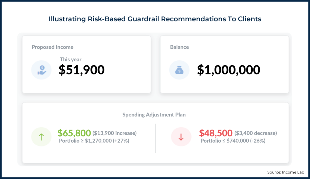
In particular, over the short term, we estimate that if your portfolio were to grow by 27%, you would be able to take $13,900 more per year. Over the short term, your portfolio would have to reach about $740,000 for us to suggest a reduction in income to about $48,500/year.
The dollar amounts in this script reflect the risk-based guardrails this advisor has chosen as appropriate risk levels for their client. The portfolio balances are the balances that would result in risk being high enough or low enough for a change to be triggered, and the new income amounts are the values to which this family would move if these guardrails were to be hit.
This information could be expressed as a dollar-based short-term income adjustment plan:
Building Spending Adjustment Plans From Spending Curve Illustrations
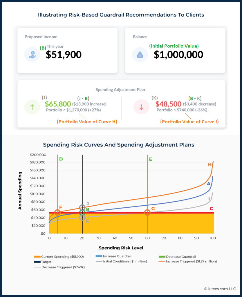
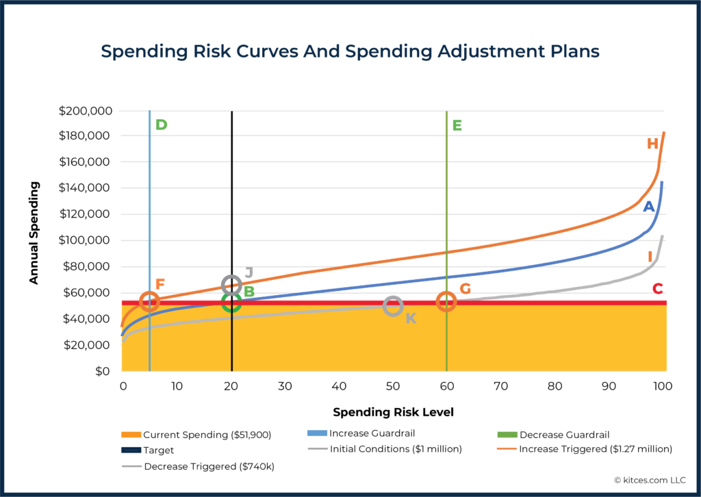
Getting to dollar values included in the risk-based guardrails discussion above from the Spending Risk Curve is a slightly more complex challenge than we’ve looked at so far. Specifically, it is going to require the use of three different Spending Risk Curves: one at the existing portfolio value, a second that reflects a lower portfolio value (which, if it were reached, would trigger a decrease in spending), and a third that reflects a higher portfolio value (which, if it were achieved, would trigger a spending increase).
To break this down step-by-step, let’s first consider the now-familiar spending risk curve corresponding to withdrawals from a $1,000,000 initial portfolio value, labeled “A”, below.
The initial annual income of $51,900 (corresponding to the target risk level of 20 ["B"]) is reflected by the horizontal line labeled “C”. Also notable are Line D, reflecting the guardrail that would trigger an increase in spending (spending risk = 5) and Line E, reflecting the guardrail that would trigger a spending decrease (spending risk = 60).
Next, consider two additional Spending Risk Curves:
- A higher curve (labeled “H” below) that would trigger an income increase: This curve reflects a higher portfolio balance of $1.27 million – exactly high enough to shift the spending risk curve up such that it crosses line C at its intersection with guardrail D.
- A lower curve (labeled “I“ below) that would trigger an income decrease: This curve reflects a lower portfolio balance of $740,000 – exactly low enough to shift the spending risk curve down such that it crosses line C at its intersection with guardrail E.
We identify these curves using software that enables us to solve for the portfolio values represented by each curve (rather than needing to guess and check).
Finally, once we’ve identified Curves I and H, then we can identify Points J and K, respectively, that correspond to the new spending levels that would be adopted if a spending increase (to $65,800) or decrease (to $48,500) were to be triggered in the short-term. These are the dollar values that the planner can present to the client, as shown in the "Spending Adjustment Plan" below:
Somewhat artificially, this example includes only portfolio withdrawals. In practice, plans are often much more complex, and both the guardrail values and plans for adjusting spending when guardrails are hit could be quite different from in this example.
Notably, the process we’ve laid out here would be quite cumbersome to try and go through each time an advisor is putting together a plan or reviewing the progress of a plan with clients. However, technology can (and should!) take care of a lot of this heavy lifting. The Spending Risk Curve is useful as a quick visualization to understand the general dynamics of a client’s plan at a given spending level – much like the Morningstar Style Box gives a nice overview of the general composition of a mutual fund portfolio – even though both are certainly missing a lot of details that can be important to a more refined analysis.
But once advisors understand the conceptual advantages risk-based guardrails (over both traditional success-and-failure Monte Carlo simulation and distribution-rate-based guardrails) and the general framework for implementing such guardrails, then technology can do the heavy lifting to deliver a total risk-based guardrails plan that can be communicated to a client as simply as the risk-based guardrails summary report above.
The Spending Risk Curve can remain a useful tool for professionals – much like probability of success is a useful concept when properly understood – even if it doesn’t need to be the focal point for a conversation with a client.
Just as a phlebotomist has an advanced set of technical terminology and shorthand for talking with other medical professionals (but doesn’t use that same language to explain test results to a patient), financial planners can still make use of technical abstractions that don’t need to be reported to clients on a regular basis. When crafting client communication, it’s important to choose the level of abstraction that is most likely to lead to an understanding of the plan.
Accordingly, Spending Risk Curves are highly versatile tools that can help advisors better understand a vast range of variables relevant to their clients so that they can more easily design relevant and suitable financial plans for them. And finding ways to communicate those plans to clients in ways that they will easily understand is even more important. Because when clients can actually understand how their plans translate into real dollars and how guardrails can safeguard against overspending (and allow for more spending when the portfolio does well) – instead of trying to decipher abstract probability-of-success or Spending Risk Curves – they will be better equipped to actually accept and follow their plans!




Interesting thoughts. I love the concept of simplified income distributions to clients. My question would be how ‘simple’ is this when you are explaining it to clients? I was getting a bit confused when looking at the carts, so I’m sure the math is there but how do you make it more simple for the client?
The other thought, you mention having a 27% return in the short term. Man, that seems a bit aggressive to be setting those expectations with the client of the possibility of such a high return in a short period. Do you think this sets you up for failure when they market does perform to that level? Or what am I missing here?
Random thoughts from the frozen north, and thank you for sharing!
I think we can still consider 5 years short term- it’s just the last 5 years have been insane so it seems longer! 🙂 Think about it like this- since 2017 many retirees probably haven’t moved their income much, yet 60/40 has done pretty well, and 60/40 using bond alternative tied to S&P really well. Easily 27%. The next 5 years i think will be different, but the point of this i think is that it gives a mathematical, repeatable, non- emotional process. Not shooting from the hip and that’s what people pay us for.
I do agree that I would see 5 years as a “short term.” As I mentioned above, I would also be updating these guardrails during an annual plan update — so they’re not going to stay completely static over the 5 year time period — but I’m generally not suggesting that hitting a guardrail is something that I expect to happen within the next 12 months.
And I 100% agree on just looking for a, “mathematical, repeatable, non- emotional process”!
The intention here is that the math and analytics are entirely behind the scenes. Here’s an example of what I would actually show a client straight out of a recent plan I put together:
https://uploads.disquscdn.com/images/7a6a2aeb0f4f33896047aa3986637de1e300e30e00d4857fec4fc08b4441ae17.png
The guardrails in the image here do capture all of the complexities described in the charts above, but ultimately get boiled down to a simple plan for action.
Regarding the 27%… I personally don’t talk about the upper guardrail in terms of performance (or even percentage growth required to get there). I keep that simple and just say something like, “If your portfolio grows to X, you can increase your spending by Y.”
That’s also not meant to be a short-term target, per se, but just simply the threshold that would have to be hit before I would take a look at updating spending. That could happen 3 years from now, 5 years from now, etc. I do update the guardrail numbers annually, so there’s some drift over time as all of the underlying factors change, but my real intent there is just to manage expectations about when an adjustment may be called for.
Can I ask what you use to derive these numbers for your guardrails? Seems like it varies based on age and withdrawal rate pretty heavily. Until this article, I’ve only seen people come up with proprietary excel level guardrails.
Didn’t even know IncomeLab existed. But given the integrations available with them, I’m interested in another way of coming up with it.
I used Income Lab to produce the guardrails in the image above. Total risk guardrails will vary considerably based on the plan inputs — that’s actually one of the virtues of the total risk guardrails approach. Additionally, the guardrails will vary considerably based on what risk settings you use. In the example above I was using a pretty low risk setting, which is why you see (a) the income is pretty modest relative to the portfolio and their SS income (obviously the full details aren’t shown here), and (b) the upper guardrail is significantly closer to the suggested spending level than the lower guardrail. For a retiree who values a higher initial income, a more balanced risk setting may be the better solution.
This would be prefect if it were integrated into MoneyGuidePro.