Executive Summary
The so-called “4% rule” safe withdrawal rate is one of the most popular ways to talk about the sustainability of retirement income, yet ironically no financial planning software solution has ever been created to illustrate the safe withdrawal rate approach. In part, that’s simply because most financial planners jump straight to the stage of collecting detailed client spending goals, and illustrating their actual financial plan’s probability of success in retirement. And in part, it’s because the original safe withdrawal rate research used very simple assumptions – from a two-asset-class portfolio, to ignoring the impact of fees, and a fixed 30-year time horizon – which just doesn’t hold for a wide swath of retirees.
To fill the void, though, two new software solutions have recently emerged for financial advisors, specifically to illustrate the safe withdrawal rate approach, and be able to model the impact of varying assumptions, from a wider range of asset classes, to the impact of investment expense ratios and advisory fees, and time horizons that may be longer or shorter than 30 years.
The first, dubbed the “Big Picture App”, draws on available historical investment returns from the Center for Research in Security Prices (CRSP) and Global Financial Data (GFD), to show how ongoing withdrawals would have sustained (or not) for any time horizon (and any ongoing expense ratio) the advisor wishes to assume. The second solution, called “Timeline”, goes further, and can even illustrate the impact of various dynamic spending strategies, from Guyton’s “Guardrails” approach, to the Kitces “Ratcheting” rule for retirement spending, and show how much wealth is often left over at the end of the 4% rule time horizon.
Ultimately, software like Timeline and Big Picture won’t realistically replace full-blown financial planning software to analyze the details of an individual client’s situation, but can be a powerful solution to facilitate client conversations around what is a “sustainable” withdrawal rate (or not), the consequences of sequence of return risk, and the impact that diversification and managing investment costs can have on retirement outcomes. The software may be especially for beginning to educate prospective retirees, or outright prospects who haven’t yet engaged the advisor for a full financial plan in the first place.
But the bottom line is simply to recognize that the safe withdrawal rates approach can actually be adapted to far more client-specific circumstances than just assuming a 2-asset class portfolio and a 30-year time horizon (with no investment costs) for every client. And now the software exists to actually illustrate it, and have productive conversations with prospects and clients about sustainable retirement income!
Safe Withdrawal Rates As A Retirement Income Strategy
With the advent of the personal computer and spreadsheets in the 1980s and 1990s, it was suddenly possible for the average investor (or advisor) to “do the math” and calculate how much money could be spent from a retirement portfolio. In fact, it was a relatively simple process; just assume a retirement time horizon, a reasonable growth rate that could be achieved over that time horizon, and calculate what spending would amortize the principle over the retirement years. More sophisticated financial planning software might have done a more detailed cash flow analysis of the spending withdrawals in each and every year of retirement – including the impact of taxes, health and long-term care costs, and collecting the proceeds of life insurance after the death of the first spouse – but the basic gist was still the same: project long-term returns over a long-term time horizon, and see what worked.
It wasn’t until financial planner Bill Bengen published his seminal article, “Determining Withdrawal Rates Using Historical Data” in 1994, that the industry collectively recognized that it wasn’t enough to project a long-term return over a long-term time horizon. Once retirement distributions began, the sequence of the returns in retirement mattered, too; if there was an extended decade of mediocre returns, followed by a favorable recovery, the long-term return might still average out, but the retiree could still deplete their portfolio during the intervening (bad) years.
Bengen illustrated this by using historical data to look at what initial withdrawal rate (with spending adjusted each subsequent year for inflation) would have worked for any particular 30-year retirement time horizon in history. Which revealed that while long-term returns might allow an initial withdrawal rate as high as about 6.6%, in reality using a 6.6% initial withdrawal rate would fail almost half the time, when either long-term returns came in lower, or an unfavorable sequence occurred. If you really wanted to pick a “safe” withdrawal rate that had never failed in history, you had to take an initial withdrawal rate as low as 4%. And thus, the “4% rule” was born.
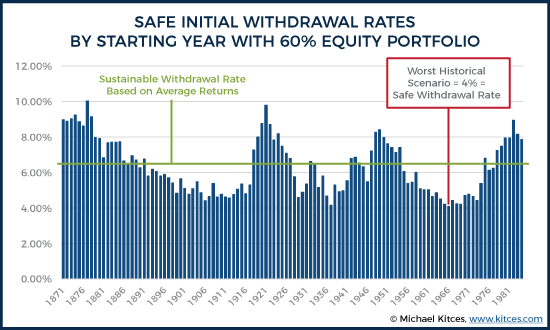
While Bengen’s research was a breakthrough at the time, it was still very limited in practical application. The original analysis simply assumed a two-asset-class portfolio of large-cap stocks and intermediate government bonds (because that data was easily available at the time from Ibbotson). It was built around the common, but certainly not universal, assumption of a 30-year retirement time horizon. There was no consideration for expense ratios of the underlying investments, or advisory fees. Spending was always assumed to adjust for inflation, but included no other spending changes based on varying goals or changing needs.
Fortunately, the reality is that all of those details, and more, have been studied in more than 20 years of subsequent studies since Bengen’s original research, making it possible to adapt the safe withdrawal rate research to individual client circumstances. However, there’s never been any way to illustrate those alternative assumptions, as even the best financial planning software is still built around straight-line assumptions and Monte Carlo analysis, and perhaps demonstrating the benefits of particular financial services products, but nothing that directly explains to clients the role of sequence of return risk, nor shows how changing elements of the plan can ameliorate that sequence risk.
Until now, as in the past year, two new software solutions for advisors have come forth, specifically to help illustrate safe withdrawal rate strategies, and more generally to illustrate how the sequence of returns can impact the sustainability of retirement distributions.
The Big Picture App by Investments Illustrated
The first recent new software solution to illustrate safe withdrawal rate strategies is called the Big Picture App. It was created by Investments Illustrated, which creates the popular “Big Picture” chart that shows the historical growth of various asset classes using CRSP data.
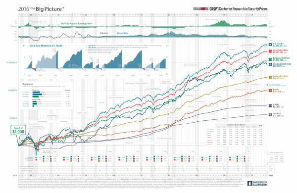
Using the available historical data going back to the 1920, Investments Illustrated took the various return sequences, and created an “app” (software that can be loaded on a desktop, laptop, or tablet, via a web browser) that would allow financial advisors to illustrate how ongoing withdrawals would impact a portfolio, given various historical sequences of returns. In other words, a tool that could reproduce the safe withdrawal rate research, but using a wider range of historical data, and more modern software to show and explain it to clients.
Thus, for instance, if a prospective retiree had a $1,000,000 portfolio and an assumed 30-year retirement time horizon, the Big Picture App can show clients the initial withdrawal rate that would have worked for any particular rolling 30-year period in history (and in fact, unlike most safe withdrawal rate studies that used annual data, Big Picture uses rolling monthly returns for analysis and illustration!).
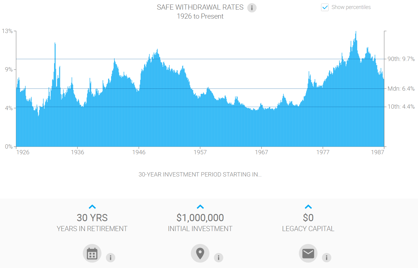
Notably, the inputs to the Big Picture App are adjustable. Clicking on any of the core inputs – time horizon, initial investment, or legacy goal – pops up a slider or number pad that advisors can use to adjust the assumptions.
In addition, portfolio allocation assumptions are also fairly flexible. Using the available data from the Center for Research in Security Prices (CRSP), Big Picture allows the advisor to select from asset classes including US Large Cap, Mid Cap, Small Cap, and Micro Cap stocks. Additional asset classes including 5-year and 10-year government bonds, T-bills, Gold, and a “global bonds” and International ex-US stock allocation, are also included, with total return information drawn from Global Financial Data.
The advisor can allocate as desired amongst all of these asset classes to create portfolios, although notably, there’s no way to dynamically adjust a portfolio and see how the changes impact the portfolio. Instead, you have to open the portfolio allocation screen, make changes, and then go back and see the outcome and whether it improved or not. But you can save allocations you like/use for future reference and easy access later.
And while the impact of portfolio changes can’t be viewed on the fly, Big Picture does include a simple output screen that shows a side-by-side comparison of the outcomes of various (saved) portfolio, along with “default” conservative (20/80), balanced (50/50), and aggressive (80/20) portfolio allocations. And the outcomes can be evaluated for any range of time horizon, starting and ending capital goals, and initial withdrawal rates, which are entered directly on the comparison screen. An additional module to be released soon will also show how long the portfolio lasts – and what year it falls short – in the various alternative scenarios that result in a shortfall.
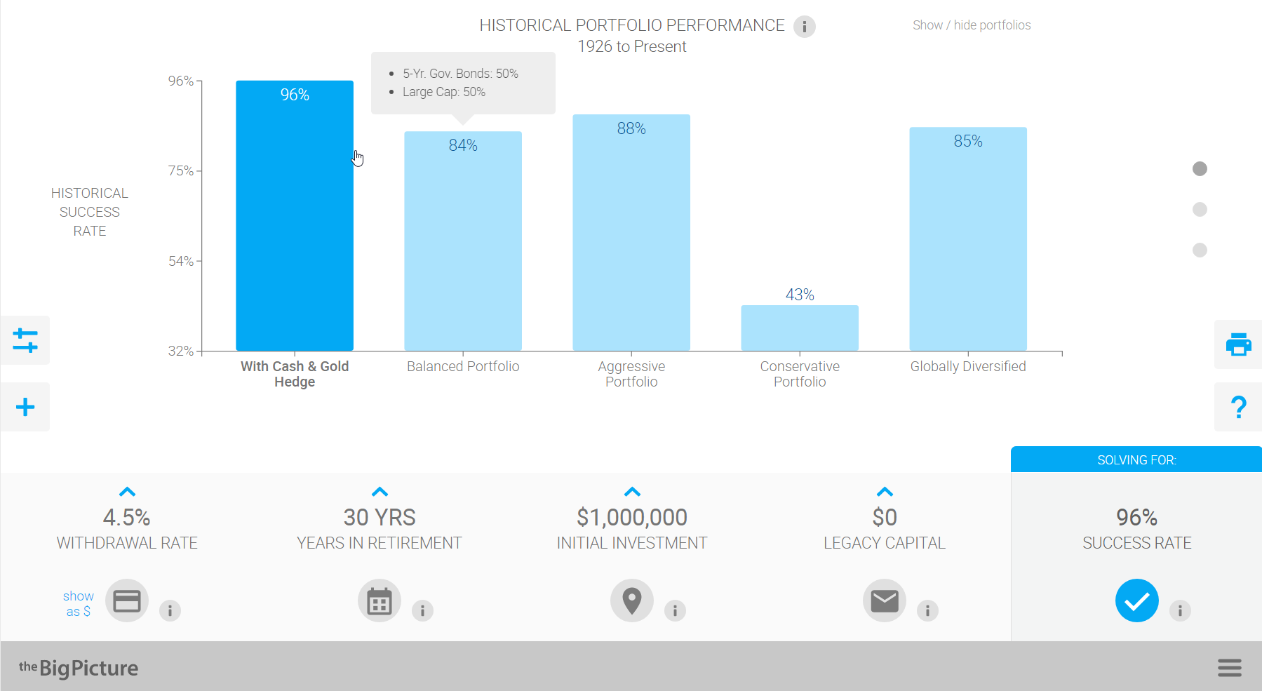
The Big Picture App also has an output screen to specifically illustrate the impact of fees, and how the historical success rate is reduced by fees (though it’s not possible to show the direct impact on the safe withdrawal rate itself, just the success rates). Alternatively, one section of the input area allows the advisor to simply apply a flat expense ratio and/or advisory fee that would apply across all scenarios and analyses.
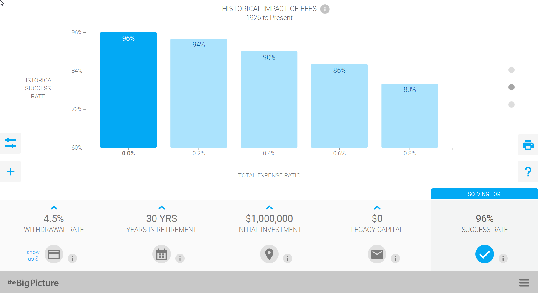
Another unique aspect of the Big Picture App is that the tool can be used to illustrate the efficacy of pre-retirement savings strategies as well, illustrating an assumed pre-retirement savings rate (based on a certain pre-retirement income), and then projecting the likelihood of achieving a certain targeted retirement nest egg amount by the planned retirement date. Although notably, the software doesn’t link together the pre-retirement accumulation projections and the retirement withdrawal sequence itself into a continuous safe savings rate sequence illustration (which Pfau has previously shown in his “Safe Savings Rate” research is actually much more stable than either the standalone success rate for the accumulation and distribution phases, given that early retirement bear markets are often preceded by pre-retirement bull markets, and vice versa). Though the company is currently working on deepening their safe savings rates illustration capabilities.
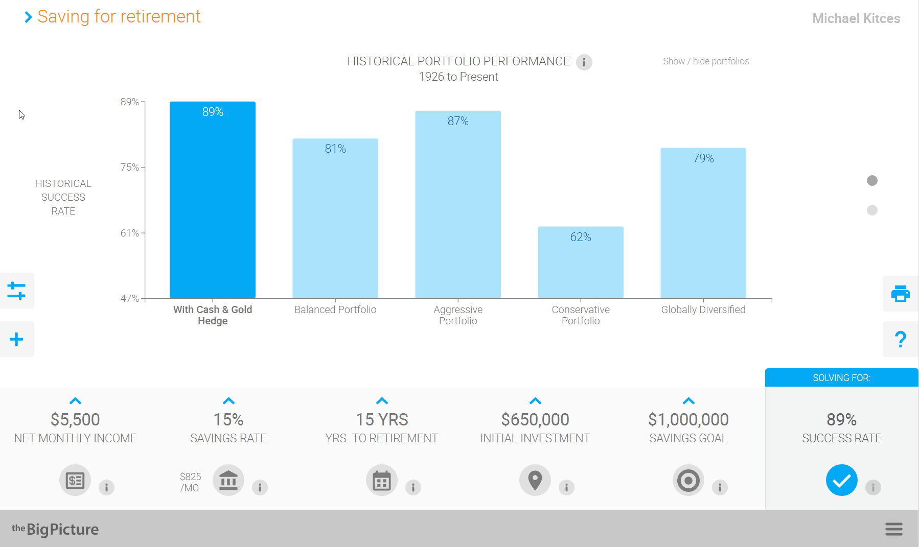
In addition, the Big Picture App includes a number of “basic” educational tools to illustrate important investing principles, drawing from their Investments Illustrated roots, including a handy graphic directly in the software itself of how various asset classes have grown over the past 90+ years, how much it would have taken to invest at the beginning to accumulate $1M in current assets over that time period, and a helpful visual of just how dramatically bull markets out-compound bear markets over time.

For advisors who are interested, the Big Picture App charges $360/year (payable annually) for the software, with a 14-day Free Trial period (no credit card required until the end of the free trial).
The Timeline App
The Timeline App was produced by Abraham Okusanya of FinalytiQ in the UK. FinalytiQ provides a range of research services for UK financial advisors, and runs an annual event called the “Science Of Retirement” conference.
As someone who has covered the retirement research, including the safe withdrawal rate studies, from the UK perspective, Okusanya created a web-based safe withdrawal rate calculator app to replicate the research using UK data… and has now added in US data to market the solution to US financial advisors as well, with a tool called Timeline.
Similar to the Big Picture App, Timeline provides advisors the ability to enter basic client information – age and life expectancy (for time horizon), an initial balance, and a target income level – and then shows how the maximum sustainable withdrawal rate for rolling 30-year periods would have compared.
Thus, for instance, a prospective retiree who is retiring with $1M and plans to spend $40,000/year adjusted for inflation (a 4% withdrawal rate), can see how the SWR in any particular 30-year period would have compared to that targeted income goal.
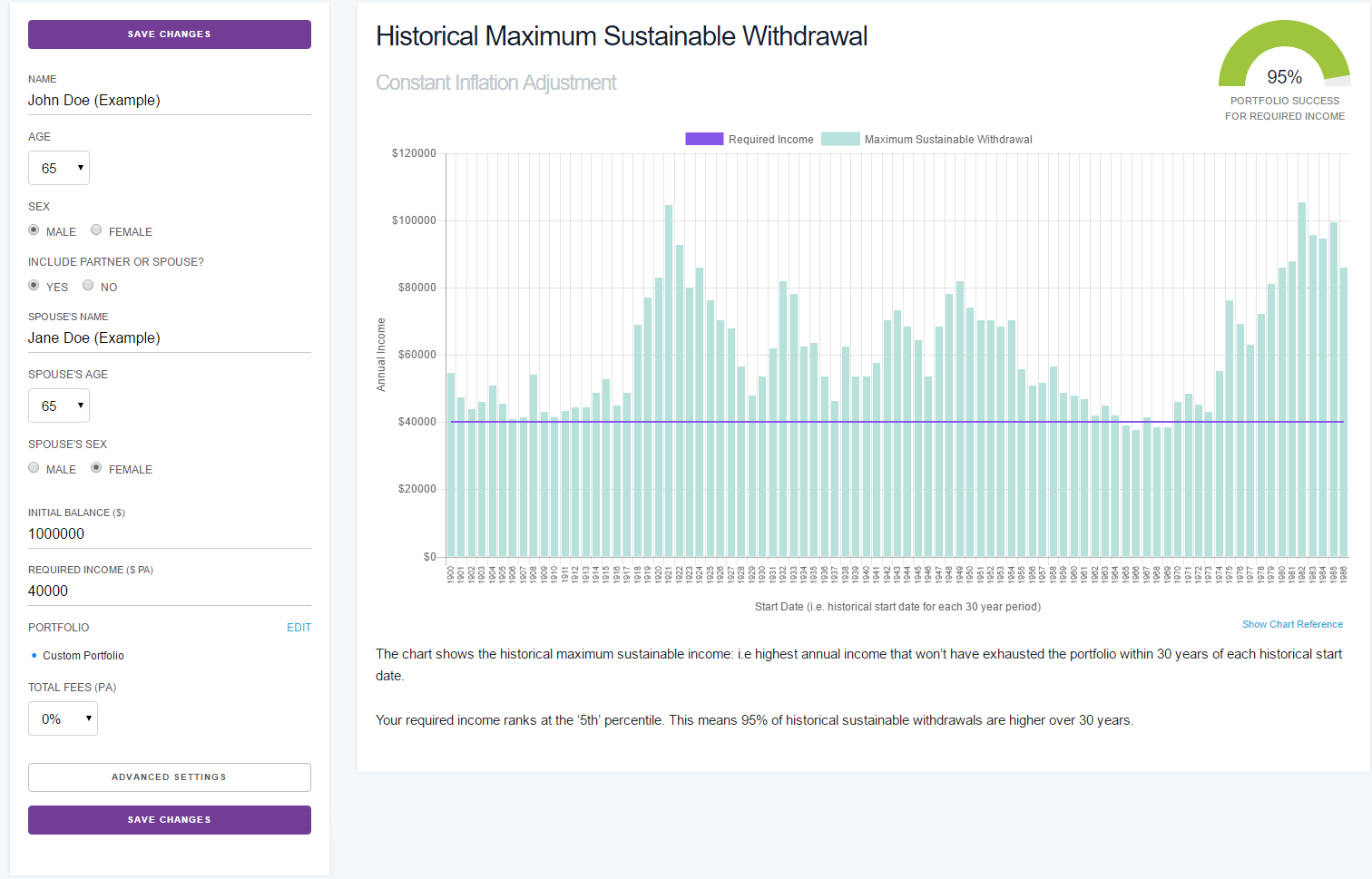
Notably, Timeline App actually shows that the safe withdrawal rate for a 30-year time period is slightly lower than 4% (it “only” has a 95% probability of success), a difference that is due to the underlying data sources. As while the Big Picture App uses CRSP and GFD data, and the original Bengen research used Ibbotson SBBI Yearbook data, Timeline uses the Dimson, Marsh, and Stanton (DMS) global return data that dates back to 1900.
The DMS data set includes returns for almost two dozen different countries for the past century, including equity, government bond, and inflation data. In the context of the US in particular, the data is based on CRSP returns for the NYSE from 1926 to 1961, uses CRSP data for the NYSE, American, and Nasdaq stocks from 1962 to 1970, and then relies on the Dow Jones Wilshire 5000 index since 1971. Bond return data is based on the Ibbotson long-term government bond index.
Given the particular stock and bond turmoil of rising rates starting in the mid-to-late 1960s, and the 1970s bear market, the use of the Wilshire total market index (with a heavier weighting to small caps, which were ravaged in the late 1960s and early 1970s), and the longer-term bond data (particularly ravaged with the rising rates of the 1970s), results in a slightly-lower-than-4% sustainable withdrawal rate for retirees starting in the 1966 to 1969 time window. (For a 60/40 portfolio using the data in Timeline, the safe withdrawal rate bottoms out at 3.75%.)
Similar to the Big Picture App, Timeline allows advisors some flexibility to customize portfolio allocations, although the choices are fewer – limited to equities (DMS data noted above), bonds (DMS using Ibbotson long-term government bond data), cash (using T-Bill returns), along with Global Equity and Global Bond allocation choices (using a range of DMS international return data). And while portfolios can be customized, the custom portfolio options cannot be saved, and have to be re-entered each time. (Though default allocations of ‘Cautious’ (30/70), Balanced (50/50), and Aggressive (70/30) are programmed in as standard, and Timeline is working on both adding Ibbotson SBBI and GFD datasets, and the ability to save custom portfolios.)
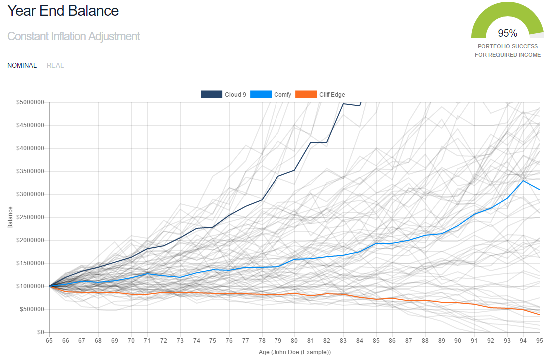
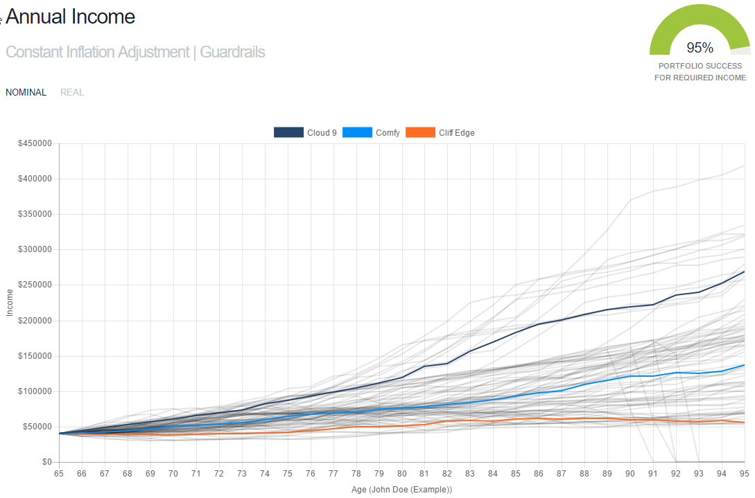
A unique feature of Timeline, though, is that it’s possible to show the wealth path of each of the rolling 30-year (or whatever time horizon) periods, and how much money is left at the end of each. Thus, clients can see that a scenario with a 60/40 portfolio that succeeds only 95% of the time, still never actually depletes until age 91 at the earliest. The results also specifically highlight the path of the 10th percentile (“Cliff Edge”), the Median (“Comfy”), and the 90th percentile most favorable results (“Cloud 9”).
As the sample results show below, even over “just” 30 years, a 4% initial withdrawal rate produces an incredibly wide range of outcomes, with at least half the outcomes finishing with almost triple the starting account balance!
Another unique feature of Timeline is its “Advanced Settings” feature, which allows advisors to illustrate the impact of either Jon Guyton’s “Guardrails” decision-rules approach – where over the first 15 years of retirement, spending is decreased if the current withdrawal rate drifts too high (spending is outpacing portfolio growth), and is boosted if the current withdrawal drifts too low (the portfolio’s growth is outpacing spending). Alternatively, Timeline also illustrates a “ratcheting rule” – as first researched here on the Nerd’s Eye View blog – where baseline retirement spending starts out conservative, but is increased once the portfolio gets at least 50% ahead of its starting point (and continues to be increased every 3 years it remains that far ahead).
Advisors can control both the Ratchet threshold, and the magnitude of the spending changes (e.g., 5% increase, 10% increase, etc.) when the threshold is reached, and with the Guardrails can set when the Prosperity and Capital Preservation rules are reached, and the magnitude of the spending adjustments to get back on track. Results can then be viewed on an “Annual Income” illustration screen in Timeline, which shows the various retirement income paths that would occur with the Guardrail or Ratcheting strategies.
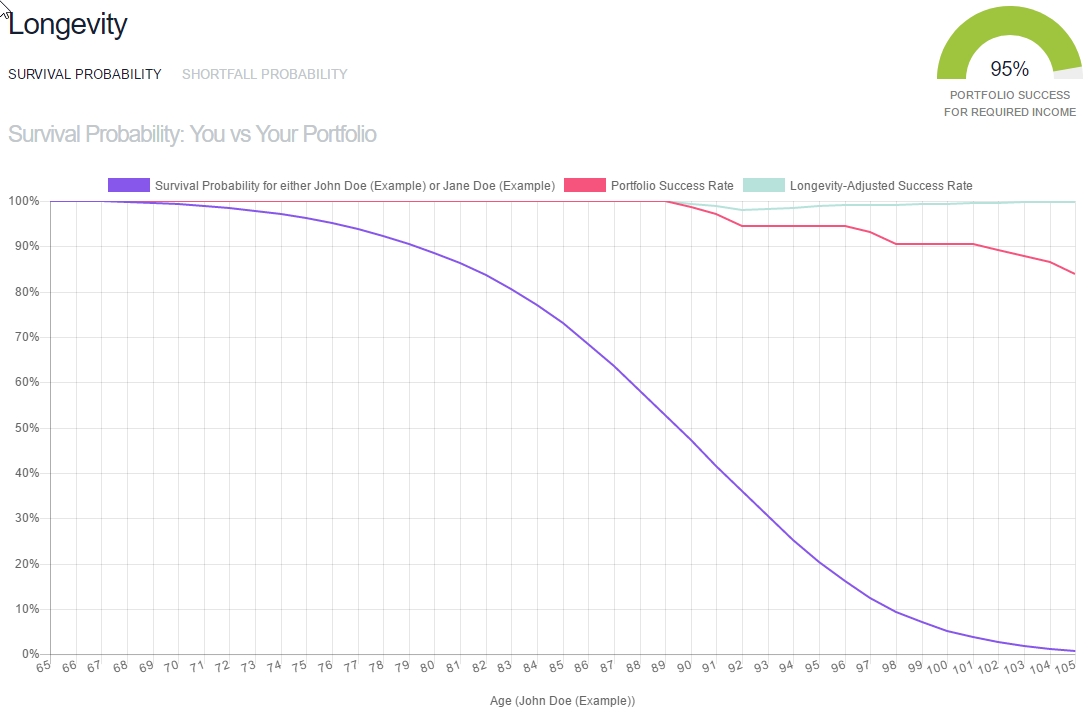
Notably, one important caveat of the safe withdrawal rate approach is that it cannot hedge against the risk that a retiree outlives his/her life expectancy. Thus why it’s common to illustrate 30-year time periods for the safe withdrawal rate, even though the reality is that it’s not very probable that both or even one member of the couple will actually live – without any reductions in spending – until age 95. In other words, even if there’s a 95% probability of success, the “other” 5% of failures that don’t begin until age 91 also might not matter… until/unless the retiree actually lives to age 91!
Accordingly, Timeline also provides a longevity illustrator, that shows the portfolio’s success rate over time (in this case, 100% survival rate until age 91), and the (individual or couple’s) probability of surviving that long in the first place (based on Social Security Cohort Life Tables, plus a positive adjustment for anticipated future improvements on survival rates). After accounting for mortality, while the portfolio’s success rate does fall below 100% at age 91, the couple’s probability of being alive at age 91 is barely 40%, which means the joint probability of success – the odds that the portfolio actually does still have enough, or that the couple didn’t live long enough to deplete anyway – is still 99%!
In fact, even though there’s only an 87% chance the portfolio lasts 35 years to age 99, since there’s only a 7% chance the couple survivals to age 99 in the first place, there’s effectively only a 7% chance that the other 13% of failures even matter… which means there’s still overall a 99% longevity-adjusted success rate!
The Timeline App is available at a price of $499/year (or a higher $49/month for those who prefer to pay monthly with a shorter commitment), and offers a 7-day free trial (credit card required at sign-up, cancel within 7 days). For multiple advisor licenses (i.e., 2 to 5 advisors), pricing is discounted to just $799/year for the firm, with enterprise pricing available for larger advisory firms.
Comparing Timeline, Big Picture App, and Financial Planning Software
Ultimately, selecting between Timeline versus Big Picture App will likely be driven by features, with Big Picture providing more asset class flexibility and a pre-retirement savings illustrator, while Timeline can uniquely illustrate more flexible spending strategies (i.e., Guardrails and Ratcheting) and has more sophisticated illustration tools to show the impact of longevity and how much wealth accumulates in the non-failure scenarios (which is powerful to show how “conservative” the safe withdrawal rate approach actually is).
Of course, neither can function (or are they intended to function) as full-blown financial planning software. Neither tool can integrate other income sources like Social Security or pensions or annuities, nor illustrate “uneven” cash flows (e.g., the retiree who wishes to spend more in early retirement, then sells their vacation home and/or downsize their primary home in their 70s, and then later taps a reverse mortgage). Nor can the software illustrate the impact of long-term care insurance, or even just the tendency for real spending to decline in a retiree’s 70s and 80s (though Timeline does illustrate other versions of inflation-capping strategies drawn from the Guyton research, and plans to add other decreasing-real-spending trajectories in the future). And none of the tools account for the impact of income taxes.
As a result, Timeline and Big Picture are better viewed as a mechanism to teach and illustrate safe withdrawal rates, the sustainability of (steady) retirement withdrawals in the face of various market return sequences, and the impact of asset allocation (and in the case of Timeline, dynamic spending strategies) on the sustainability of portfolio distributions. In other words, they can set the groundwork for initial client education about sequence of return risk and its consequences, or as a conversation tool with a prospect (or prospective retiree), which can then be subsequently expanded upon into a full-blown financial plan with the client’s specific and detailed circumstances.
Alternatively, either of the tools might someday be incorporated into existing financial planning software, perhaps as a connected module in the eMoney Advisor or Envestnet Logix dashboards, as a prospect engagement tool integrated with Riskalyze, or simply acquired and rolled directly into the other existing financial planning software solutions. Given the overall popularity of safe withdrawal rates, at least as a discussion point with clients, it remains shocking that no financial planning software has even been built to illustrate the concept as simply and easily as these tools do!
But the bottom line is that for those who have been looking for a way to illustrate and explain safe withdrawal rates and sequence of return risk, test the impact of fees and asset allocation on retirement sustainability, and illustrate the benefits of more dynamic spending strategies – as a lead-in to the full financial plan, or perhaps an alternative to it for those with “simpler” and more straightforward retirement scenarios – solutions like Timeline or Big Picture are finally available to fill the void! And both are working on new capabilities that should make them ever more robust illustration and educational tools over time!
So what do you think? Would a standalone “safe withdrawal rate” illustration tool be useful for doing financial planning? Would you use it as an educational or explanatory tool for prospective retirees and then move on to a full financial plan? Please share your thoughts in the Comments section below!
Disclosure: Michael Kitces has a financial interest in the US distribution of the Timeline app.


Is it wise for the Timeline to base success rate probabilities on life expectancy data for the whole population when it will be used by advisers whose clients are likely to be much wealthier than average, and therefore can expect to live much longer than average? In a key recent pension review (Cridland) it was shown that male period average life expectancy in affluent areas of London such as Sloane Square was over 90 against average life expectancy in the city of 80. Clients are more likely to come from affluent areas so tools ought to capture this. Large swathes of the financial services industry in the UK makes a lot more money out of riskier drawdown than safer annuities so probably welcome this kind of bias to justify their recommendations and products. As for the consumer…
Might explain why Vanguard use the age of 100 to suggest how long our money would last.
I’ve use timeline for a few clients and it’s been an invaluable discussion tool. The default life expectancy for calculating the swr is 95 but you can change it – we usually extend it to 100.
There is a separate chart following the analysis which shows the likelihood of the client surviving (average life expectancy) compared to the likelihood of the portfolio surviving. This is not the main aspect of the tool – still very interesting though
Michael – to use your Financial Advisor Success Podcast 20 analogy, I’m a grain of sand. However, my reply has the potential to be a big rock in your world. Our proprietary, cloud-based financial planning tool, the Cashflow Fingerprint®, was created in 2012, and ironically, it has allowed advisors to illustrate safe withdrawal rates over user defined life expectancy periods (default is to age 90) ever since. But unlike either Timeline or Big Picture, the Cashflow Fingerprint® is a comprehensive financial planning software tool enabling an advisor to input multiple different positive and negative cash flows, both taxable and non-taxable, of a client/household. This includes earned and passive incomes, health and LT care costs, life insurance proceeds after the death of the 1st spouse, inheritance, rental property income, etc. The Cashflow Fingerprint® also permits advisors to use whatever static or dynamically adjusted investment portfolio asset allocation they like among five, historically accurate asset classes. The Cashflow Fingerprint® uses actual historical portfolio returns (CRSP data by rolling quarter) net of a user input fee percentage, and of course, the model does NOT cherry-pick the good periods and omit the poor ones. So it includes realistic sequence of returns scenarios. The Cashflow Fingerprint® rebalances a client’s investment portfolio annually just like we do in the real world.
Additionally, a client’s annual recurring spending can be static – with or without a COLA, variable by year or period based on advisor inputs, or linked to historical (CPI) inflation. Furthermore and most importantly, the Cashflow Fingerprint® is extremely tax accurate! The Cashflow Fingerprint® uses the 2013 federal income tax tables for single or joint filers calculating the appropriate tax rate based on the client’s cash flows. The Cashflow Fingerprint® does NOT apply an assumed average annual federal tax rate because clients’ lives do not work that way. As you know, taxes usually decline when a client pivots from the accumulation phase to the withdrawal phase, and client tax rates often spike back up again when RMDs kick in. The Cashflow Fingerprint® also allows the advisor to assign short-term and long-term capital gain percentages for taxation of the annual investment portfolio rebalance (default is 25% ST, 75% LT). Why? Because that’s the way it works in the real world! And because taxes are the biggest expense our clients will have throughout their lives, a financial planning tool that is not tax accurate might deliver false positives or negatives in the plan results! In our view, not accounting for taxes invalidates the efficacy of ANY financial planning tool, include safe withdrawal rate apps.
Summary side-by-side comparisons of different Cashflow Fingerprint® case results provide outstanding clarity to clients who wish to see the impact of different inputs like retirement ages, asset allocations, private versus public education elections, job changes, 401(k) participation levels including company match, lump sum vs. multi-year deferred comp payout elections (accurately taxed), etc.
Back in 2012, I gave you an online Go-To-Meeting demo of our cloud-based financial planning tool called the Cashflow Fingerprint®. I’d love to do so again. The Cashflow Fingerprint® is $1,050 for a single user license and $2,500/year for an enterprise license. No financial planning product is perfect, including ours. However, the Cashflow Fingerprint® is a dynamic, real-world, tax accurate cloud-based solution that clients understand! Based on my experience, when clients understand the process, the process becomes actionable!
Thanks Michael, and thanks for all you do for the advisory community! It’s more helpful than you can fathom!
Stuart McGehee, [email protected] or [email protected]
The main problem I see with evaluating safe withdrawal rates based on long term historical data like this is the absence of sufficient past observable periods of dramatically rising rates from near zero levels. While multi-decade average stock returns can be at least somewhat reasonably taken as a guideline for long term future assumptions, it’s not the same with interest rates and bonds; there is no way the next 30+ years of bond portfolio returns will mirror the risk/return profile created in the past 30 as rates gradually fell to near zero from much more elevated average (or formerly average) levels. Since research suggests that the best forecast of bond returns until maturity is the starting yield, we can see the challenges to a 4% withdrawal rate that exist now but didn’t in most periods in the past. Is it possibly to assess in a statistically significant way the safety of 4% withdrawal rates based on average returns from any previous longer term periods of rising rates from similarly depressed levels?
Riskalyze also has a Retirement Map that shows what a safe withdraw rate from your specific portfolio would be. You have to work with it a little and fine tune it…but if you measure investment risk with them already you have a safe withdraw rate tool built in. It just comes as a dollar amount and you have to calculate the percentage yourself.
I read Abraham Okusanya’s book, Beyond the 4% Rule, and became aware of the Timeline app there, but I never realised that the app has South African data available, which I require. Without this article, I would never have clicked through to find that out. Thanks for posting!
alas, no mention I can see of James Welch’s brilliantly useful optimal retirement planner, which appears to be offline
http://i-orp.com/