Executive Summary
Watching a portfolio experience market volatility in the first few years of retirement can be terrifying to a new retiree, raising legitimate questions of whether there’s a danger that early declines plus ongoing withdrawals could lead to a retirement spending shortfall. And as the safe withdrawal rate research has shown, that danger is real – in fact, it’s been dubbed the “sequence of return” risk to retirement spending, a recognition of the reality that even if returns average out in the long run, it doesn't matter if ongoing withdrawals deplete the portfolio before the “good” returns finally show up.
Yet the caveat is that while sequence of return risk is real, it’s not necessarily just about the danger of getting a severe bear market on the eve of retirement. In fact, a deeper look at the data reveals that there is remarkably little relationship between returns in the first year or two of retirement, and the safe withdrawal rate that can be sustained in the portfolio… even if retirement starts out with a market crash.
Instead, it turns out that the true driver of sequence of return risk and safe withdrawal rates are the returns that the retiree earns over the first decade – and specifically, the real returns over the first decade, that provide an indication of whether the retirement portfolio will have produced enough real growth to keep up with inflation-adjusted spending for the rest of retirement. Fortunately, though, bad decades of returns are not entirely random, and instead can be reasonably predicted by long-term market valuation trends, providing retirees with at least a few tools to manage the dangers of sequence of return risk through adjusting asset allocation in retirement and setting a reasonable initial withdrawal rate in light of the market conditions that exist – and the potential for a bad decade of returns – when their retirement begins.
Defining Sequence Of Returns Risk
The concept of “sequence of returns” risk draws from the research on safe withdrawal rates. It is the idea that, even if short-term volatility averages out into favorable long-term returns, that a retiree could still be in significant trouble if the sequence of those returns are unfavorable – i.e., with the bad returns occurring at the beginning of retirement, which became evident once Bengen published the first safe withdrawal rate study that analyzed the sustainability of retirement income withdrawals through actual historical market returns (which can now be illustrated with various software tools).
Mathematically, the sequence of returns doesn’t matter when there are no cash flows in and out of a portfolio, even when there is extreme volatility. For instance, a $1,000,000 portfolio that experiences returns of -50% and +100% finishes with the same balance as a portfolio that has returns of +100% and -50%. In both cases, the portfolios finish with the same $1,000,000 that they started with. The arithmetic average return is 25% and the geometric return is 0% - the difference is often dubbed “volatility drag” and represents the effective that volatility has on compounding. But regardless of which sequence occurs, the arithmetic average remains 25% and the geometric return remains at 0%.
Once cash flows occur, though, the results are different. In the logical extreme, imagine a retiree with $1,000,000 who needs to take a big $500,000 withdrawal at the end of the first year. With the “good” sequence, the portfolio grows 100% from $1,000,000 to $2,000,000, easily funds the $500,000 withdrawal, and after the 50% drop in year two finishes with $750,000. By contrast, with the “bad” sequence, the portfolio falls 50% to $500,000, the $500,000 withdrawal completely depletes the portfolio down to $0, and the subsequent 100% return is now irrelevant because you can’t compound an account balance of zero!
Of course, in the real world most retiree cash flow needs are not as extreme as needing to spend half the portfolio after the first year. Nonetheless, the fundamental point remains: once cash outflows are occurring, it’s not enough for returns to average out in the long run, if the portfolio could be complete depleted before the good returns finally show up.
Which Sequence Of Returns Impact The Safe Withdrawal Rate - Bad Years Versus Bad Decades
While the safe withdrawal rate research has brought a great deal of visibility to sequence of returns risk and highlighted the dangers of retiring on the eve of a bear market, the caveat is that when spending needs are modest – e.g., “just” an initial withdrawal rate of 4% in the first year – the consequences of an early bear market are not necessarily all that severe. After all, with a diversified portfolio, a bear market crash in stocks might simply mean the first year’s liquidation will just come from bonds (which in point of fact, will be the natural result with an annually rebalanced portfolio anyway!), and if the portfolio bounces back in the subsequent year, not a single dollar of stocks will have been liquidated while they’re down at all! Accordingly, the chart below shows the relationship between the safe withdrawal rate from a 60/40 portfolio, and the first year’s return in equities.
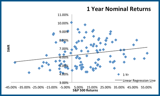
As the results reveal, there’s not a terribly strong relationship between the safe withdrawal rate and just the first year’s return. The worst return (far left, -42%) is associated with a “lower” safe withdrawal rate, but it was still a withdrawal rate of 5.34%, well above the “4% rule” threshold. And similar withdrawal rates of 5%-6% are also found at the opposite side of the chart, where the first year’s return was 35%-55% as well! Overall, the correlation between the safe withdrawal rate and the first year’s return is a mere 0.21.
As noted earlier, the reason that the safe withdrawal rate has little relationship to just the first year’s withdrawal is that in the short term, a diversified portfolio has other sources to draw from, and even if a withdrawal must be taken from equities it’s still only a few percent of the portfolio and is hardly likely to lead to a catastrophic depletion on its own.
The true risk is not merely a bad return in the first year, but a string a bad returns where the cumulative withdrawals add up to something more significant and the portfolio in the aggregate starts to get winnowed down. Accordingly, the chart below shows the relationship between the safe withdrawal rate from a 60/40 portfolio, and the (geometric) return on equities for the first 10 years.
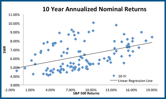
As the chart shows, 10-year returns are at least somewhat more predictive. The correlation between the safe withdrawal rate and the 10-year return is 0.44, more than double the correlation with just 1-year returns. The few extremely bad results are clearly associated with the lower end of the withdrawal rates, and the highest subset of returns consistently lead to moderately higher withdrawal rates. On the other hand, the predictive value is clearly still limited; the safe withdrawal rates in the 4%-5% range are still occurring with 10-year average annual compound growth rates anywhere between 2% and 10%!
Given that 10-year returns were more predictive than 1-year returns, one might expect that increasing the return time horizon further will improve the predictive value, but it turns out this is not true. In fact, as the time horizon increases further, the results become less predictive. As shown below, there’s virtually no correlation at all between the safe withdrawal rate and 30-year compounded equity returns!
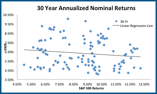
To some extent, this simply reiterates the importance of sequence-of-return risk – long-term returns over 30 years don’t matter if the returns are so bad in the first decade that the retiree runs out of money before the good returns at the end show up! In fact, the chart above reveals that the relationship between safe withdrawal rates and 30-year returns just looks like a giant blob of randomness, and the overall correlation trend is actually slightly negative! The best withdrawal rates come with the middle-ish returns, while the higher 11%+ returns are actually clustered in the lower half of the safe withdrawal rate results!
This somewhat surprising result – where higher returns are associated with lower withdrawal rates – isn’t entirely counterintuitive though. The reason is actually quite simple: because these returns are nominal, and higher nominal returns are often associated with higher inflation, which can be very disruptive for retirees!
Inflation Sequencing And Bad Real Returns
While the focus thus far has been on returns, the reality is that inflation plays an important role in sequence of returns risk as well, both because high inflation overall means more withdrawals are required to sustain a standard of living (which necessitates getting higher returns just to survive!), and because inflation itself has its own sequencing risk.
For instance, if inflation averages 3% for 20 years and 8% for the last decade, overall average compound inflation is 4.6% for the 30-year time horizon. If inflation is 8% for the first decade and 3% for the last 20 years, it’s still the same 4.6% for 30 years.
In actual dollar terms, though, the results are quite different. As illustrated in the chart below, a retiree starts with nominal spending of $40,000/year, the late higher inflation (8% in the last decade, solid blue line) requires cumulative nominal withdrawals (dotted blue line) of $2.12M for 30 years, while the early higher inflation (8% in the first decade, solid red line) requires $2.90M of cumulative withdrawals (dotted red line) because the higher early inflation results in a higher level of base spending upon which the later inflation still compounds even if the later inflation rate is lower. The end result is that the sequence of inflation – even with the same compound annual growth rate of inflation for the whole time horizon – can increase the nominal withdrawal requirement by almost 37% (the difference between $2.90M and $2.12M)!
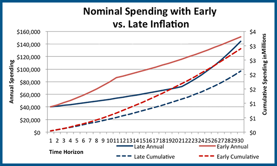
Of course, these varying inflation sequences are quite manageable if returns keep up with inflation in the first place – or viewed another way, if returns cover inflation and then add real growth on top, the inflation sequencing isn’t necessarily a problem because your inflation-adjusted retirement principal is still keeping up with inflation-adjusted spending, while the further returns fuel growth for future spending needs.
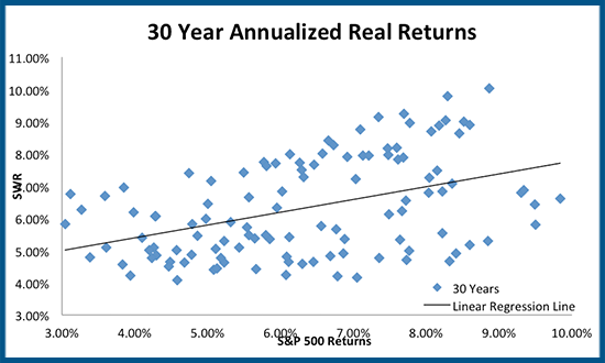
What this does mean, however, is that real inflation-adjusted returns are actually far more crucial than nominal returns evaluated earlier. In fact, the inflation-adjustment difference between real and nominal returns explains most of the “odd” negative correlation shown earlier between safe withdrawal rates and 30-year returns. As shown below, on a 30-year real return basis, there is a solid 0.43 correlation to the safe withdrawal rate (not a mild negative correlation!), which actually means 30-year real returns are just as predictive as 10-year nominal!
And as discussed earlier, 30-year returns (real or nominal) still don’t actually highlight the true sequence of return risk. When the time horizon is consolidated to view just the first 10 years and is evaluated on a real return basis, the correlation spikes to a whopping 0.79, with a clear predictive trend.
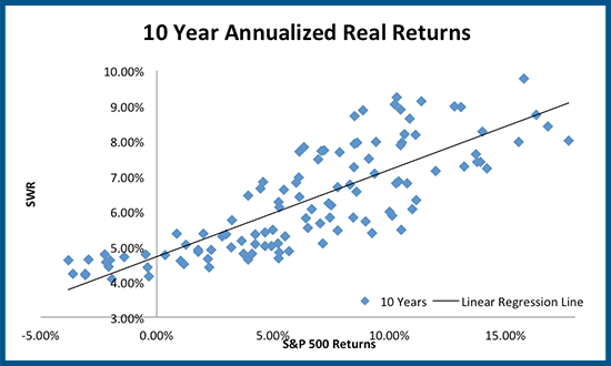
As the chart above reveals, there is a strong and consistent relationship between safe withdrawal rates for a 60/40 portfolio and the real returns of equities during the first decade of retirement. Extremely low real returns (e.g., below 0%) are highly damaging to the sustainable spending level (and in fact any compounded real returns below about 3% are still in the 4% to 5.5% safe withdrawal rate range). On the other end, there is a positive sequence of return effect visible as well; with a good first decade (e.g., 12%+ returns), the worst safe withdrawal rates were still at least 7% and often higher! In other words, just as a bad first decade can be so severe with ongoing withdrawals that a subsequent market rebound just isn't enough to recover, but a good first decade can be so positive than even a subsequent bear market can’t ruin the outcome!
The Impact Of Market Valuation On Safe Withdrawal Rates And Sequence Of Returns Risk
As the data here has shown, ultimately sequence of return risk is driven by bad decades of real returns, not necessarily by ‘mere’ bear markets early in retirement (even severe ones) that can bounce back quickly. As discussed earlier, this is due to the fact that something like a 4% withdrawal rate just isn’t all that high relative to the size of the portfolio, so for a $1,000,000 portfolio a mere one year’s $40,000 withdrawal in the midst of a bear market isn’t a big deal; in fact, with a normal rebalancing process, the reality is that the whole withdrawal will come from bonds anyway, not stocks. Sequence of return risk is not a one-year phenomenon (and it doesn’t take elaborate risk management techniques to manage it, either).
Instead, the real problem is not a bad year or two at the beginning of retirement, but a bad decade to start off retirement. A bad decade outlasts most cash reserve strategies, many bucket strategies (unless you truly let the fixed bucket spend down and implement a rising equity glidepath), etc. It’s a slow inexorable grind that whittles down the portfolio to the point there’s just not enough to recover, and there are few places to hide after 10 years of poor returns.
In fact, as it turns out 10 years really is the “sweet spot” for sequence of returns risk; a bad decade at the start of retirement is more predictive than 1-year returns and is also more predictive than 30-year returns, as shown below.
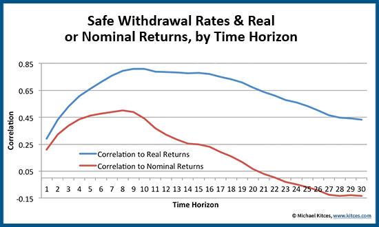
The chart above is the true embodiment of sequence-of-return risk. As the results show, 1- or 2-year returns (e.g., a bear market in the first year or two of retirement) are only modestly predictive; similarly, there’s less of a relationship between safe withdrawal rates and 30-year returns, as just looking at returns over the whole 30-year time horizon ignores the sequence of return risk as well. The crucial sequence timing is the first decade or so, where the correlation peaks between real returns and safe withdrawal rates (the correlation actually peaks at 0.810 after 9 years but is still 0.808 after 10 years). And real returns are far more predictive than nominal returns, by more accurately reflecting the impact of inflation (or at least, the impact of real portfolio returns keeping up with inflation).
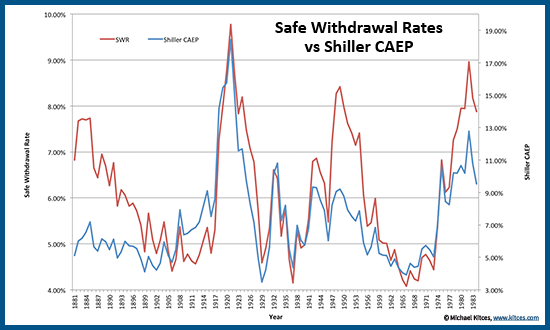
Notably, the fact that 10-year equity returns are so predictive (even of the safe withdrawal rate from a 60/40 portfolio) is also why market valuation can be so effective as an indicator for retirement – because measures like Shiller P/E10 actually do a good job predicting real returns over a decade or more, which is the exact time horizon that matters for sequence of returns risk. In fact, as shown below (and as I’ve also shown in prior research on market valuation and safe withdrawal rates), if we look at the earnings yield of stocks using Shiller methodology (E10/P, or CAEP) and compare it to the 30-year SWR, the correlation is a remarkable 0.77! Market valuation and earnings yields at the start of retirement are remarkably predictive of 30-year safe withdrawal rates!
The bottom line, though, is simply this – for retirees, don’t worry quite so much about the short term. Bear markets in the first few years are retirement are not necessarily “fatal” if they bounce back just a few years later (which, notably, has been the outcome for a 2008 retiree already!). But at the same time, don’t depend too much on ultra-long term returns to carry the day; it doesn’t matter if volatility averages out in the long run if the portfolio has already been depleted when the good returns finally show up. What really matters is the intermediate term, as a “merely mediocre” decade of returns can actually be worse than a short-term market crash, where getting no growth for an extended period of time just grinds down other resources while waiting over 10 years for good returns to finally show up. Fortunately, though, bad decades are not entirely random, allowing for some potential for retirees to manage to the situation, with respect to both managing their asset allocation dynamically, adjusting their asset allocation glidepath through retirement, and the initial withdrawal rate they start their retirement with in the first place!


