Executive Summary
In this modern era, and especially since the pandemic, financial advisors’ websites have become a crucial part of developing new leads. However, while many advisors do not build or join a practice because of their experience in web design (justifiably!), their ignorance can prove dangerous on at least two fronts. First, while a financial advisor’s website design technically tells a prospective client nothing about that advisor’s ability to provide valuable advice, visitors often use their website experience (perhaps subconsciously) to assess a financial advisor’s work quality and professionalism. Second, SEO signals, important criteria for websites to get found in the first place, are increasingly based on quantitative User eXperience (UX) metrics as determined by search engines such as Google. Which means that websites with higher UX standards will fare much better in search engine rankings, making them more visible to prospective clients!
Fortunately, advisors looking to evaluate their site’s UX have several key indicators they can use. Some easy measurables such as dwell time (the amount of time someone spends on a page) and bounce rate (the percentage of people who visit only one page before leaving the site altogether) are just two indicators that can help determine if potential clients are finding value on a landing page. Additionally, many of a website’s key UX metrics can easily be tested through various assessment tools, such as Google Analytics and PageSpeed Insights. For advisors who find their website UX stats raise some alarms, thankfully there are often easy solutions to make correcting adjustments that become obvious once the problem is viewed from the perspective of how the user experience can be faster, easier, more convenient, and more useful.
When a website is translated through the lens of the user, advisors need to make two assumptions: first, that prospective clients are visiting the website with no prior knowledge of the advisor or firm; and second, that they are not here to spend a lot of time to do a deep read (unlike our Nerd’s Eye View blog readers!). In essence, when reviewing their website’s UX metrics, an advisor has to ask themselves, “If someone only took one glance at the first part of my front page, would they understand what I do?” In that first glance, all an advisor has to affirm is relevance and competence.
Once the user is convinced they’re where they belong, a well-structured, user-focused website invites clients to dig deeper into the website, where further UX features affirm trust and competence, and also help improve the visibility of the website in search engine results. For example, a page’s loading speed not only makes a difference to the user, but also to search engines like Google, which use a website’s loading speed as an important SEO ranking criteria. Other features, such as non-intrusive (but still noticeable) pop-ups that come after a client has shown interest in content, can help genuinely interested people find their way onto an advisor’s email list.
Ultimately, the key point is that good UX strategies can create trust, which encourages inquiry and helps to convert visitors into clients. Ironically, a website made for users (rather than for search engines) is often a website that performs well in search engine rankings. And when websites cater to users and showcase what makes an advisor unique, valuable, and engaging, UX can have a tremendous impact on people looking for an advisor – not just by helping them find the right advisor, but also by encouraging long-term engagement with their advisor!
User eXperience (UX) is quickly becoming one of the most important Search Engine Optimization (SEO) ranking factors. In fact, on May 28, 2020, Google announced a new SEO ranking signal that will be used to better analyze the experience users have on web pages. The new signal, known as Core Web Vitals, is set to go live in May 2021 and will be combined with previous UX-related SEO signals such as Page Experience. Put simply, if Google discovers that your website visitors are having a poor experience, your organic search traffic (i.e., SEO) will likely suffer.
As I shared in my previous Nerd's Eye View article (2 Ways I Improved My Advisor Website SEO), organic search traffic to my website has been one of the key ingredients in maintaining an average of 15 high-net-worth web leads each quarter. Another important factor is providing a good, engaging website experience to visitors when they do find us. For those reasons, I've spent a significant amount of time and resources over the last few years – and especially in the months following Google's announcement – to maintain and grow our SEO rankings by improving our website UX.
In this article, I share the top five things I've done to improve my website UX, grow our organic search traffic to over 9,000 users per month, and create an easy path for web visitors to become clients. I also share exactly how I made these improvements and the tools I used so advisors can quickly and easily take action.
By reducing friction on their websites and delivering a more enjoyable web browsing experience, financial advisors will make it easier for their users (i.e., potential clients!) to take action while also boosting SEO.
What Is User Experience (UX) And Why Is It Important?
User eXperience (UX) involves all of the different aspects that affect the interaction of a website's visitor with the site itself, and that influences the visitor's perception of the company, product, and/or services promoted by the website. Improving UX involves making a visit to your website as useful and valuable as possible. It's about helping web users easily understand who you are, what you do, and how you can help. It's also about making it easy for them to find what they're looking for and, if desired, to take action.
In addition to improving brand credibility and user engagement, UX is important because it's considered a top priority for search engines like Google who care deeply about their users. If a Google search result leads their user to a website riddled with obstacles and irrelevant information, that user may be less inclined to use Google in the future.
According to Google, "By adding page experience to the hundreds of signals that Google considers when ranking search results, we aim to help people more easily access the information and web pages they're looking for, and support site owners in providing an experience users enjoy."
Websites delivering an enjoyable experience are directly rewarded by Google, but they're also indirectly rewarded by other third-party sites because people are more likely to share and link externally to a user-friendly resource. When another website links to a page on your website, you become the recipient of a backlink, and backlinks are known to boost your SEO (as I discussed in my previous Nerd's Eye View article).
How Does Google Measure And Monitor User Experience (UX)?
While Google doesn't share the specific details of their SEO ranking algorithm or exactly how they measure UX, they do regularly provide updated information about the common metrics that are factored in.
By now, most financial advisor websites have addressed the basic UX signals being monitored by Google for SEO, such as optimizing for mobile-friendliness, adding HTTPS security, and providing a safe browsing experience. But with Google's renewed focus on providing a valuable and enjoyable experience to users, advisors will need to go beyond the basics if they want to maintain and boost their online visibility.
Here are three important UX-ranking signals that financial advisors need to become familiar with in order to stay relevant online:
- Dwell Time and Bounce Rate;
- Intrusive Interstitials; and
- Core Web Vitals.
Dwell Time And Bounce Rate
Dwell time is the amount of time someone spends on your website or webpage. The longer a person spends on a page, the more it signals to Google that the page is valuable and worth sharing with others.
When a user visits a page on your website and quickly leaves (e.g., they clicked through to the page, looked at it, decided it wasn't what they were looking for or was something they didn't want to read), it reduces your dwell time and sends a negative ranking signal to Google (literally, "this isn't the page people actually stay on and read when it's provided as the result of a search!").
It also increases your bounce rate – the percentage of people who visit only one page on your site and then leave without visiting any other of your website's pages (another signal that your content may not have been engaging to the reader). In more technical terms, bounce rate is "the percentage of single-page sessions divided by all the sessions for your website (or an individual page)", according to Search Engine Journal.
One study, conducted by the SEO training website backlinko.com, found that the average dwell time for a Google first-page result is 2.5 minutes. Similarly, the consensus among SEO experts is that sites with lower-than-average bounce rates, compared to other sites in the same industry, would be expected to rank higher in search results.
While you can view your bounce rate in Google Analytics and the Google Search Console, you won't find a dwell time report. However, Google does provide your "Avg. Session Duration", which is very similar.
Intrusive Interstitials
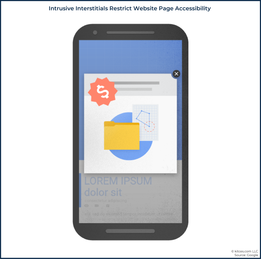
An intrusive interstitial is a website element that makes content on a page less accessible, such as a poorly placed pop-up or advertisement.
While pop-ups can be intrusive on desktop browsers, they are even more problematic on mobile devices, which have less screen real estate to work with. And, given that Google primarily uses the mobile version of a website in its ranking algorithm, it's more important than ever to understand how to avoid intrusive interstitials.
An example of an intrusive pop-up from Google is shown in the graphic below.
According to Google, "To improve the mobile search experience, after January 10, 2017, pages where content is not easily accessible to a user on the transition from the mobile search results may not rank as highly."
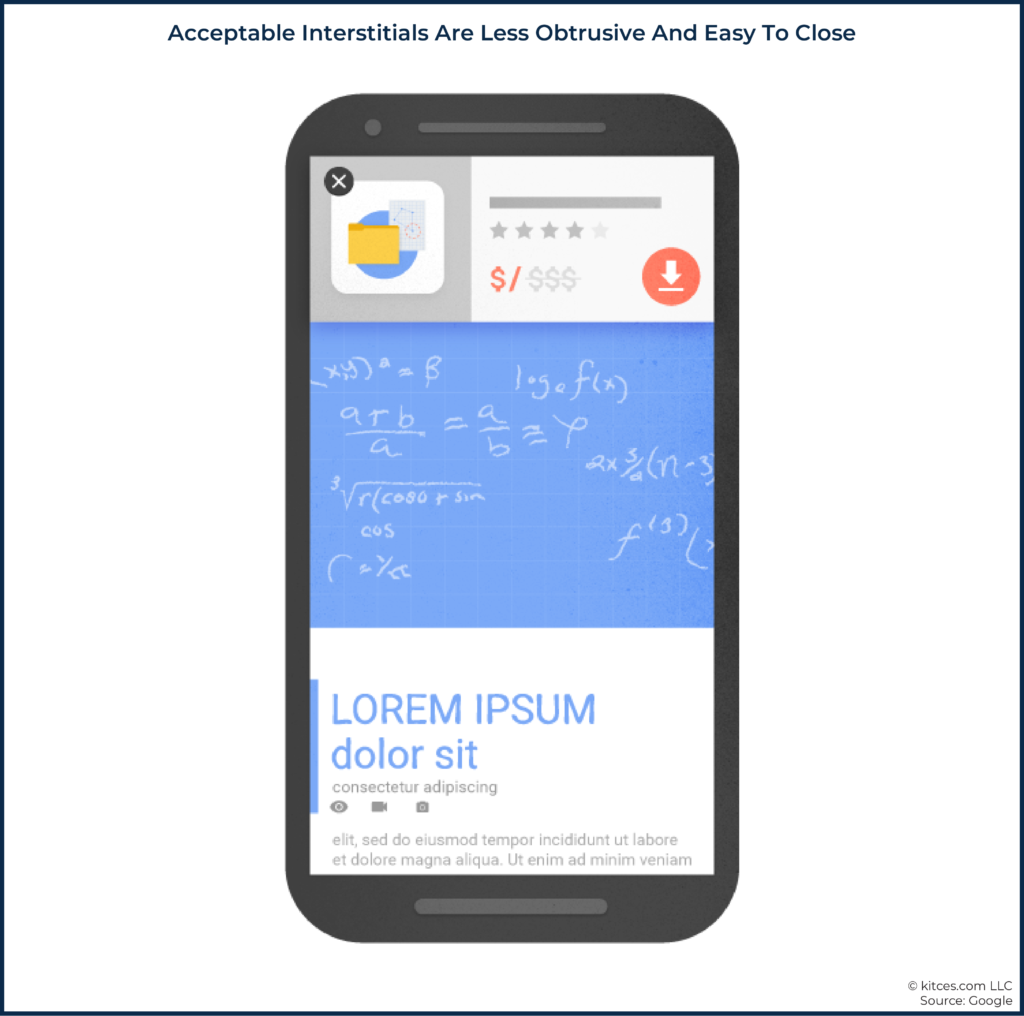
An example of an accepted interstitial from Google would look more like this:
In short, an accepted interstitial typically takes up less than 15% of the page, is easy to close, and doesn't cover the content on the page. Interstitials that you are legally required to display, such as cookie usage and age verification, are also accepted.
Core Web Vitals
According to Google, Core Web Vitals "measure dimensions of web usability such as load time, interactivity, and the stability of content as it loads (so you don't accidentally tap that button when it shifts under your finger – how annoying!)."
Put simply, Google rewards stable, fast-loading web pages that make it quick and easy for users to take action (e.g., finding and clicking a call-to-action button or a link in the site's menu).
The underlying metrics that make up Core Web Vitals are known as Largest Contentful Paint (LCP), which assesses perceived page loading speed; First Input Delay (FID), which measures how quickly the page loads in response to user interaction); and Cumulative Layout Shift (CLS), which measures the stability of the website content's visual elements.
To see how your website stacks up against these metrics, you can use free tools such as Google Search Console, PageSpeed Insights, or Chrome User Experience Report. A good threshold to measure is the 75th percentile across desktop and mobile for the three metrics above, says Google.
While it's important to have a basic understanding of the complexities behind the scenes, common sense typically leads to the right solution. In short, the name of the game is to provide your website visitors with the information they're looking for without friction or obstacles, and the best place to start in accomplishing this is to maintain valuable, engaging, and high-quality content that is easy to digest. As simple as it sounds, most advisors overlook the basic tactics necessary to find success.
For example, many advisor websites make it difficult for consumers to quickly and easily understand what they do and who they do it for. This can lead to a potential client giving up and hitting the back button in their browser.
Advisors also tend to go overboard with the number of things they want the user to do when they land on their site. (e.g., Meet the Team, Download Our Free Guide, Schedule a Call, etc.) This can leave website visitors overwhelmed and paralyzed, resulting in no action at all… and a speedy exit without going any further (which, again, results in low dwell time and a higher bounce rate).
Finally, advisors are often more concerned about the appearance of their website than with the development quality, functionality, and user-friendliness. This typically leads to a visually appealing website, albeit one that fails to meet the standards of providing a delightful user experience.
We have less than 15 seconds to capture the attention of a web visitor before they leave. Fortunately, there are some simple tweaks every advisor can make to improve their website experience, encourage users to take action, and send positive signals to Google that will improve SEO.
Five Key Priorities That Put The Website User First
Prior to understanding the importance of UX and creating an engaging user journey, I made selfish decisions for our website.
I hired a low-cost web designer to create a modern-looking website but was left with painfully slow page load speeds and an unsafe domain that was the victim of multiple cyber-attacks.
I came up with clever taglines, but they were non-descriptive and unhelpful to web visitors who might be coming to my website for the first time and were just trying to figure out what I did in the first place.
I wrote high-quality content for our web pages and blog posts, but the copy was dense and hard for readers who might not yet be ready to delve in deep and just wanted to skim.
Worst of all, I hit web visitors with intrusive, poorly timed pop-ups to try to get them to take action… without building trust first.
The great thing about improving user experience and website SEO is that you don't have to look very hard for the solution.
"Focus on the user, and everything else will follow," says Google.
While that statement is part of their company philosophy published over 20 years ago, it's still widely relevant and guides most of the decisions I make with my website today. I regularly ask myself, "How can I make this more valuable to the user? How can I make it easier and simpler? How can I create a better experience?"
By continuously updating and optimizing my website with a focus on the user, I can be confident that users who come to my website will not only find what they need but will also be more likely to take action, all of which will send positive signals to Google along the way and boost our SEO.
Improve The Hero Space
One of the first improvements I made to create a better experience for users was writing a crystal-clear description in the hero space on my website.
The hero space is the very first section at the top of your homepage. In other words, it's the very first element a web visitor sees!
The hero space on a homepage is typically made up of a text heading and a call-to-action button. These can also be complemented by an image or video. According to Trajectory Web Design, your hero message should explain the following in less than five seconds:
- Who you are (industry or niche);
- What you do; and
- Why the visitor should care (i.e., what's in it for them).
The hero area should also help you establish credibility and encourage users to take action with you.
With this newfound knowledge, our hero message went from "Define Your Financial Future" to "Retirement Planning for Individuals Over Age 50." I also added our three most valuable services – "Reduce Taxes, Invest Smarter, Optimize Income" – as a sub-header for additional clarification.
The new, descriptive text helps web visitors quickly and easily understand our who, what, and why.
In addition to improving the messaging, I added a compelling and descriptive Call-To-Action (CTA) button that says, "Get Your Free Assessment". Instead of something self-serving and vague like "Learn More" or "Contact Us", I'm offering something of value to the visitor, which increases the chances of them taking action and staying on our site.
I also worked with my designer to inject a new color into our brand to use specifically for this CTA button. The gradient magenta we adopted helps our call-to-action stand out from other elements on the site, making it less overwhelming for the user to figure out what action they should take first. In fact, the retirement assessment landing page linked to this CTA button is the second most visited page on our website! This is very different from most advisor websites, where their homepage, bio, blog, and contact form are typically the most visited. While those pages are certainly important, users are likely visiting them because they weren't given a better option. The primary goal of our website is to encourage web visitors to consider hiring our firm, and a crystal-clear CTA button leading them to our assessment page provides a clear and easy path for them to take action.
By making these improvements to the hero area, I've created a better experience for our website visitors – by more clearly, upfront, showing them exactly what I do, who I do it for, and what they should do next to delve deeper – while also moving them one step closer to scheduling an introductory phone call with my firm.
Use Reader-Friendly Formatting
Studies continue to show that web visitors consume less content than we think. Most are skimmers, looking for information on a page that's relevant to them. Even those that scan an entire page only consume about 25% of the content on that page.
To make our website more skimmable and user-friendly, I made the following improvements:
- Added lists (like this one!) and improved spacing of text. Short paragraphs, especially on mobile platforms, have made it easier for page scanners to consume information. Limiting paragraphs to an average of 1 – 3 sentences (and no more than 5 sentences) is a good guideline to follow.
- Injected helpful images and other media elements. Proper use of visuals has added variety to our web pages and enables me to share information without adding more text.
- Created better headings and subtitles. Breaking content into digestible sections with descriptive headings and subtitles, with appropriate keywords used in meta tags, has improved site navigation and made it easier for skimmers to find relevant information.
By focusing on the users' needs and making our content more skimmable, I've improved the experience and made it easier for web visitors to stay on our site.
Create Non-Intrusive Pop-Ups
How do you feel when you visit a website for the first time, and your browsing experience is immediately interrupted by a pop-up that asks you do to something before you've even had a chance to read the site (and even worse, blocks the text you were trying to read in the first place!)?
While excessive pop-ups and other forms of intrusive interstitials (e.g., welcome mats, modals that are difficult to close, splash advertisements) can be harmful to your SEO, it doesn't mean you have to remove them from your website. Because, if done right, they can add value to your visitors while also contributing to your marketing efforts.
For example, if a website visitor is reading my blog post and enjoying the content, it's quite likely they would want to be notified when I publish new articles. To make it easy for them to receive my latest content as it's released, I can add a pop-up containing an opt-in form to receive our newsletter. If I didn't provide that opportunity, the user would have to remember to regularly check my blog for new content, and being expected to do that doesn't offer a great experience.
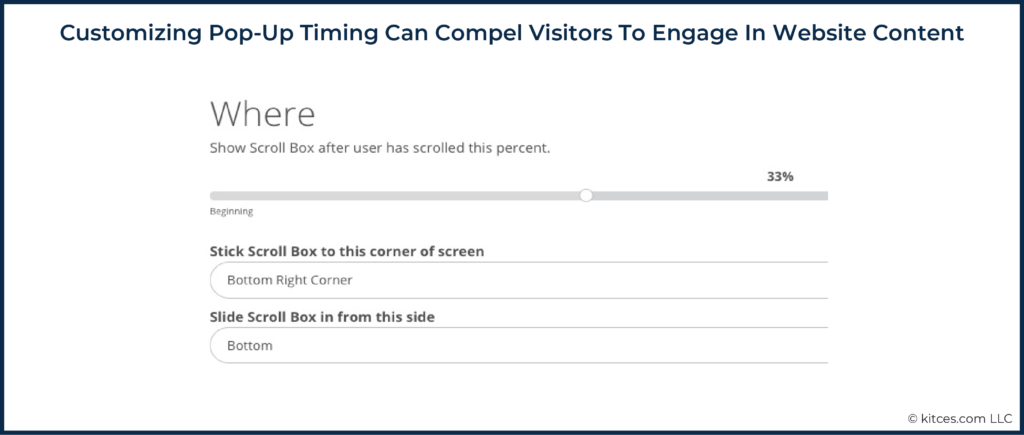
With that being said, we need to exercise caution when using pop-ups to ensure they don't disrupt the user experience and hinder our SEO. Keeping that in mind, the first thing I did to improve our approach with pop-ups was to install the WordPress plugin, Sumo. Along with helping me create more enticing pop-ups, this free tool gave me the ability to customize when, where, and how they appear on my website.
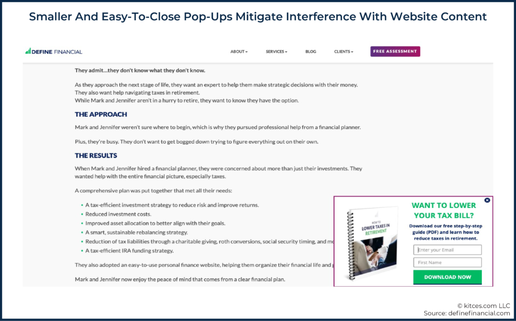
With Sumo enabled, my next step was to design less intrusive pop-ups. For example, I made the pop-ups a smaller size and placed them in the bottom right-hand corner of the screen to mitigate their interference with the content and ensured that it would be very easy for users to close the pop-up if they weren't interested.
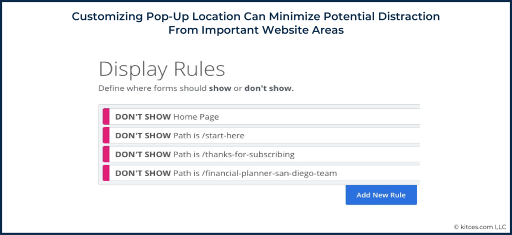
Next, using Sumo, I chose certain pages on my site where I did not want the pop-up to show. This included our homepage, retirement assessment landing page, and 'Meet the Team' page. These pages are the most visited pages on our site and contain important information for a person considering my firm. The last thing I want to do is distract a potential client and hinder their experience while they're on a page that might be their last stop before calling us.
Lastly, on the pages that do permit pop-ups, I told Sumo only to show them when the user has scrolled 33 percent down the page. In other words, the user has shown enough of an interest in our content where I feel comfortable asking them for a small piece of information (their email address) in exchange for something of value (an educational guide). As an alternative to scrolling percentage, you can also choose to show a pop-up based on time spent on a page, which accomplishes a similar goal.
You can also create and customize other forms of interstitials in an SEO-friendly format.
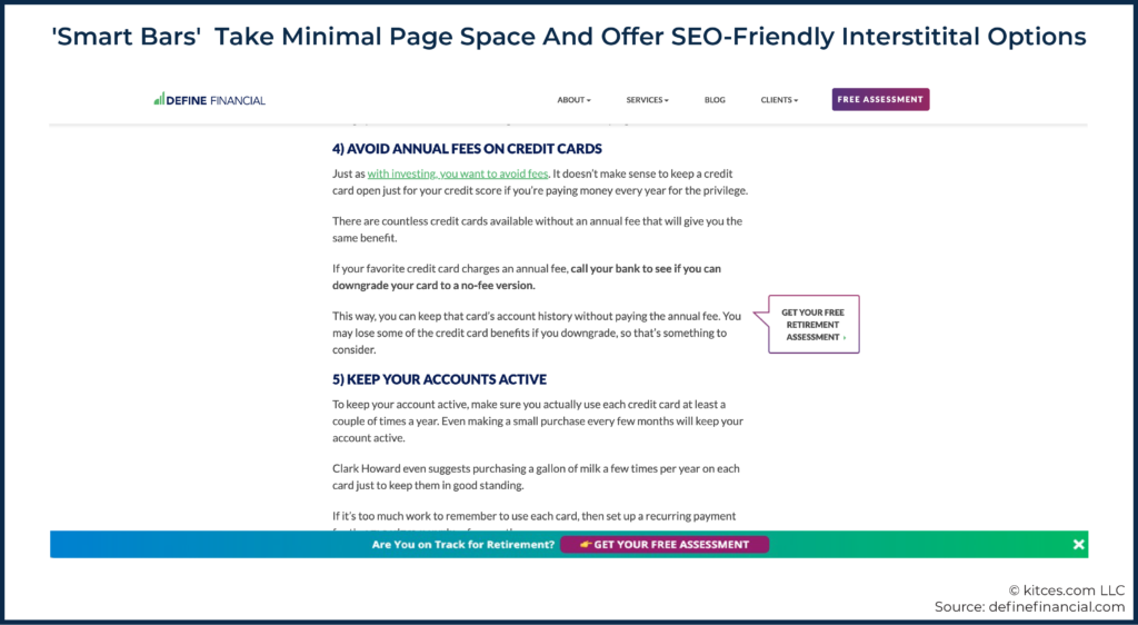
For example, a 'smart bar' is a type of form that sticks to the top or bottom of your screen. This form style takes up a very small percentage of the screen and doesn't cover up content on the page, making it an acceptable and appealing solution.
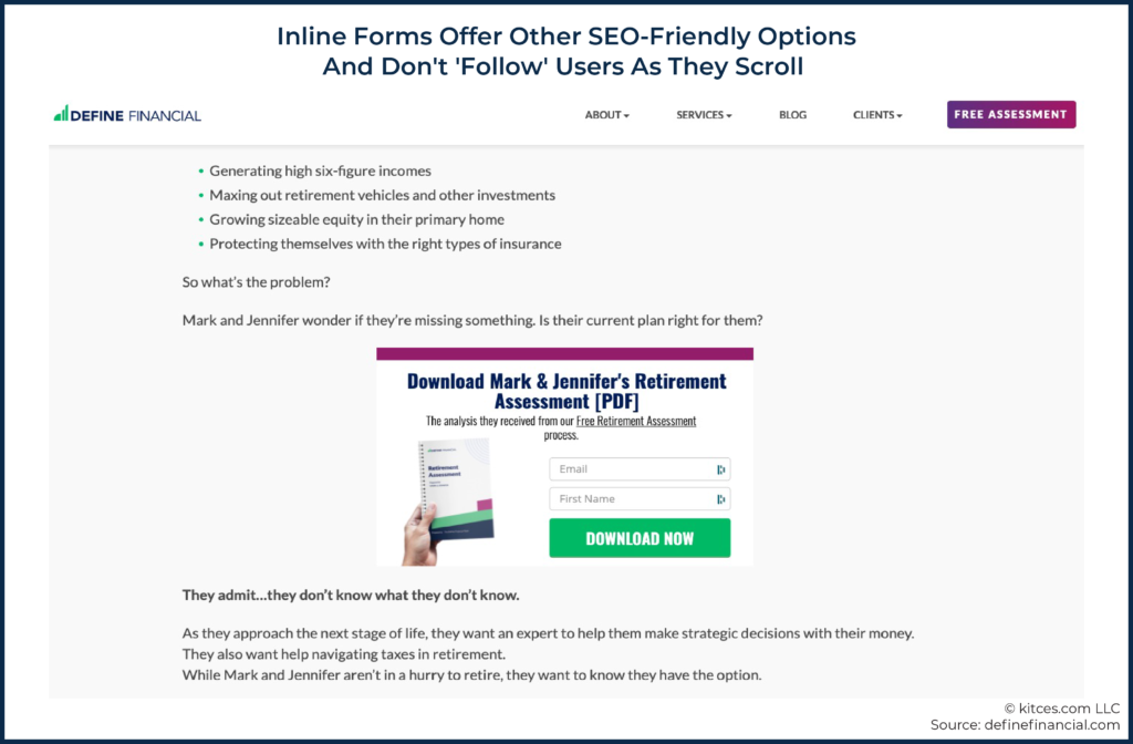
Another SEO-friendly option to consider is an 'inline form' that rests between sentences or paragraphs on your site. However, unlike a smart bar or traditional pop-up, it doesn't follow the user as they scroll or require them to click a button to exit. For those reasons, it's much easier for a reader to ignore and continue reading, which can lead to lower conversion rates.
Regardless of the style you choose, take the extra steps to implement this marketing strategy in a user-friendly way to add value for your readers and avoid being penalized by Google.
Optimize Page Speed
Similar to meeting someone in person for the first time, we want to make a good first impression on our web visitors, and it all starts with speed. In fact, based on Google's data examining mobile page speed, 53% of people will leave your site if it takes longer than 3 seconds to load. This means that web users might not even get a chance to read your awesome content if your speed takes longer than this to load!
According to Google, "Faster sites create happy users, and we've seen in our internal studies that when a site responds slowly, visitors spend less time there."
Fast-loading web pages also help reduce bounce rates and increase dwell time, two metrics that are important UX-ranking signals being monitored by search engines. But Google is taking page speed measurements a step further with the rollout of Core Web Vitals. For example, Largest Contentful Paint (LCP) – a metric that is part of Core Web Vitals – measures how quickly a user is able to see and interact with your page, which is arguably more important than simply how fast a page loads. In addition, First Input Delay (FID) enhances previous metrics by measuring how long it takes for a user to take action on your page (e.g., scroll, click, type).
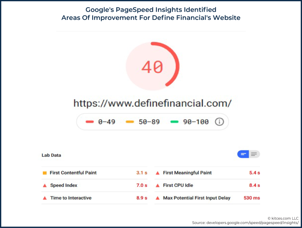
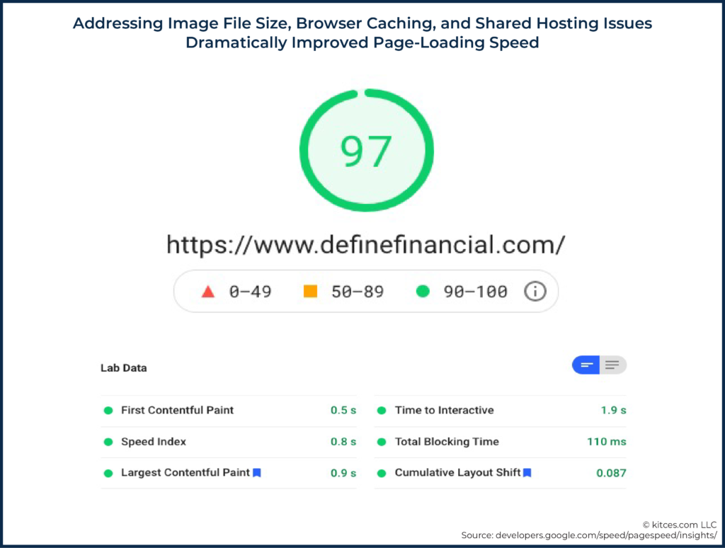
Given that I want to keep website visitors and search engines happy, boosting page speed was a critical piece of my UX improvement project. The first step towards improving page speed was to determine the current performance of our site. To do that, I used Google's PageSpeed Insights, a free tool that measures page speed and generates suggestions to make improvements. Here were the initial results:
Since I'm a financial planner and not a website developer, I sent the results to my web team, Tiny Frog Technologies, and asked them to help improve our scores.
Here were three of the biggest issues they found along with their suggested fixes:
- Large image files. I was carelessly publishing high-resolution photos to our website without realizing much these large files were slowing down page load speeds. To quickly compress all the images on our site and improve our page speed scores, they suggested installing the WordPress plugin WP Smush Image. They also suggested that I use a simple tool like PicMonkey to compress images before uploading them to the website going forward.
- Browser caching. If a user on your website travels to a new page, browser caching will remember all of the previously loaded data (e.g., site logo, header, footer), allowing the new page to load much faster. To implement caching, my web team installed a WordPress plugin called WP Rocket. Another caching plugin to consider is W3 Total Cache which claims to improve overall site performance by 10x.
- Shared hosting. Prior to working with Tiny Frog, I unknowingly signed up for "shared web hosting" to keep costs low. Shared hosting means that my website is hosted on the same server as hundreds, or even thousands, of other websites around the world. The downside to this arrangement is that if one website on the server sees a big uptick in traffic, it eats up shared resources and slows down page speeds for everyone. The recommended solution was to move my website hosting to WP Engine, a managed hosting provider. A managed host provides hosting resources through a dedicated server which helps eliminate resources from being taken up by other sites.
After my web team implemented the recommended fixes, I ran another performance test through Google's PageSpeed Insights and was happy to see a meaningful improvement to our scores.
While it's nearly impossible for me to measure the exact impact faster page speeds have had on our UX and SEO in the short term, I know that I'm delivering a better experience to our users than ever before. I also know that I've passed all of the Core Web Vitals tests ahead of the new ranking signals going live in a couple of months.
Improve Content Relevancy
Content Relevance is an SEO ranking factor that attempts to measure how relevant website content is to users and search queries. If a user lands on a page on our website and the content is not relevant to them and their search intent, they will likely leave quickly, sending a negative signal to Google and discouraging them from putting our content in front of search users.
One of the best ways to improve content relevancy is to improve quality. To help provide a framework for boosting content quality, Google published Quality Guidelines, which includes basic principles such as:
- Make pages for users, not search engines.
- Ask yourself, "Does this help my users?"
- Help your website stand out from others in your field by thinking about what makes it unique, valuable, or engaging.
- Avoid publishing auto-generated content.
- Avoid creating pages with little or no original content.
With these principles in mind, the first step towards improving content quality was to get crystal clear on who my ideal user was, which I tackled when I improved our hero space. If you don't clearly know who your perfect web visitor is, it's critical to solve for that first prior to creating or improving content. HubSpot's free 'Make My Persona' tool can be a good place to start if you're feeling stuck.
The next step for me was to lean on my virtual assistant to review the 100+ blog posts on our website and develop a plan for making quality improvements. As a result of this review, we decided to take two meaningful actions:
- Deleted blog posts that were not relevant to our ideal reader. For example, we discovered a blog post about how to tackle student loan debt. Given that our target user is a high-net-worth retirement saver, that post was deleted.
- Consolidated blog posts on similar topics. For example, we had one blog post about credit freezes and another blog post about credit scores. To create a valuable resource for our readers about managing and protecting their credit, we consolidated the two posts into one.
After blog posts were deleted and consolidated, I tapped my virtual assistant to help improve the quality of the remaining blog content. This process included making blog post titles more descriptive and relevant to what users were searching, re-writing introductions to help readers better understand what the article would teach them, and updating important numbers that can become outdated over time, such as contribution limits.
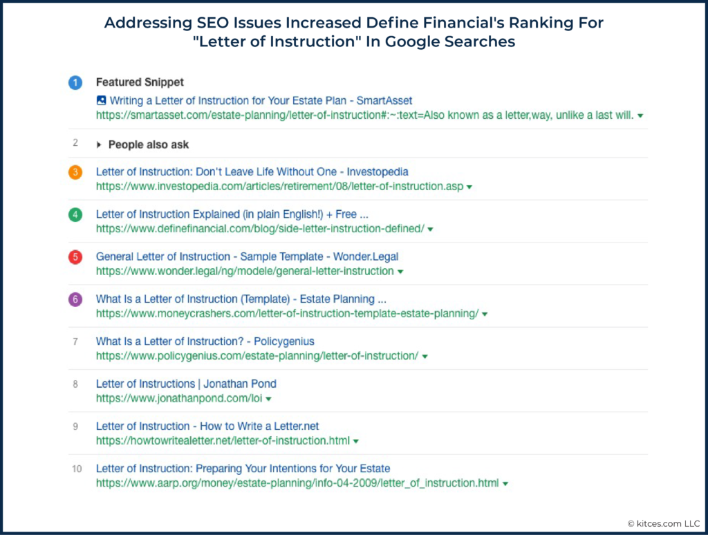
This process also involved uncovering opportunities to strengthen an existing piece of content to make it even more valuable to our readers. For example, I had previously written and published a blog post about writing a letter of instruction. While the article did a great job explaining what a letter of instruction was, we determined that we could take it a step further by sharing specific examples of things to include in this type of document. That led us to add a nice, bulleted list to the existing blog post, which helped improve the quality and relevancy of the content. It also made it more skimmable!
In the U.S., approximately 1,000 people per month are searching the keywords "letter of instruction", and our blog post on the topic jumped up to the #4 search result on Google after making the above-referenced improvements.
Today, we have fewer than 75 published blog posts and continue to review them on a regular basis with the goal of making them more valuable, unique, and relevant. Through this process of speaking directly to our target audience and putting them first, we've been able to improve content relevancy and significantly improve the experience readers have when they visit our site. This has led to a 300%+ increase in organic search traffic in the last twelve months and a consistent flow of inbound inquiries from people we do our best work for.
Action Items For Improving User Experience (UX)
Creating a good user experience is one of the most important SEO ranking factors, but it's also one of the easiest to improve. "Focus on the user and everything else will follow," just like Google says.
Along with adopting a tool like Sumo (or OptinMonster as another alternative) to create less intrusive email capture forms, see if your homepage passes the "grunt test" – as StoryBrand suggests, show your homepage to a group of people for 5 seconds and see if they can tell you what you do, how it helps them, and what the first action step is. In other words, "could a caveman look at your website and immediately grunt what you offer?"
Also, begin reviewing each page of your website to identify how you can make it more skimmable and user-friendly. Remove filler words, improve text spacing by keeping paragraphs short, add different media types, and make good use of headings and sub-titles to break content into digestible sections.
And, remember that more than half of your potential web visitors might not even see your user-friendly content if your website takes more than three seconds to load. For that reason, consider running a free analysis via Google's PageSpeed Insights tool to learn how your website is currently performing and what you can do to optimize your page load speed.
Lastly, with your ideal web visitor in mind, review each page on your site to ensure the content is highly relevant to them. As you assess, simply ask yourself, "Does this help the user? How can I make this more valuable and engaging?" Through this process, consider deleting content that lacks relevancy and improving content that is outdated or missing important information. As a reminder, the best way to improve content relevancy is to improve the quality.
If you're like me and find all these tasks daunting, consider hiring a professional to help. I've hired creative writers (such as Wendy Cook, Holly Johnson, and Roger Wohlner) to improve our web copy and, most recently, I hired Wolfhound Interactive, a UX expert, to perform a comprehensive audit on my site. It's amazing what kind of insight a fresh pair of eyes can provide.
By improving your hero space, ensuring your content is relevant and easy to read, removing intrusive website elements, and keeping your page load speed optimized, you will be well on your way to creating a good user experience.
These positive experiences will create happy web visitors, improve the SEO metrics search engines are monitoring, and boost organic search traffic to your website. They will also encourage potential clients to take action with your firm.
Here are some action items to improve your UX and keep your visitors engaged:
- Remove intrusive website elements and consider adopting a tool to create more discreet email capture forms (e.g., Sumo, OptinMonster);
- Ensure that visitors can immediately identify what you offer; and
- Review your web pages to ensure they are easy to skim
- Remove unnecessary filler words; and
- Use short paragraphs and frequent section breaks to minimize reader fatigue.
Ultimately, the key to improving your website SEO is to deliver an enjoyable, engaging, and valuable experience to your ideal web visitor. Along with sending positive ranking signals to search engines, a good experience will encourage users to take action, which is often the reason we have a website, to begin with.
While UX has always been important, the impending rollout of Google's Core Web Vitals should serve as a strong reminder of how critical it will be going forward. And the great thing about improving website experience is that common sense typically leads to the right solution. Focus on the user, and everything else will follow!





Leave a Reply